Data Explorer
On this page you will learn about Data Explorer and the advanced features you have available to be able to analyze events in detail and make decisions on your Asset's performance.
What is Data Explorer ?
Data Explorer is a time series graphical chart that melds many of the Kelvin features and items into a seamless experience.
It is designed to allow you to analyse situations and to gather, compare and analyze a range of metrics recorded in the Kelvin to be able to quickly come to conclusions and take the necessary decisions.
Basic Features
Data Explorer has all the usual features found in any standard time series analysis graph. These include;
- Time-based data line chart
- Multiple line charts
- Data selection
- Time selection
- Dynamic zoom on x and y axis
- Legend
- Mouseover data popup
- Download the data to a CSV file
Kelvin Features
But Data Explorer is much more than just another time series line graph.
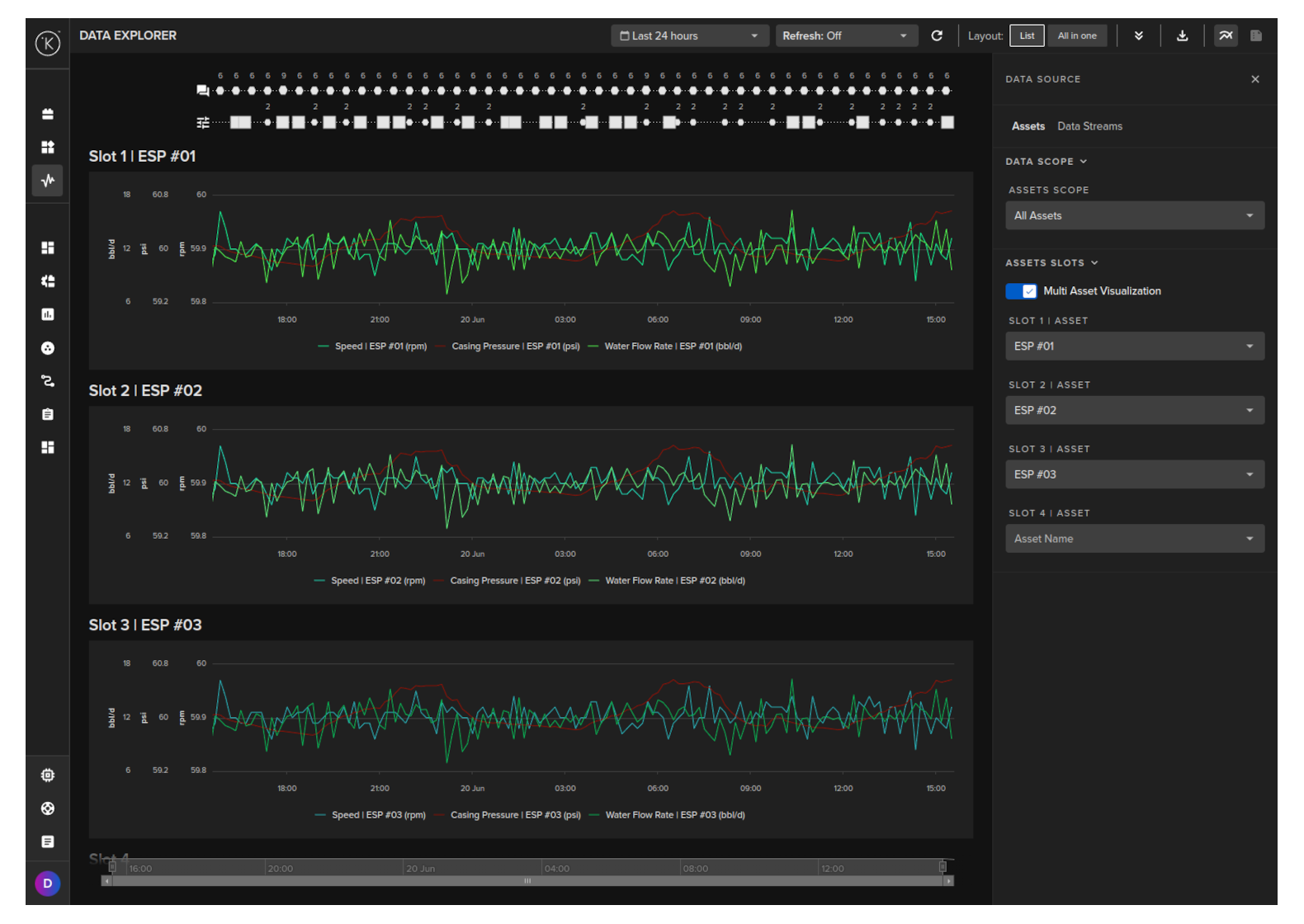
It is tightly integrated with Kelvin and the industrial requirements for being able to see many parameters at the same time. This allows you to analyze the full picture of the industrial controls and come to quick decisions.
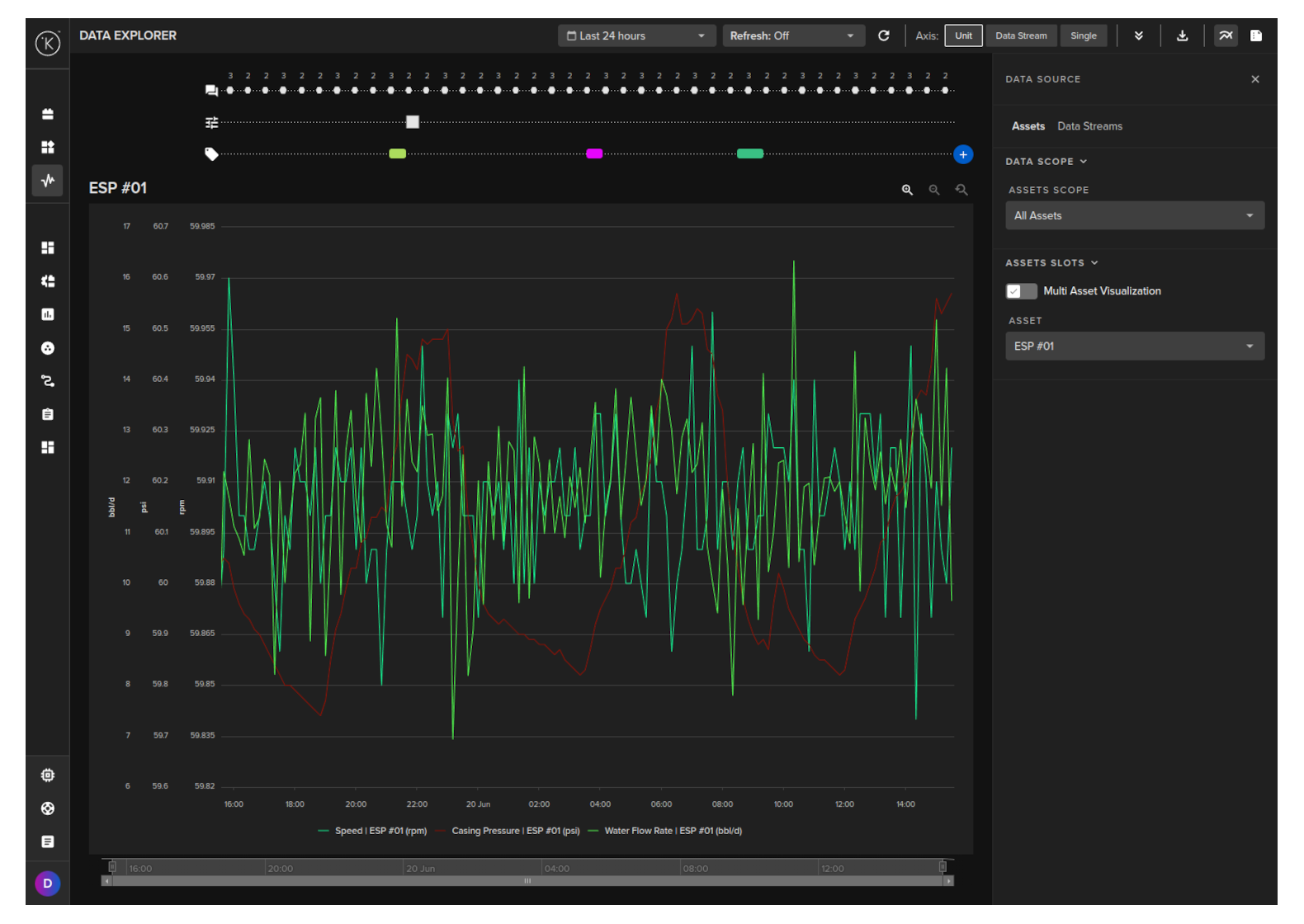
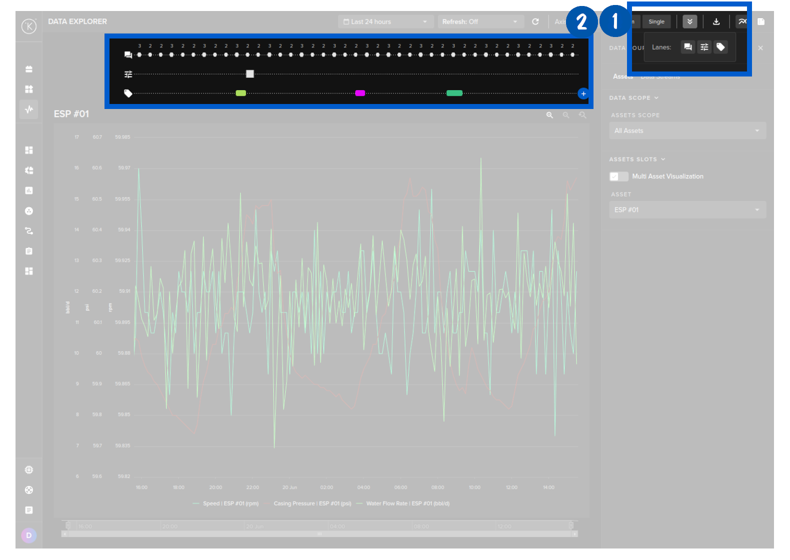
There are three types of events that are recorded and optionally displayed on the graph in the lanes; Tags, Control Changes and Recommendations.
Tags are an option for you to tag certain time locations for easy identification on the graph lanes at a later stage.
Control Change and Recommendation lanes are very useful to view when either have happened and you want to see what the effects were in the recorded data streams.
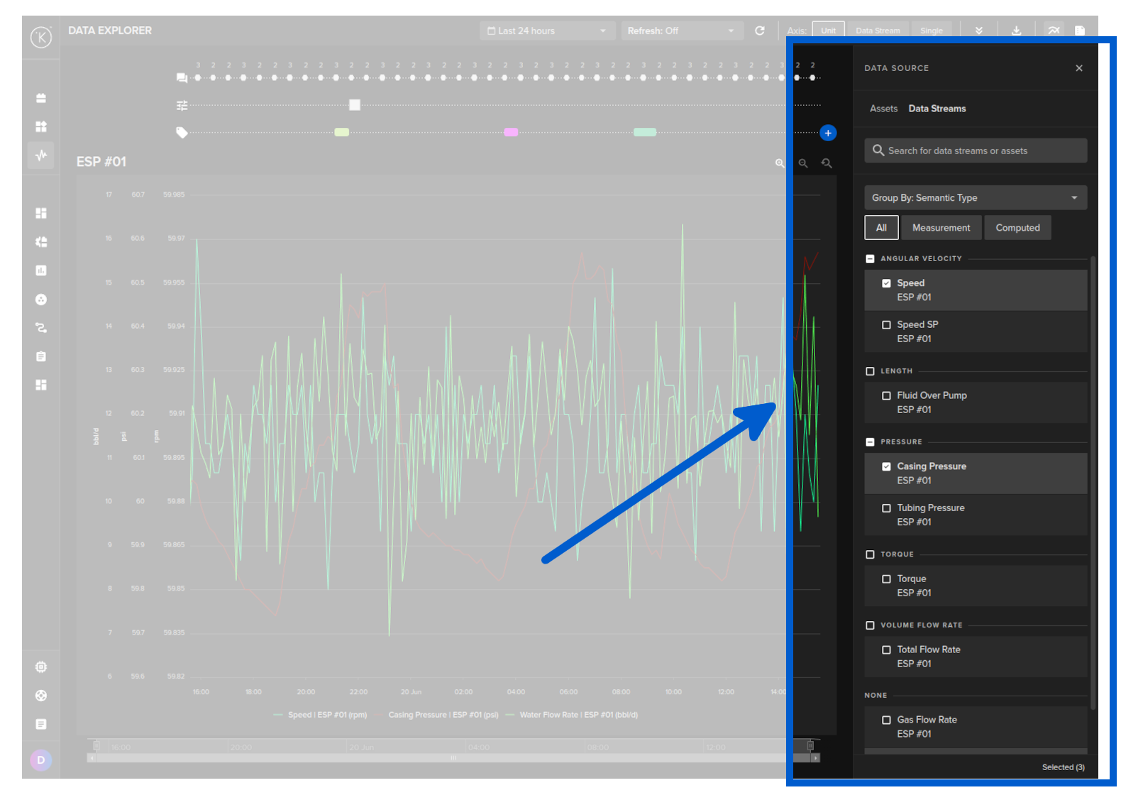
To easily bring up your asset data, the graphs are linked to an Asset and any of its related Data Streams.
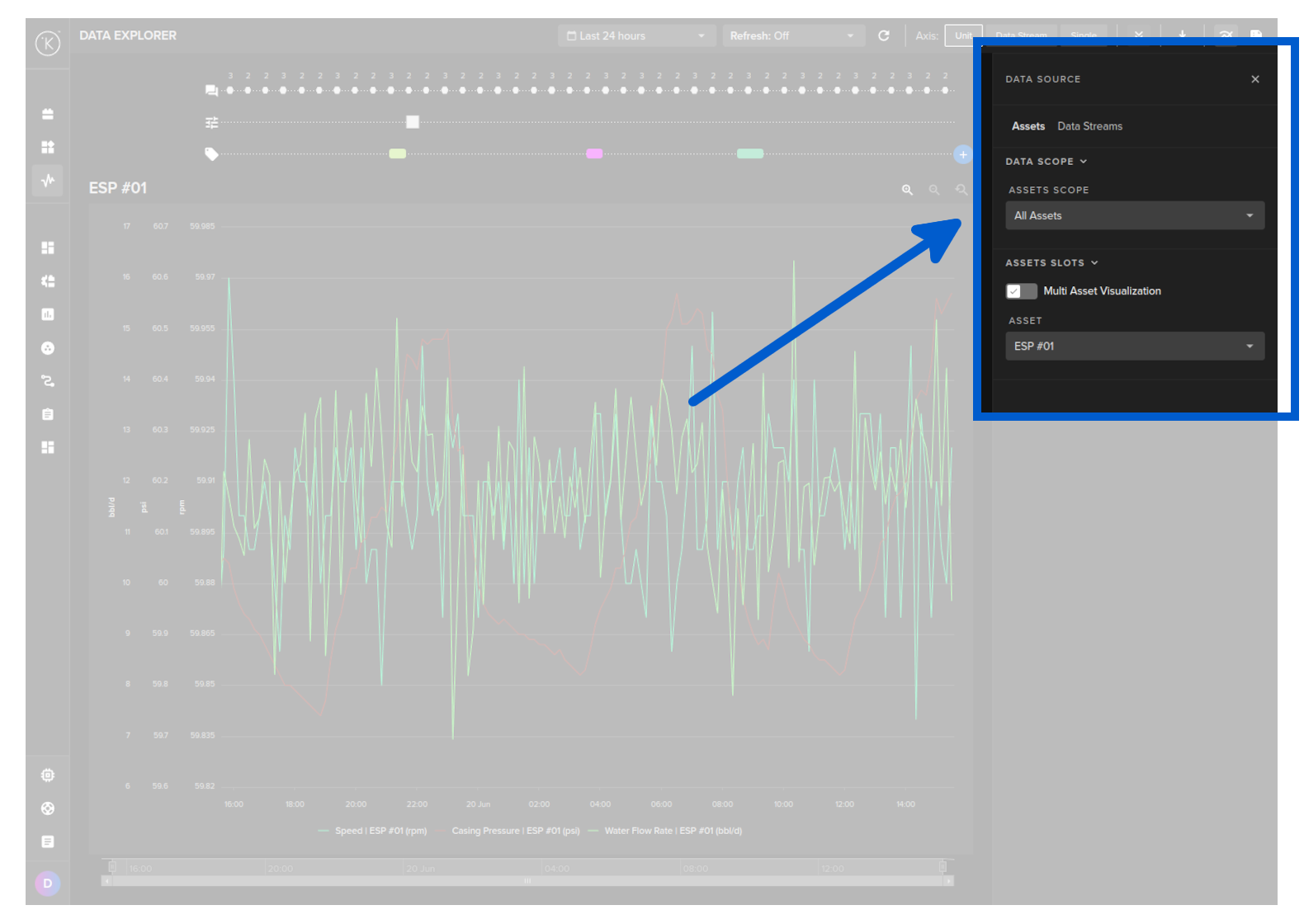
This makes it easy to quickly find the data to display rather than having to remember hundreds or thousands of metric names and trying to find them from a long list of options.
You can use the Data Explorer for both real time monitoring or historical data analysis.
In real time monitoring mode, you can set the refresh rate of the graphs from 5 seconds to 1 hour.
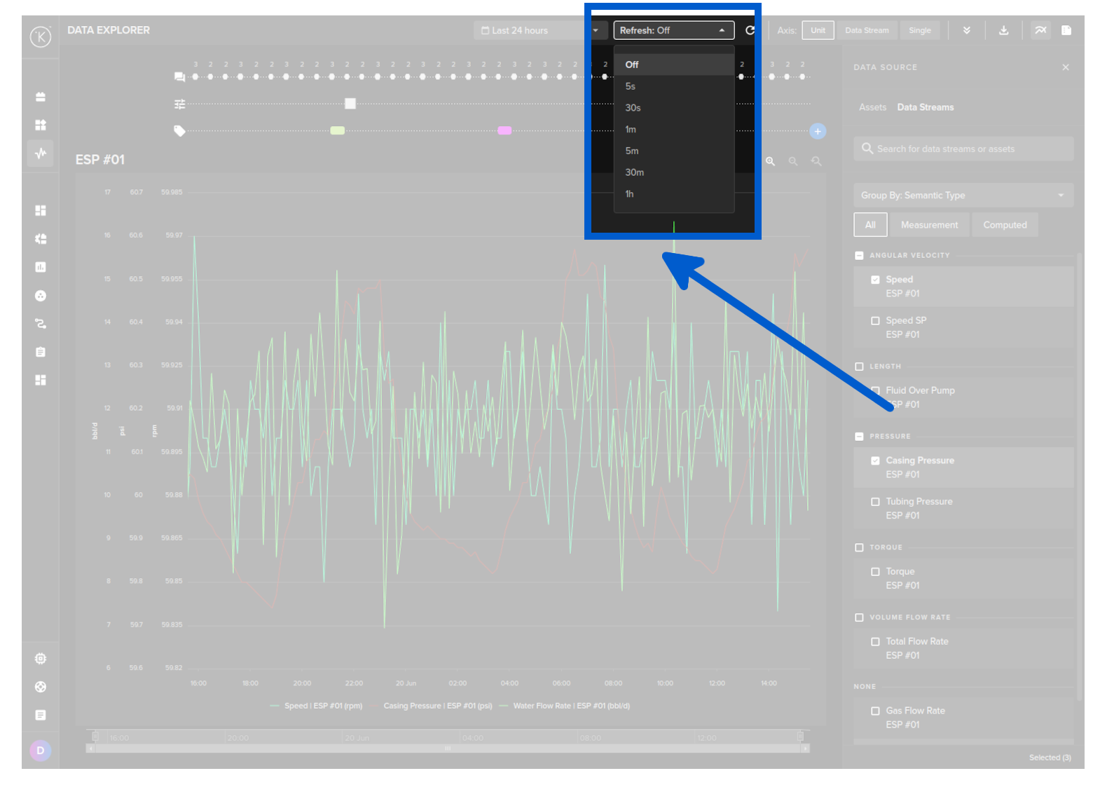
To revert to historical data analysis you can turn off real time monitoring by selecting Off.
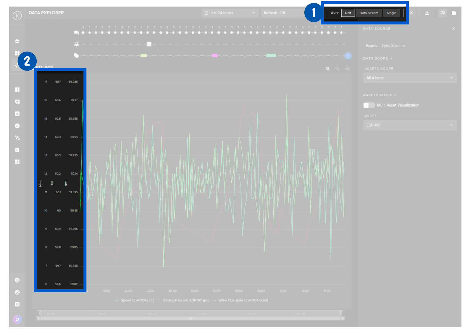
When dealing with different metrics, in many cases you will find the units of each metric will be very different.
For example you may have metrics for a AC Motor, where you record temperature (normally 60 - 200 degrees Fahrenheit), rpm (normally 1,000's) and flow rate (say 0 - 10).
With Data Explorer, you can have separate y-axis to have good visibility on each, rather than having one y-axis and the small numbers like flow rate a very small line at the bottom only.
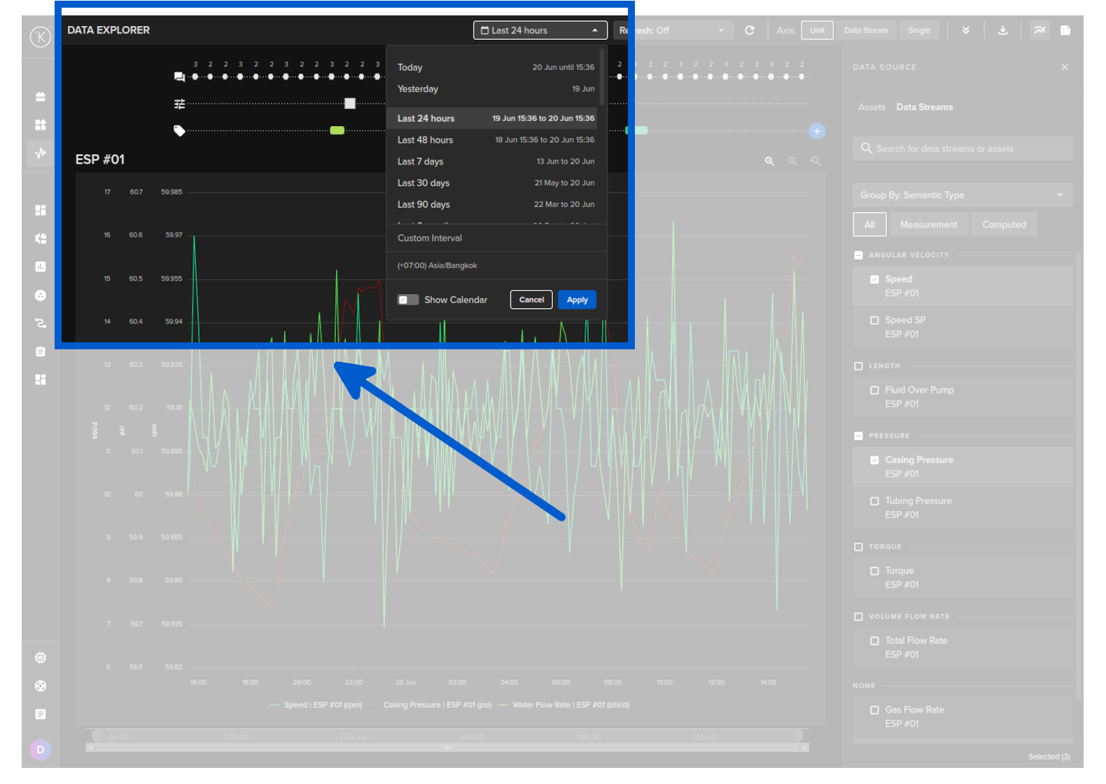
Many solutions will only show you the data in your own timezone or the time of recording.
Kelvin gives you the option to select what timezone you want to view the data. The data will be adjusted accordingly as it is recorded with the timezone data too.
This makes it very useful if your assets or team are in a different timezone and you want to sync your information, communications or reports with multiple timezones.
You can select your own timezone just below the Custom Interval option.
You can also view multiple Assets and their associated Data Streams all together and synced to the same time.
You still have the related control changes and recommendations shown on the top that allows you to get the most information on what is happening to your assets at any time.