Monitor Asset Data with Data Explorer
On this page you will learn how to use the Data Explorer to monitor, analyze and compare Asset data in Kelvin UI.
Available Guides on this Page
Setting Up
-
Open it from the menu, Assets or Applications.
-
Select Assets and Data Streams
Choose what to show in the chart.
-
Set the aggregation and y-axis limits.
-
Pick a preset, an interval or a timezone.
Navigating
-
Zoom the time and each y-axis.
-
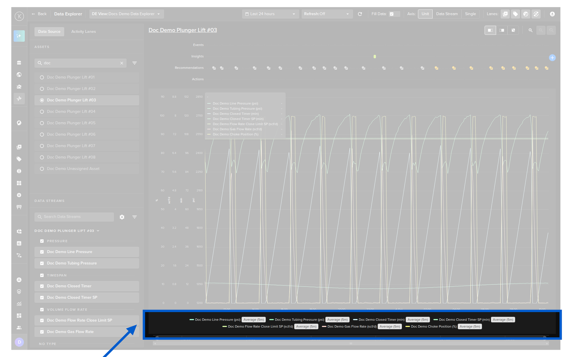
See each Data Stream, its color and aggregation.
-
All the header controls in one place.
Customizing
-
Refresh the chart automatically.
-
Show one y-axis per unit, per stream or one for all.
-
Plot all the data for more resolution.
-
Choose which lanes show above the chart.
Overview
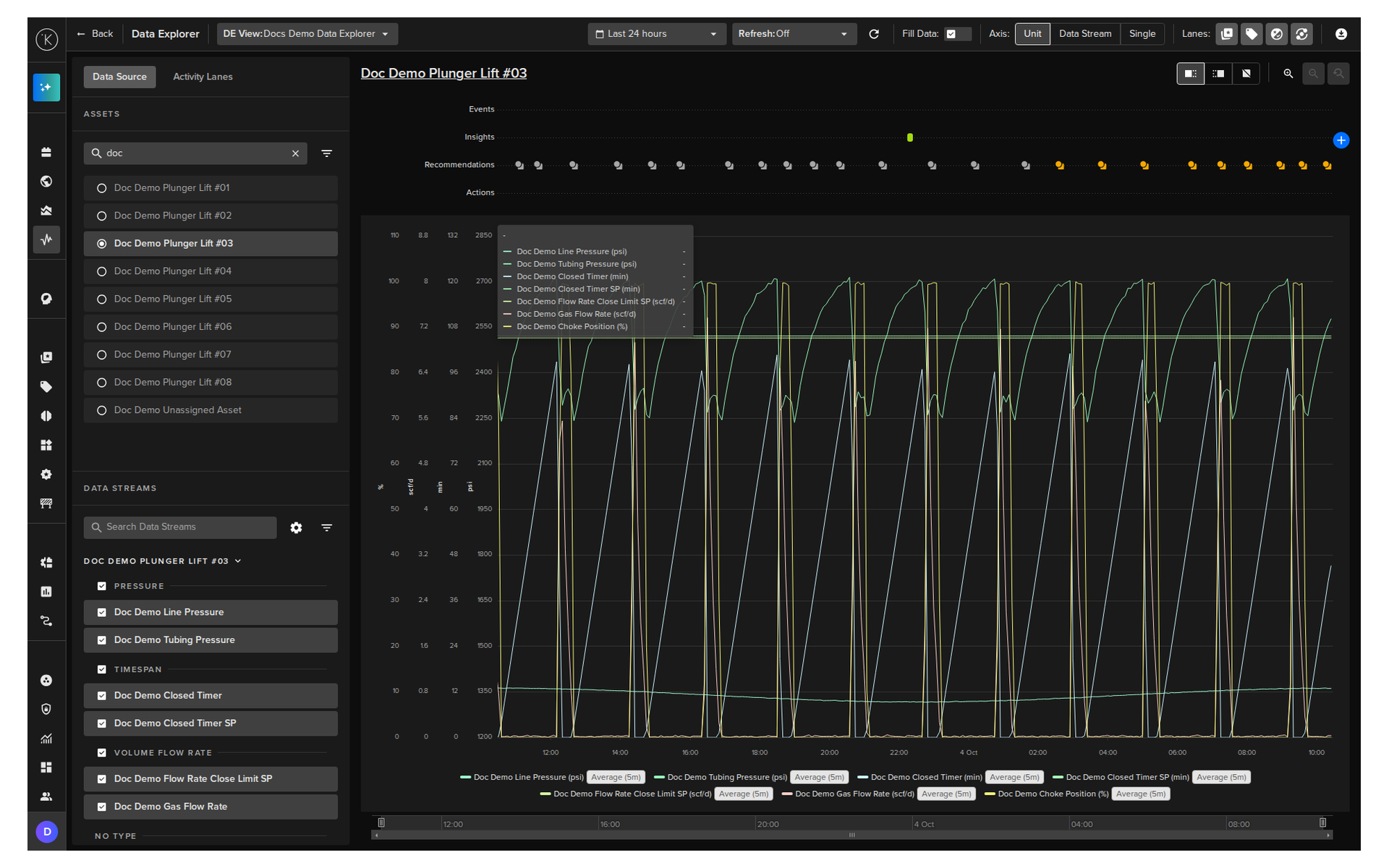
The Data Explorer provides historical and real-time graphical views of Asset Data Streams. Key capabilities include:
- View when Actions, such as Control Changes, were performed on an Asset
- View when Recommendations were created and what was decided
- View the Insights and Events of an Asset
- Save and switch between views
- Change timezone to match Asset location
- Search and filter by Assets and Data Streams
- Configure the aggregation and y-axis limits of each Data Stream
- Configure Y-axis display per unit, per Data Stream, or single axis
- Independent Y-axis zoom controls
Open Data Explorer
You can open the Data Explorer from several locations in the Kelvin UI.
Note
When you are in Data Explorer view, you can return to the Asset page by clicking on the Asset name.
From the Left Side Menu
Click the Data Explorer menu item under Operations in the left sidebar.
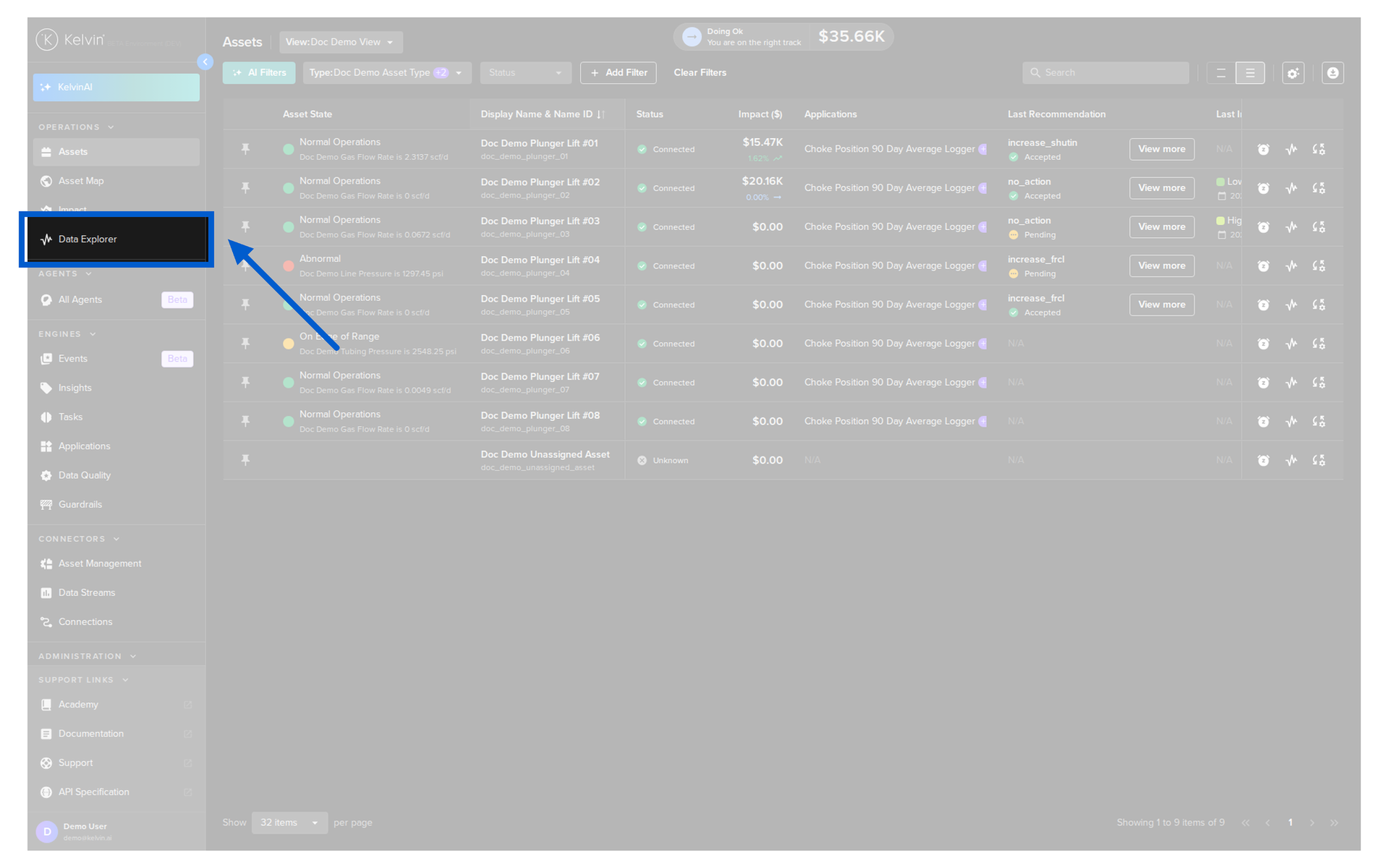
The left menu will automatically collapse to allow more space for the historical data display.
From the Assets Page
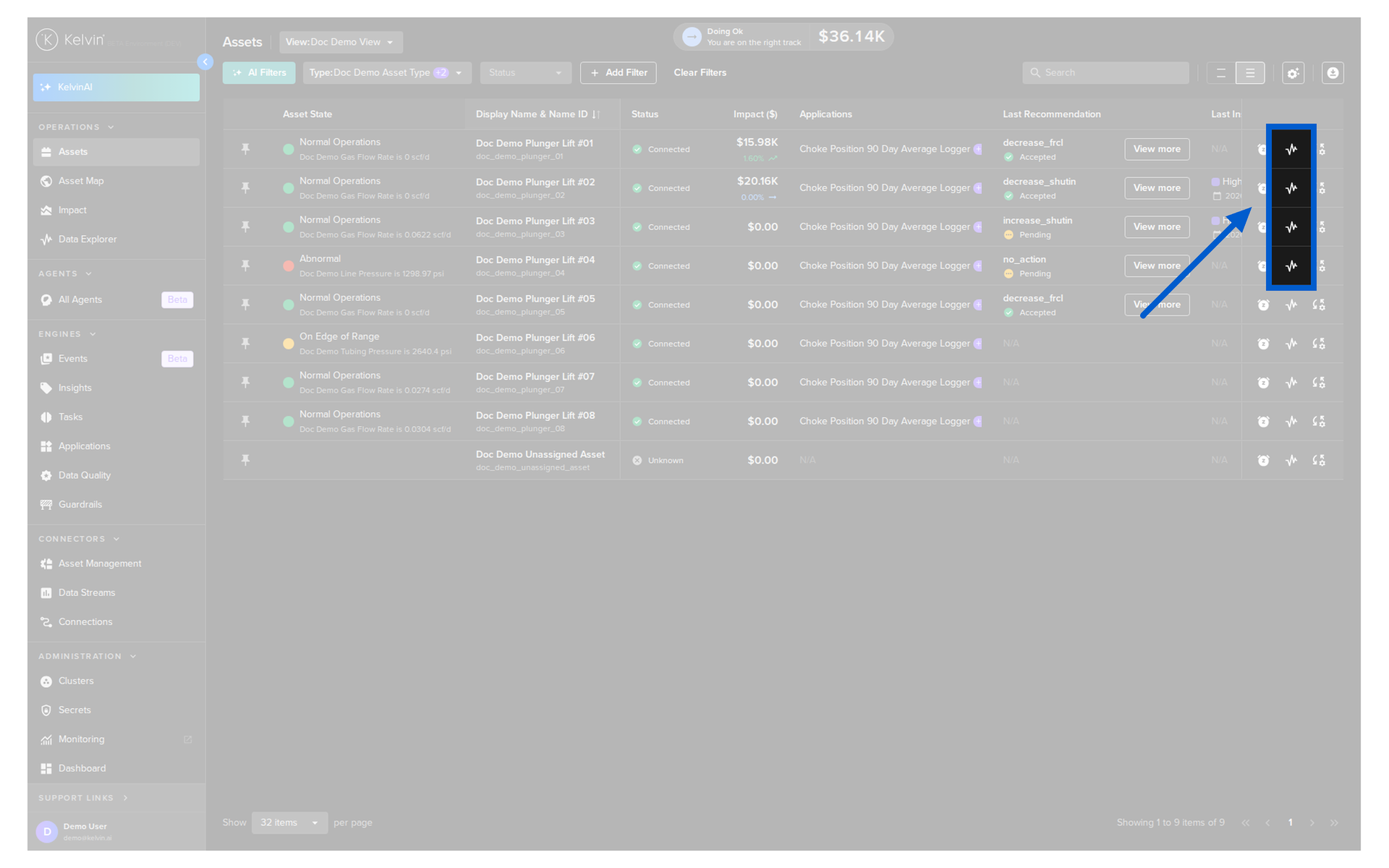
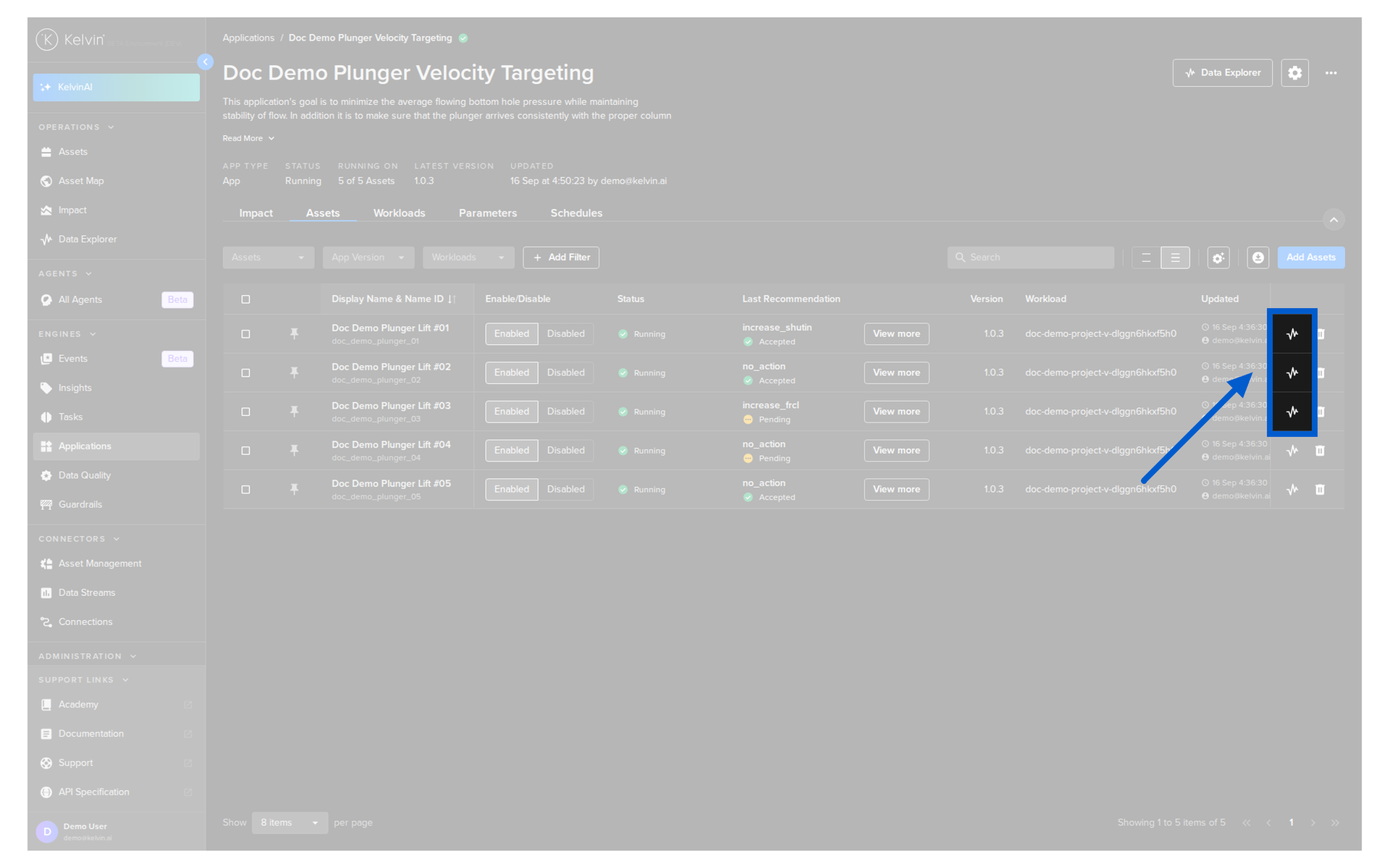
Click on the Data Explorer icon in the Asset row. This will automatically select that Asset.
From the Asset Details Page
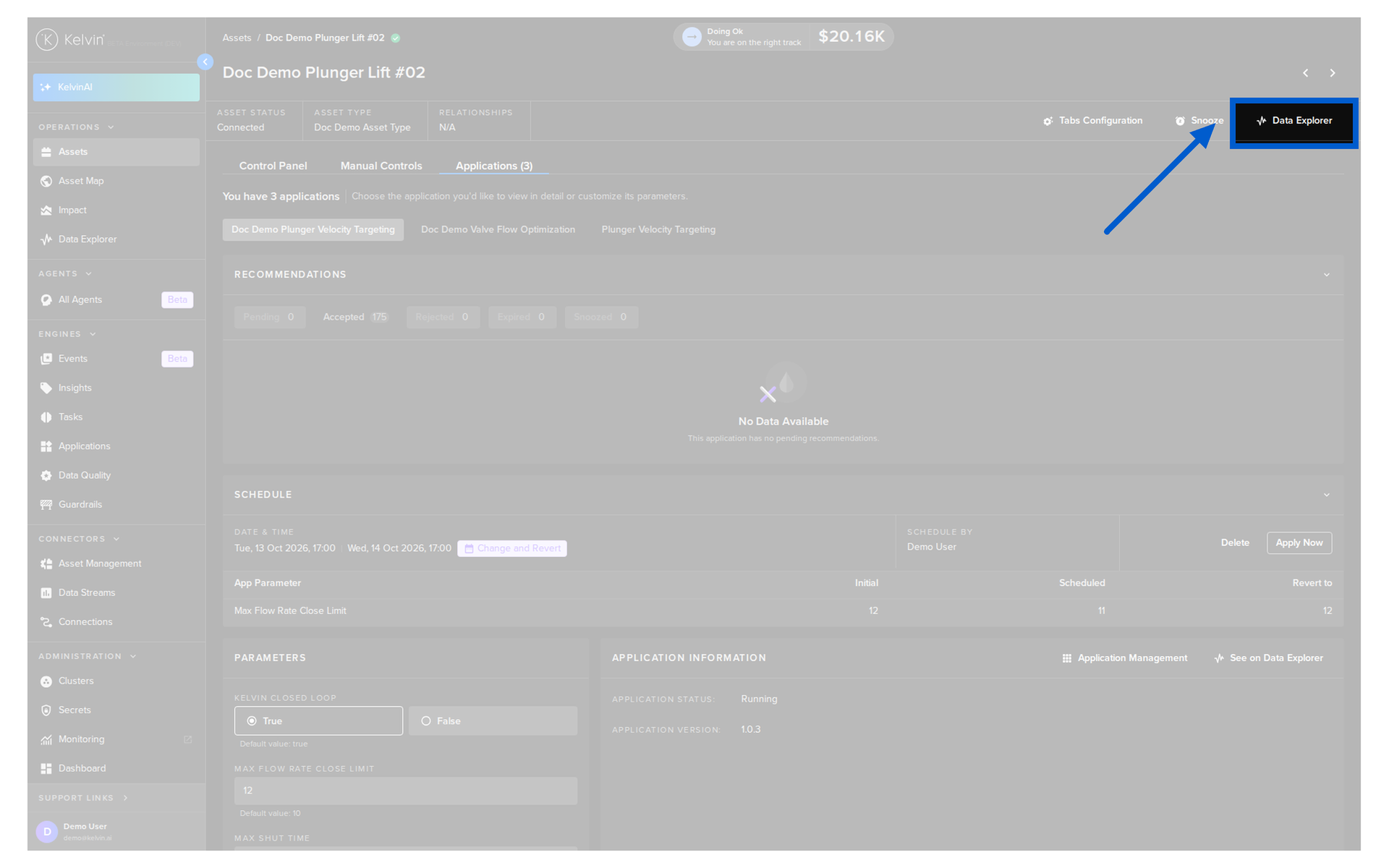
Click the Data Explorer button at the top of the page. This will automatically fill in the Asset name.
From the Applications Page
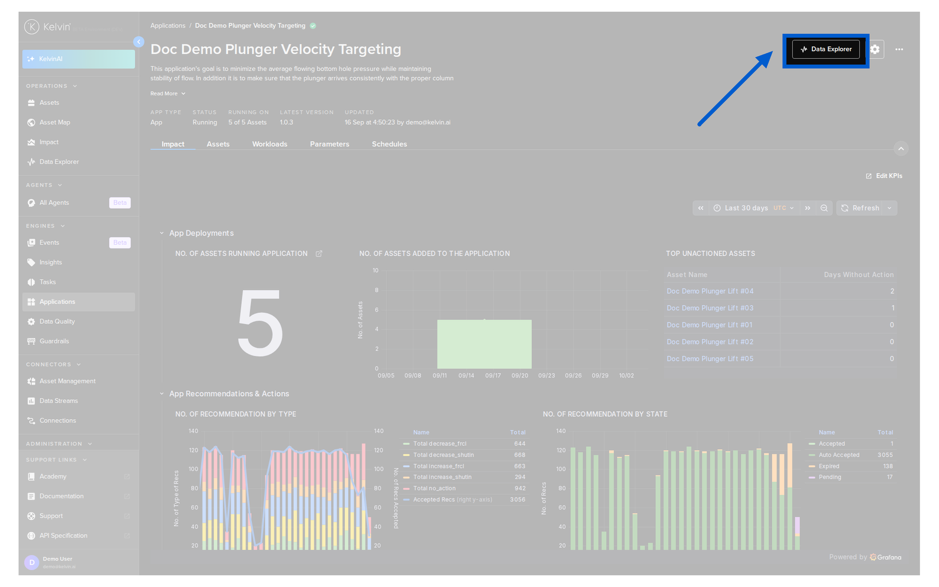
Click on the Data Explorer button on the Application summary page.
Or click on an Asset name in the Assets tab of the Application page.
Select Assets and Data Streams
Use the Data Source tab in the left panel to choose what is shown in the chart.
Select an Asset
Click an Asset in the list to show its data.
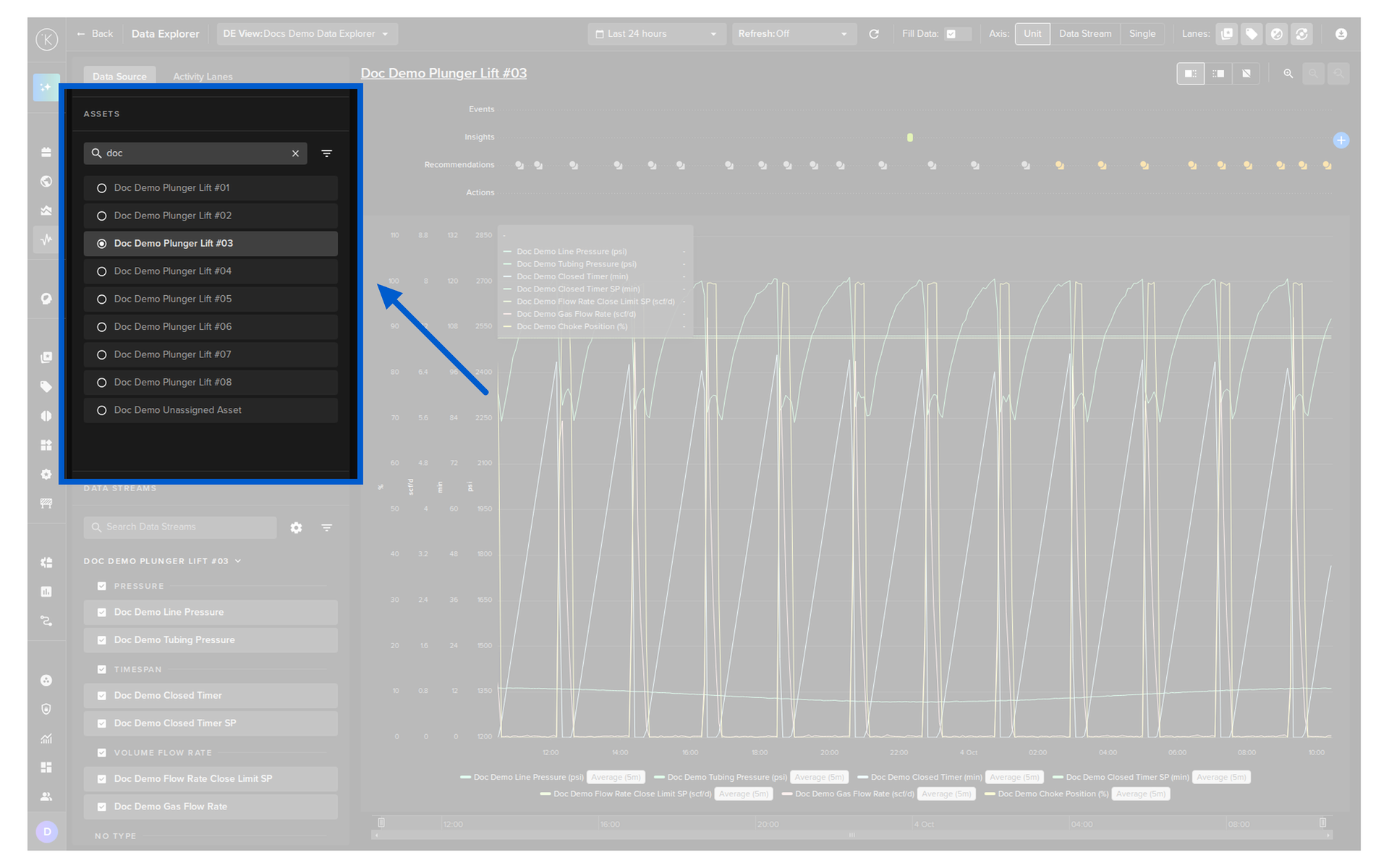
You can find an Asset by;
- Typing in the search box
- Clicking on the filter icon to filter the list
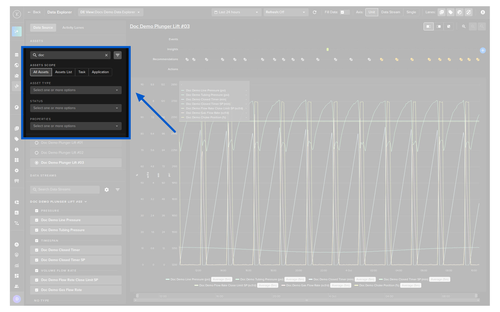
Select Data Streams
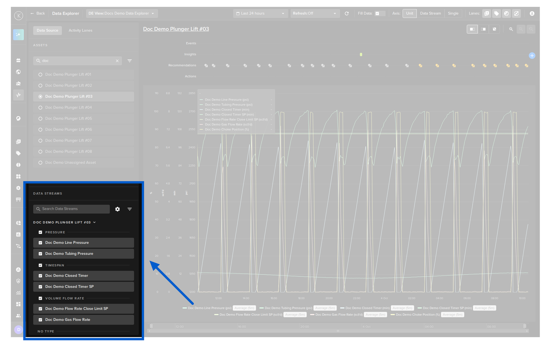
- Tick the checkbox of a Data Stream to show it in the chart
- Tick the checkbox of a type to select all the Data Streams of that type
- Type in the search box to find a Data Stream
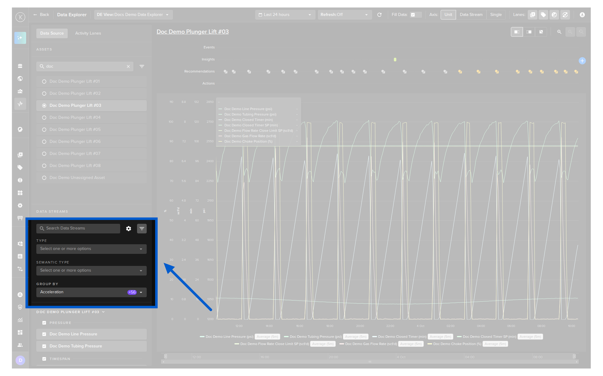
- Click on the filter icon to filter the list
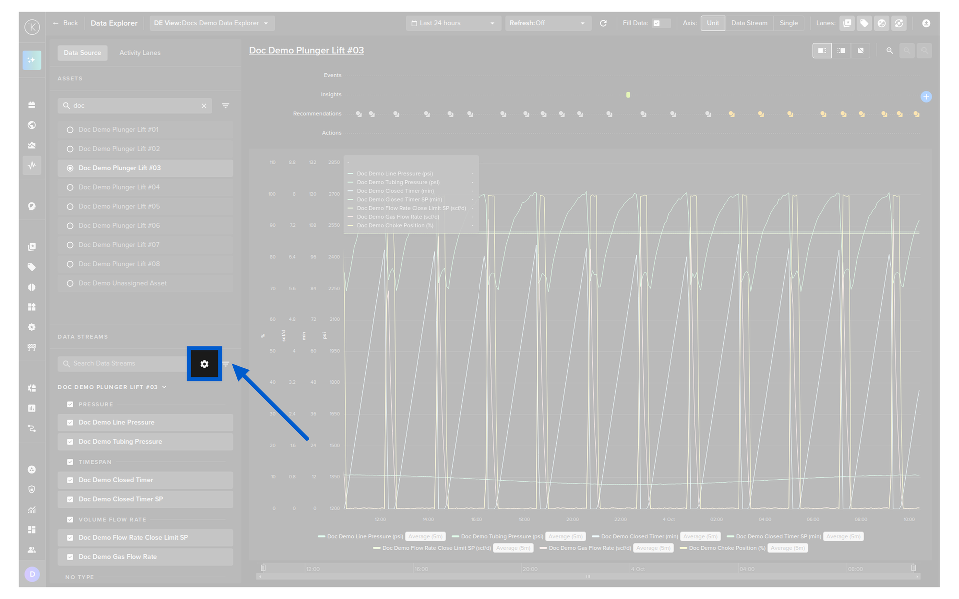
Configure Data Streams
Click on the cog icon in the Data Streams section to open the Data Streams Configurations popup.
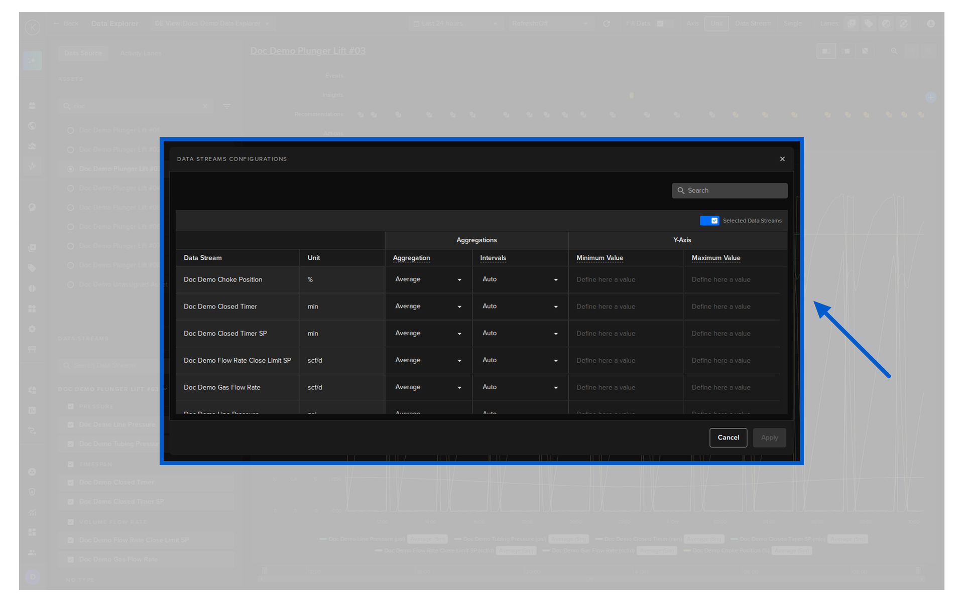
| Setting | Description |
|---|---|
| Aggregation | How the values are aggregated over a time interval. Select None to display the raw data. |
| Intervals | The time period over which the values are aggregated. |
| Minimum Value | Overrides the minimum value of the y-axis for this Data Stream. |
| Maximum Value | Overrides the maximum value of the y-axis for this Data Stream. |
Click on the Aggregation dropdown of a Data Stream to select the aggregation.
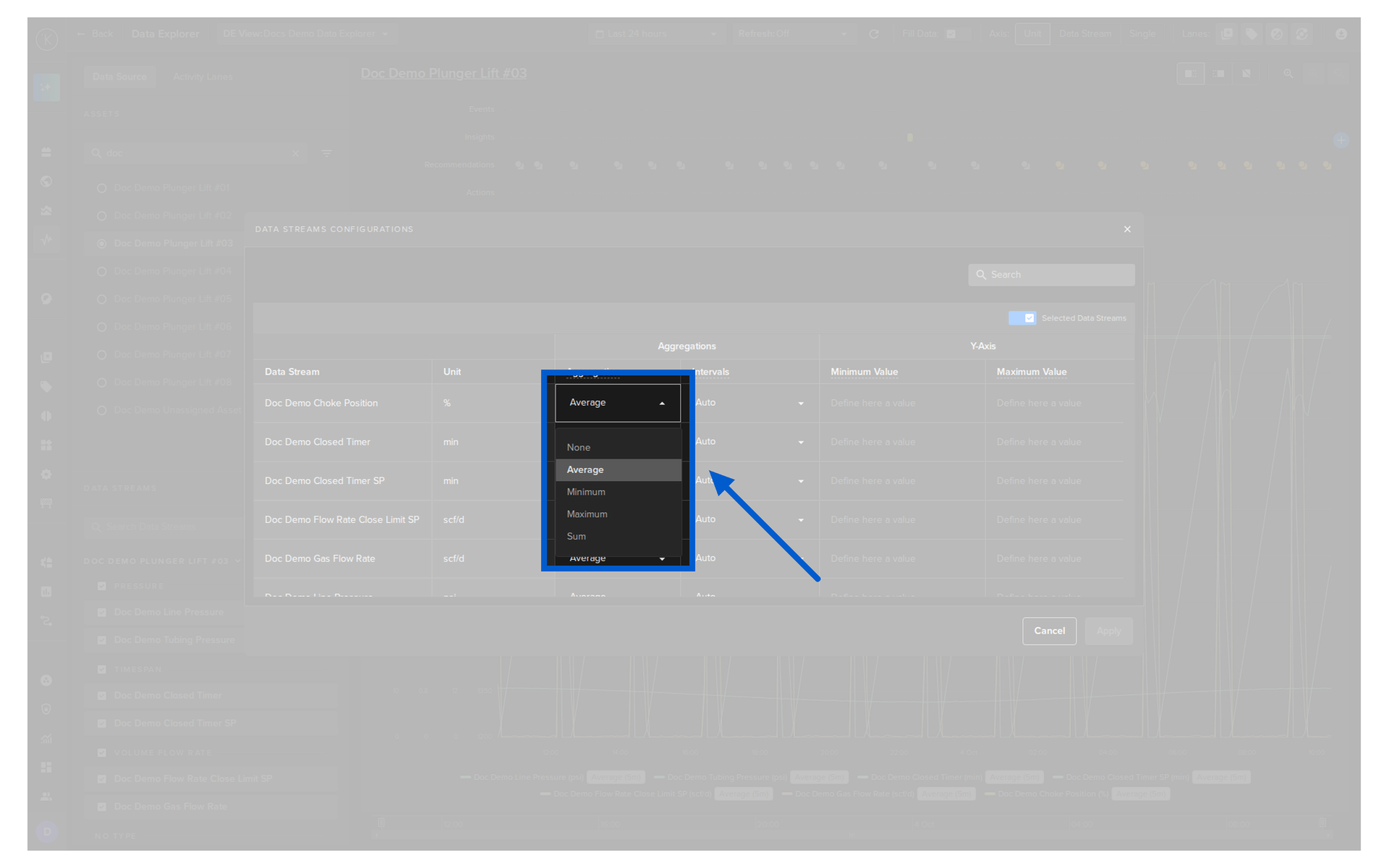
| Option | Description |
|---|---|
| None | Display raw data with no aggregation applied. |
| Average | Display the average value over the selected interval. |
| Minimum | Display the minimum value over the selected interval. |
| Maximum | Display the maximum value over the selected interval. |
| Sum | Display the sum of values over the selected interval. |
Click on the Intervals dropdown of a Data Stream to select the time period of the aggregation.
| Option | Description |
|---|---|
| 1 minute, 5 minutes, 30 minutes, 1 hour, 1 day, 1 week | Aggregate the values over this fixed time period. |
| Auto | The interval is adjusted dynamically according to the size of the chart. |
To set the limits of the y-axis, enter the Minimum Value and Maximum Value for the Data Stream.
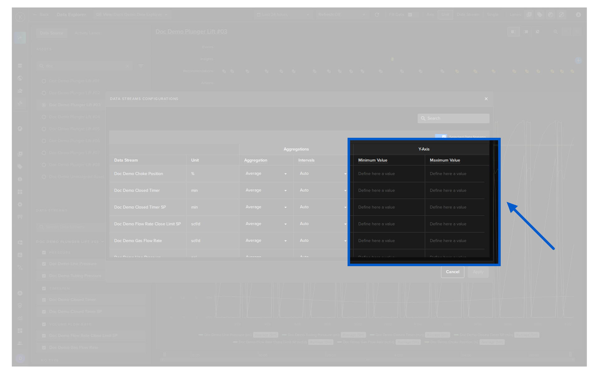
Click the Apply button to save your changes or the Cancel button to close the popup without changes.
Set the Time Range
Click on the calendar icon to open the time range selector.
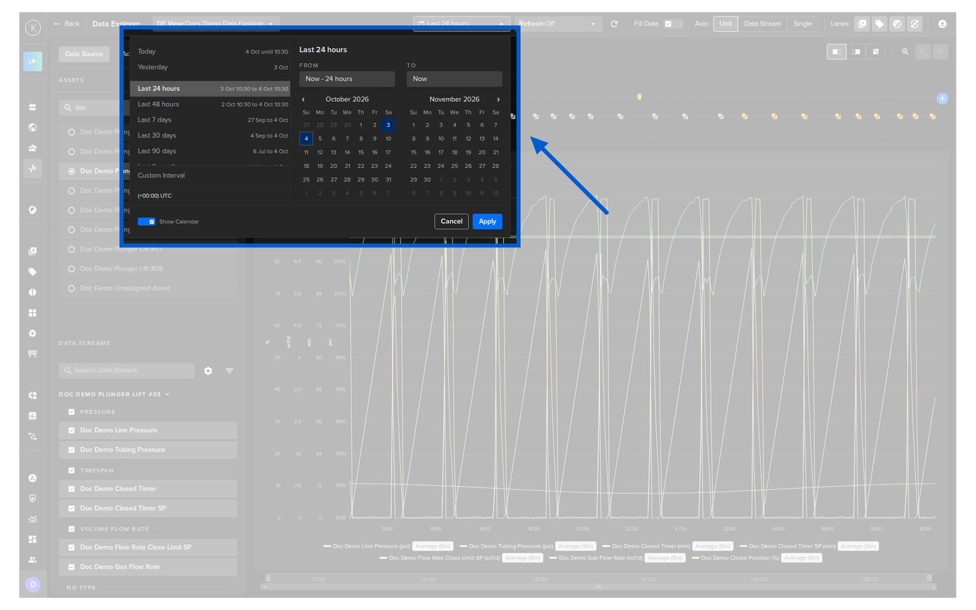
| Feature | Description |
|---|---|
| Quick Time Range | Quickly select preset ranges such as Today, Yesterday, Last 1 hour, Last 24 hours, Last 7 days, Last 90 days, All time and more. The actual date range is displayed next to each option. |
| Customize Interval | Select a custom time range relative to the current time. |
| Time Zone | Change the timezone of the graph to match the Asset's location. This is useful when reports reference local time and you want to view graphs at that time without manual conversion. |
| Show Calendar | Show both the Quick Time Range, Custom Interval and Time Zone options together with a calendar date picker. |
Use a Custom Interval
Turn on the Show Calendar switch to select a time range from a calendar picker. You can also set your local timezone here.
Monitor Data in Real Time
You can use Data Explorer for live monitoring by setting a refresh rate.
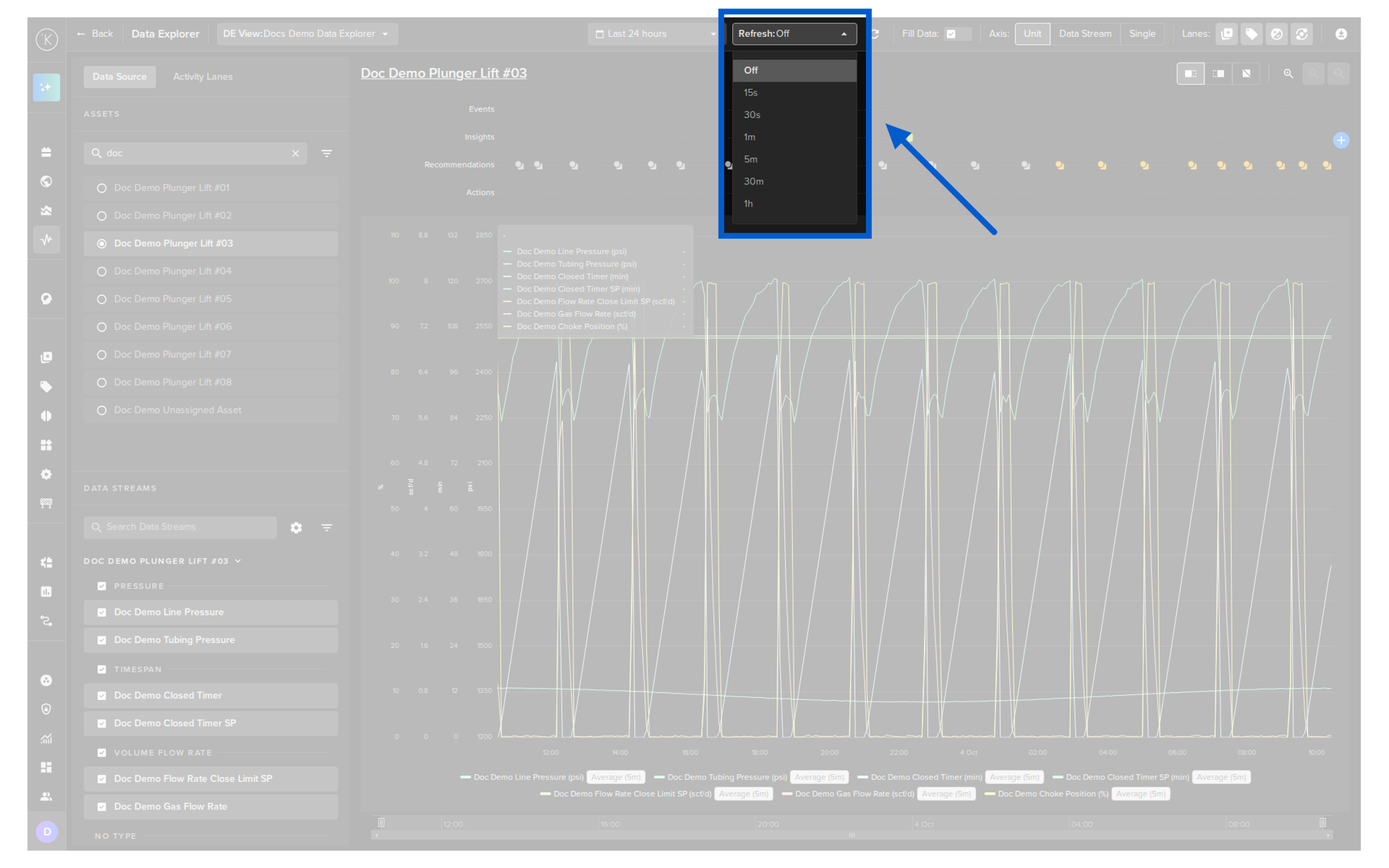
The refresh rate can be set from 5 seconds to 1 hour. To return to historical analysis mode, select Off in the Refresh dropdown.
Customize the Y-Axis
The Axis control in the header sets how the Y-axis is displayed.
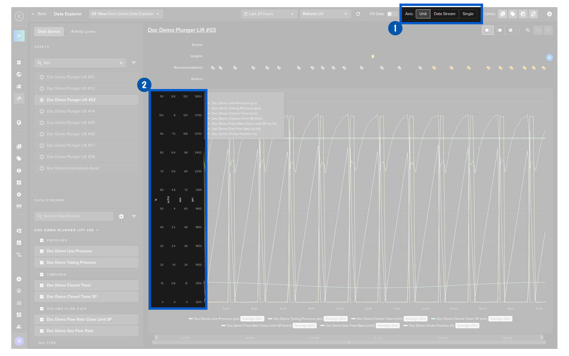
| Option | Description |
|---|---|
| Unit | Data Streams are grouped by unit. For example, two Data Streams with units m² share one Y-axis while a Data Stream with units g/kg gets a separate Y-axis. |
| Data Stream | Each Data Stream gets its own Y-axis. |
| Single | All Data Streams share one Y-axis, from the largest to the smallest value of all of them. |
Warning
With Single, Data Streams with very different values are difficult to see together.
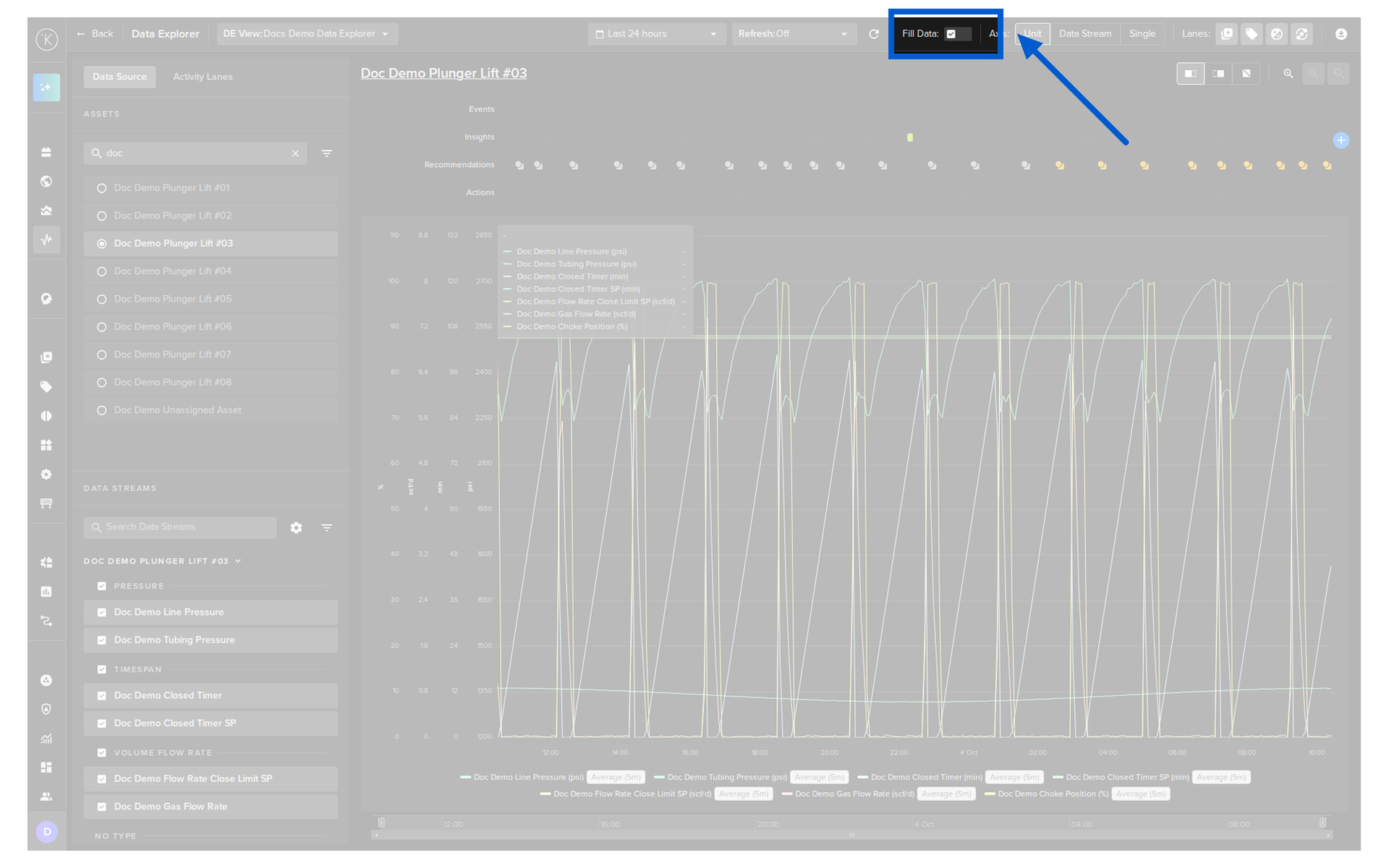
Fill Data
Fill Data is off by default.
To keep Data Explorer fast, the chart plots a subset of all the data in the time period shown. If you need more resolution, turn on Fill Data and ALL the data is plotted.
Warning
For large time ranges, Fill Data can significantly slow the refresh of Data Explorer.
Zoom Into Data
Zoom the Y-Axis
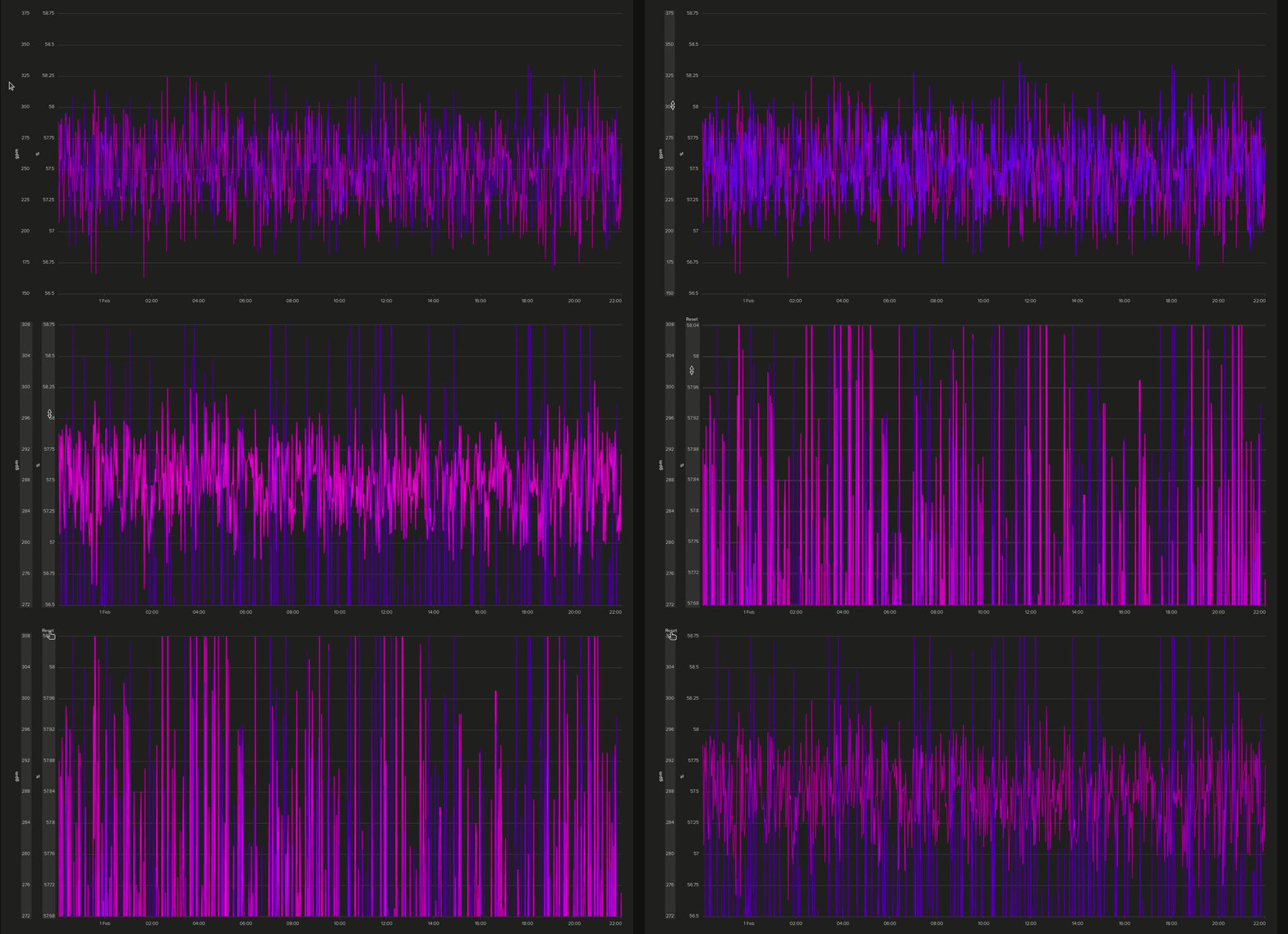
You can individually zoom into each variable's Y-axis separately. This is useful for viewing a section of data in high detail.
To zoom all axes at the same time, click the Single option in the Axis control at the top.
Zoom the X-Axis (Time)
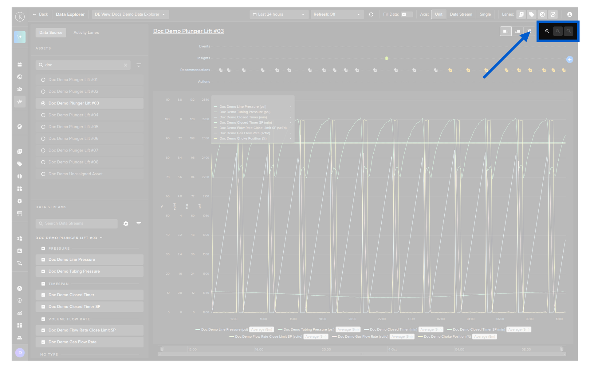
You can zoom the time span on the X-axis. When zoomed in, the Zoom Out / Zoom Reset controls above the chart become active.
Show or Hide Activity Lanes
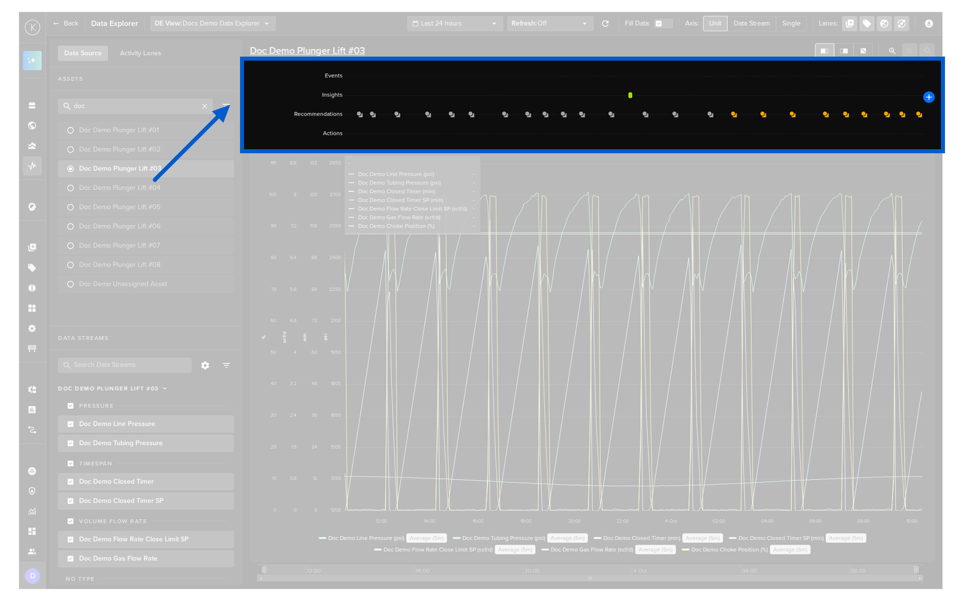
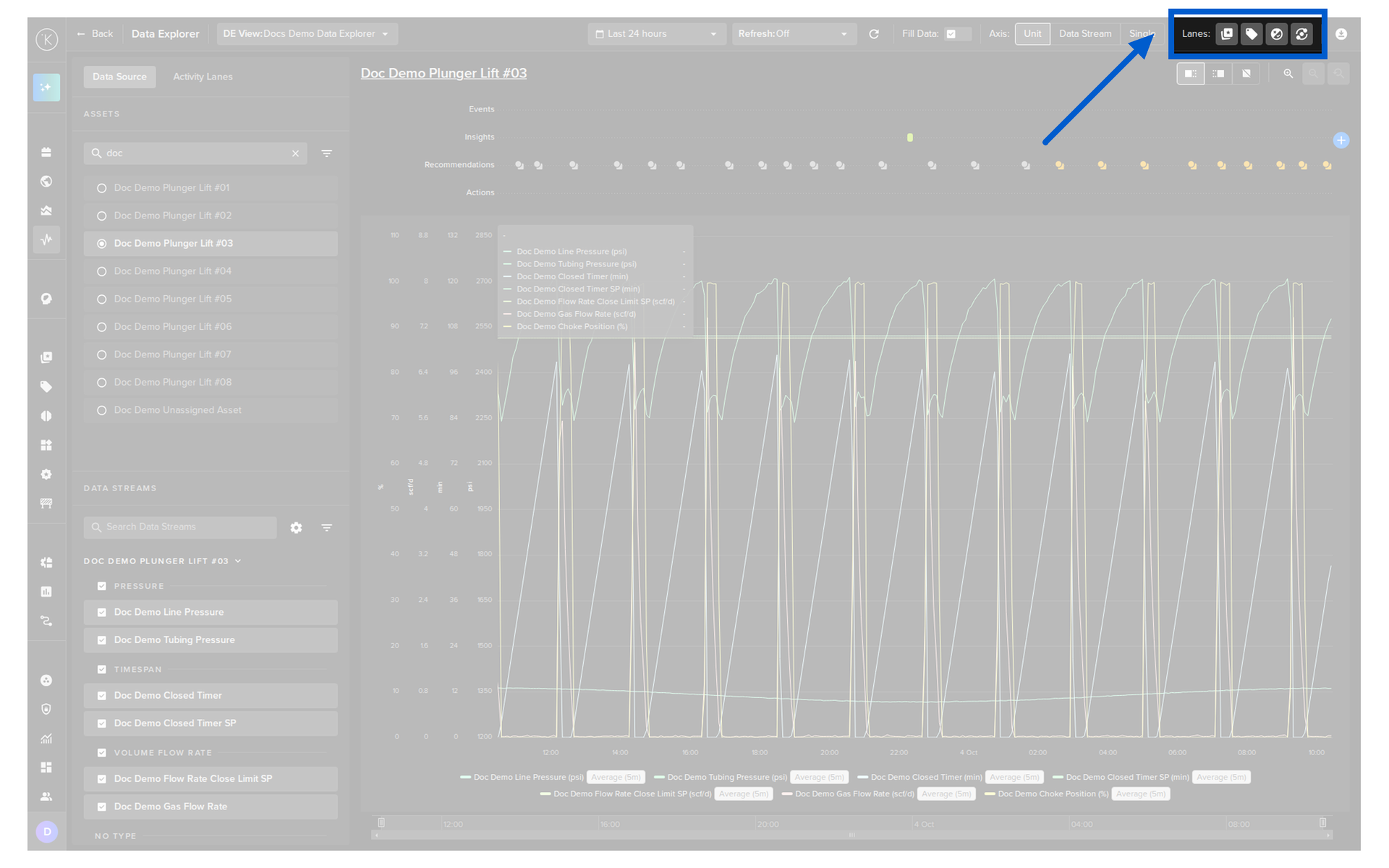
You can toggle each lane independently with its icon in the Lanes control in the top right corner. You can also turn lanes on or off in the Activity Lanes tab of the left panel.
| Lane | Description |
|---|---|
| Events | Show or hide the Events lane. |
| Insights | Show or hide the Insights lane. |
| Recommendations | Show or hide the Recommendations lane. |
| Actions | Show or hide the Actions lane. |
Legend
Header Controls Reference
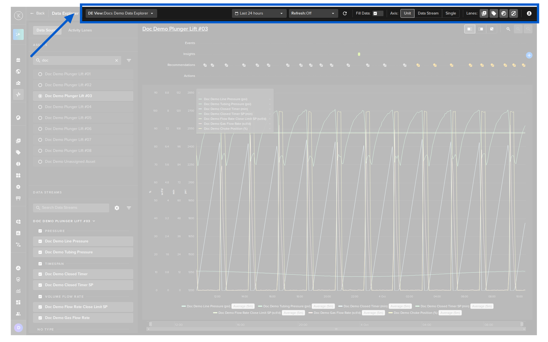
| Control | Options | Description |
|---|---|---|
| DE View | Select | Switch between your saved views. See Custom Views. |
| Time Range | Multiple | See Set the Time Range. |
| Refresh | Multiple | See Monitor Data in Real Time. |
| Fill Data | On / Off | See Fill Data. |
| Axis | Unit / Data Stream / Single | See Customize the Y-Axis. |
| Lanes | Events / Insights / Recommendations / Actions | See Show or Hide Activity Lanes. |
| Download | Select | Export the data. See Download Data. |