Data Explorer
On this page you will learn about Data Explorer and the advanced features you have available to be able to analyze events in detail and make decisions on your Asset's performance.
You can watch this short demo video for a quick tour of the page, or read the full overview below.
What is Data Explorer ?
Data Explorer is a time series graphical chart that melds many of the Kelvin Platform features and items into a seamless experience.
It is designed to allow you to analyze situations and to gather, compare and analyze a range of metrics recorded in the Kelvin to be able to quickly come to conclusions and take the necessary decisions.
It also shows the Events, Insights, Recommendations and Actions on the same time line as your data, so you can see what happened and what effect it had.
Automatic Data Aggregation
Normally if you select Raw data, all the data will be shown in the Data Explorer.
To maintain system performance and Data Explorer readability, the Kelvin UI automatically aggregates data when large datasets or long time ranges are selected.
The automated aggregation feature is defined per client platform depending on how data is collected.
Click here to read more about raw and aggregated data.
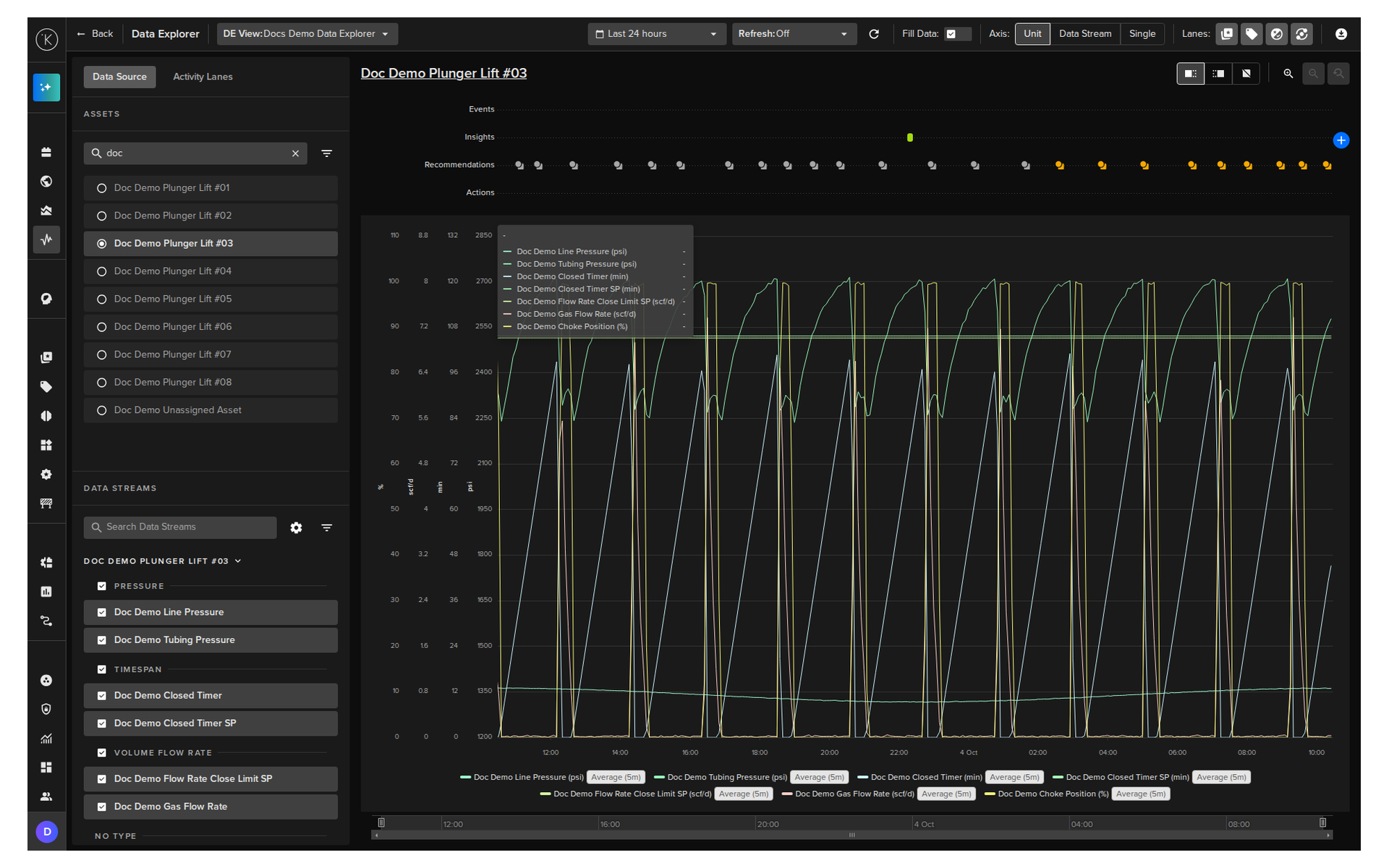
Layout
- The header at the top has the controls for the view, time range, refresh, fill data, axis, lanes and download
- The left panel has the Data Source tab to select Assets and Data Streams, and the Activity Lanes tab to browse the current and past activity
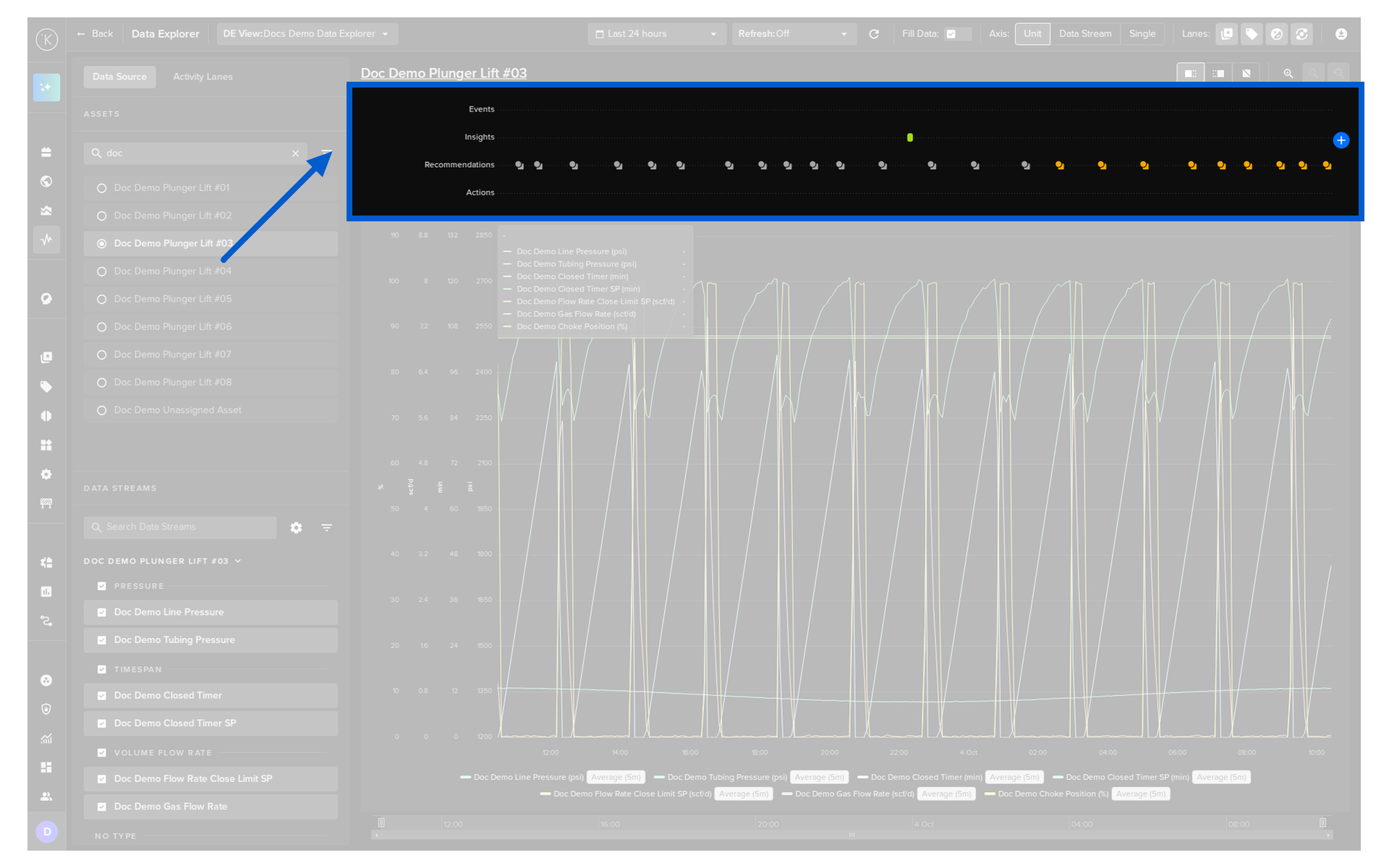
- The activity lanes above the chart show the Events, Insights, Recommendations and Actions on the same time line as the data
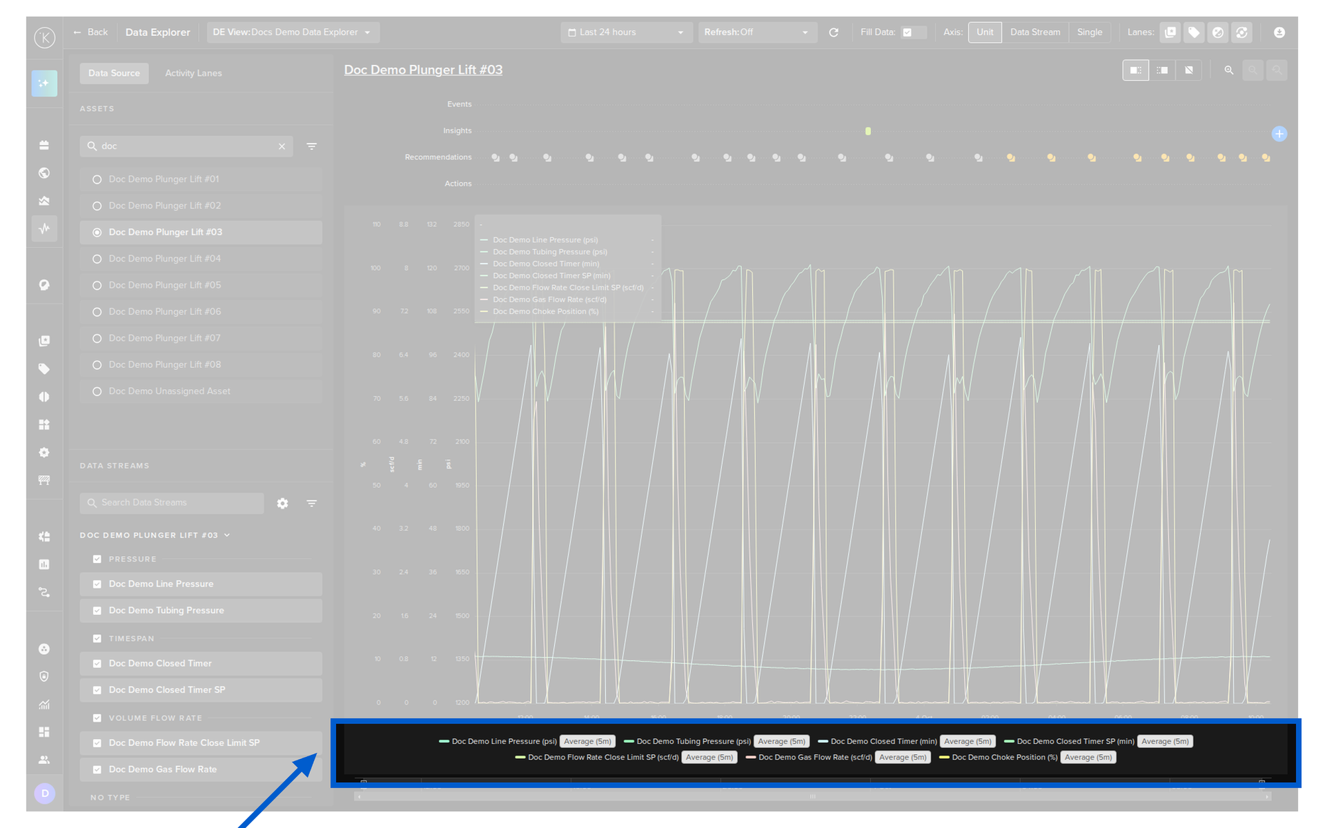
- The chart shows the Data Stream values over time, with the legend at the bottom
Basic Features
Data Explorer has all the usual features found in any standard time series analysis graph. These include;
- Time-based data line chart
- Multiple line charts
- Data selection
- Time selection
- Dynamic zoom on x and y axis
- Legend
- Mouseover data popup
- Save and switch between views
- Activity lanes for Events, Insights, Recommendations and Actions
- Download the data to a CSV file
Kelvin Features
But Data Explorer is much more than just another time series line graph.
It is tightly integrated with Kelvin and the industrial requirements for being able to see many parameters at the same time. This allows you to analyze the full picture of the industrial controls and come to quick decisions.
Set Up Data Explorer
Choose what Data Explorer shows and how it is set up.
You can watch this short demo video on choosing the Asset and Data Streams and configuring them, or read the details below.
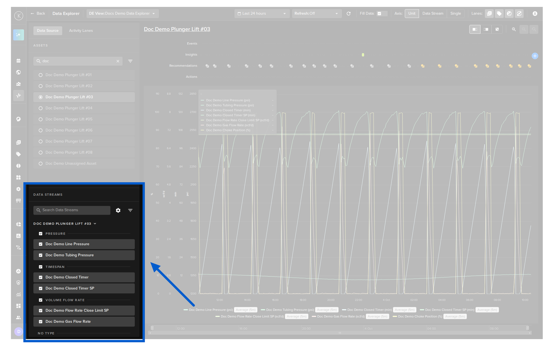
To easily bring up your asset data, the graphs are linked to an Asset and any of its related Data Streams.
Assets and Data Streams are together in the Data Source tab. Each has a search box and a filter icon.
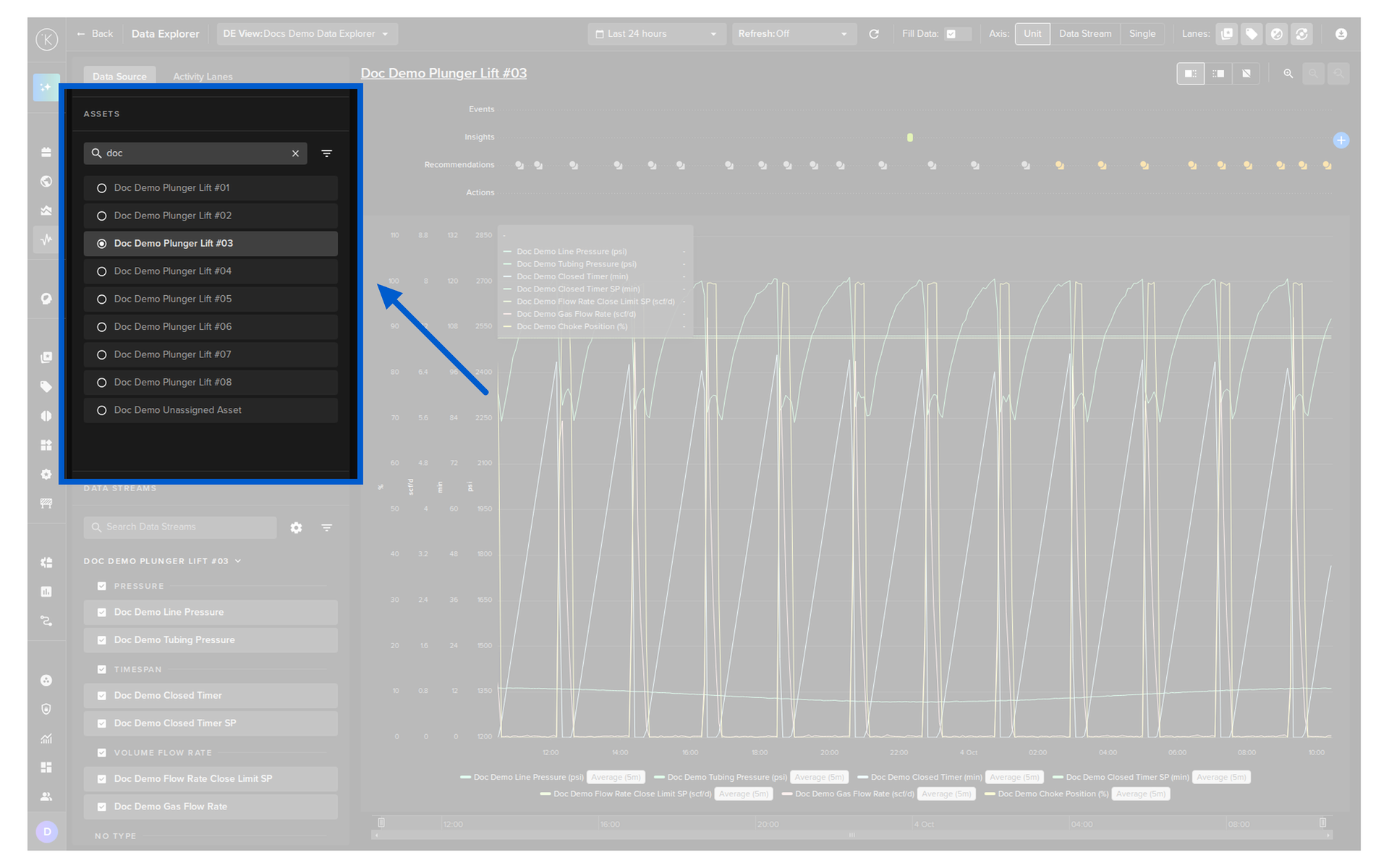
This makes it easy to quickly find the data to display rather than having to remember hundreds or thousands of metric names and trying to find them from a long list of options.
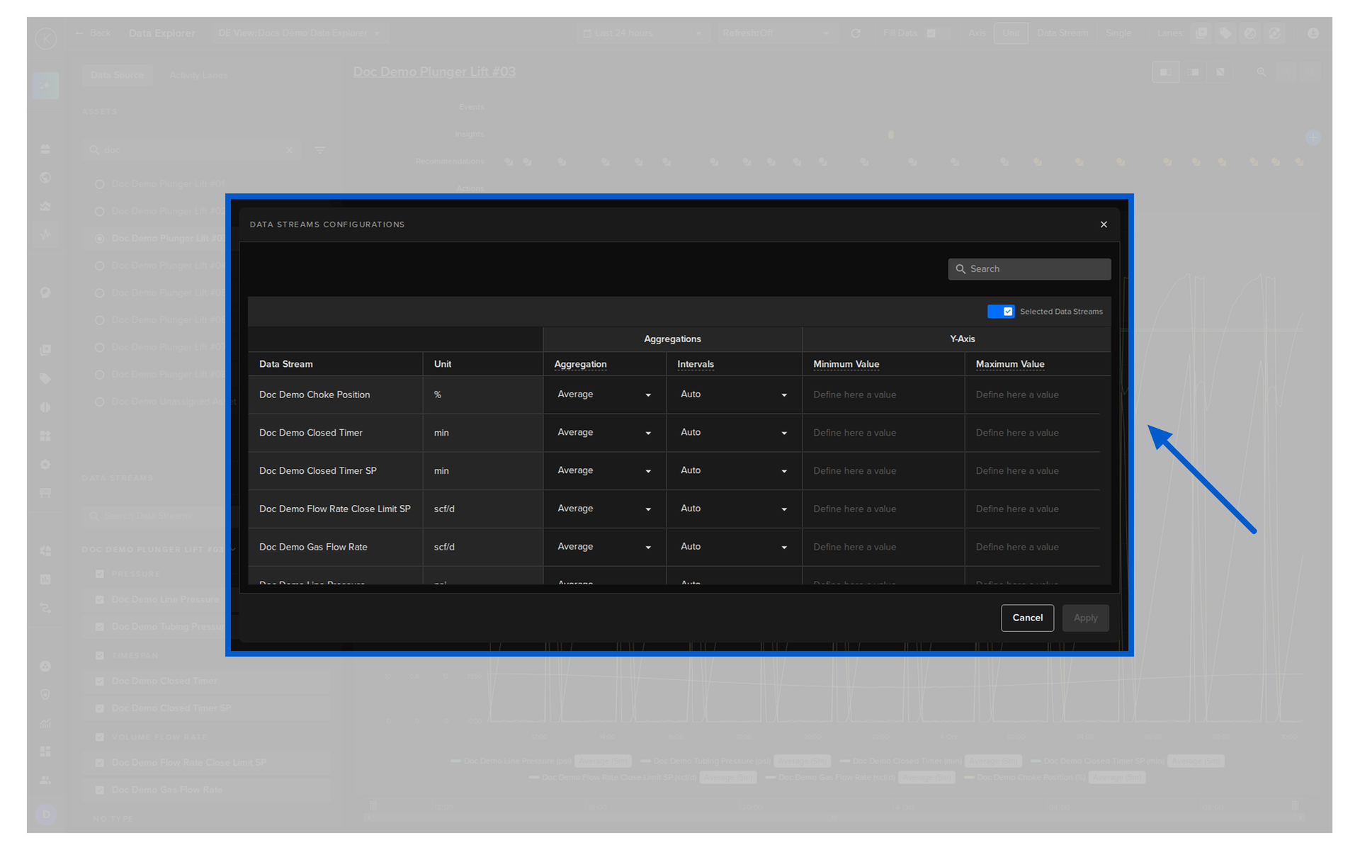
Click on the cog icon in the Data Streams section to open the Data Streams Configurations popup.
For each Data Stream selected you can edit;
- The aggregation of the values over a defined period
- The minimum and maximum limits of the y-axis
Note
None means that the raw data will be used for the chart.
Check out the chapter below Warning on Raw Data View for more information about how raw data is displayed and when it is automatically aggregated.
Warning
The system will make every effort to follow the aggregations selected.
Only under extreme conditions, such as selecting minute intervals over a two-day range, the system may automatically adjust the interval to prevent large data updates that could freeze the browser.
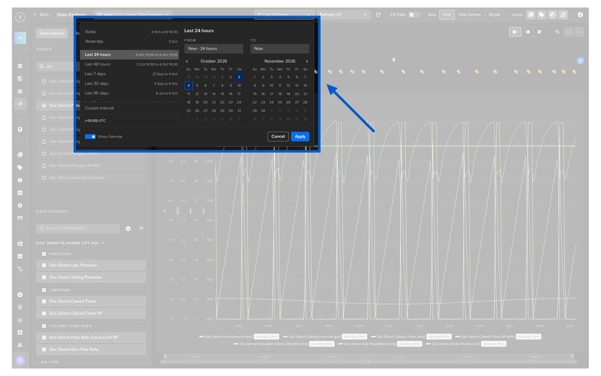
You can watch this short demo video on the time range, the time zone and the real time refresh rate, or read the details below.
Many solutions will only show you the data in your own timezone or the time of recording.
Kelvin gives you the option to select what timezone you want to view the data. The data will be adjusted accordingly as it is recorded with the timezone data too.
This makes it very useful if your assets or team are in a different timezone and you want to sync your information, communications or reports with multiple timezones.
You can select your own timezone just below the Custom Interval option.
Save a Data Explorer setup as a view and switch between your views any time from the DE View dropdown in the header.
- Save different views for different analysis
- Share a view with all users when you save it
- Manage your views in one place
- Data Explorer remembers your last selected view, and keeps unsaved changes as a draft, like the Assets list
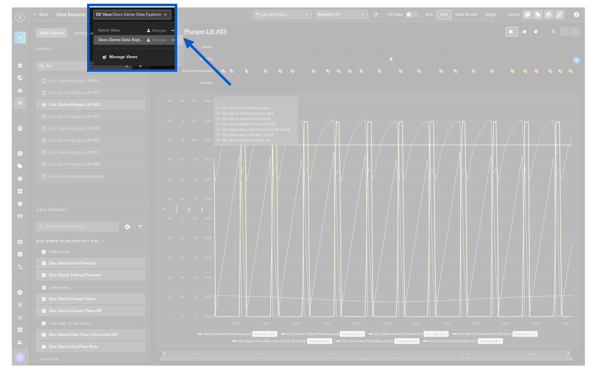
Read more in Custom Views.
Activities
See what happened on your Asset and what effect it had.
You can watch this short demo video on the Activity Lanes, or read the details below.
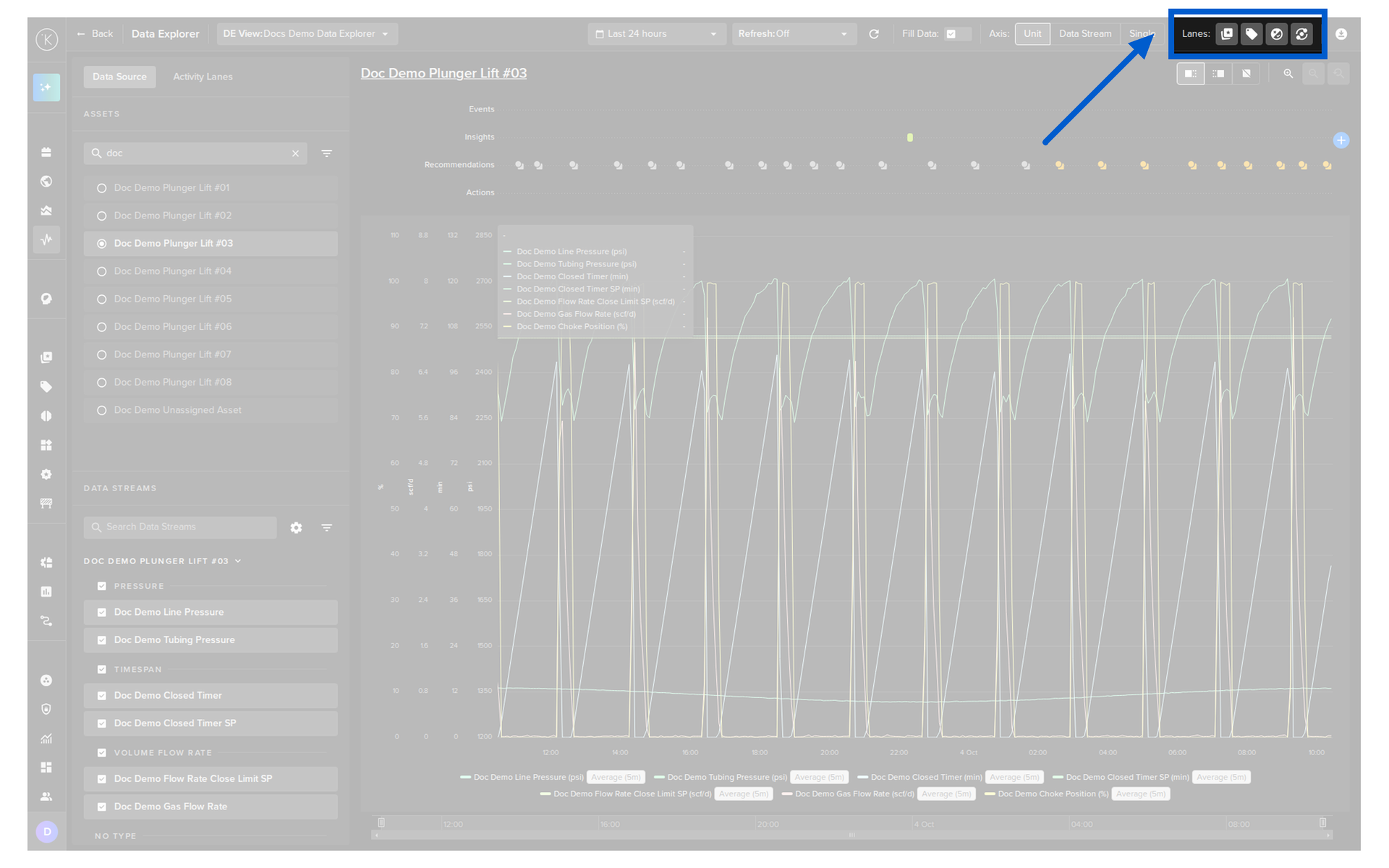
There are four lanes that can be shown above the chart. Each lane has an icon in the top right corner of Data Explorer.
| Lane | Description |
|---|---|
| Events | The events found by the AI tools. |
| Insights | The Insights marked on the time line, for a point in time or a period of time. |
| Recommendations | The Recommendations created by the Applications. |
| Actions | The actions performed on the Asset, such as Control Changes. |
Note
Click a lane icon to show or hide that lane.
Hiding lanes gives more screen space for your charts.
The Activity Lanes tab in the left panel shows the current and past activity of a lane as a list of cards. Select one of the four lanes to see its list.
From the tab you can also;
- Turn each lane on or off in the chart
- Search the list
- Filter the list
- Change the row size
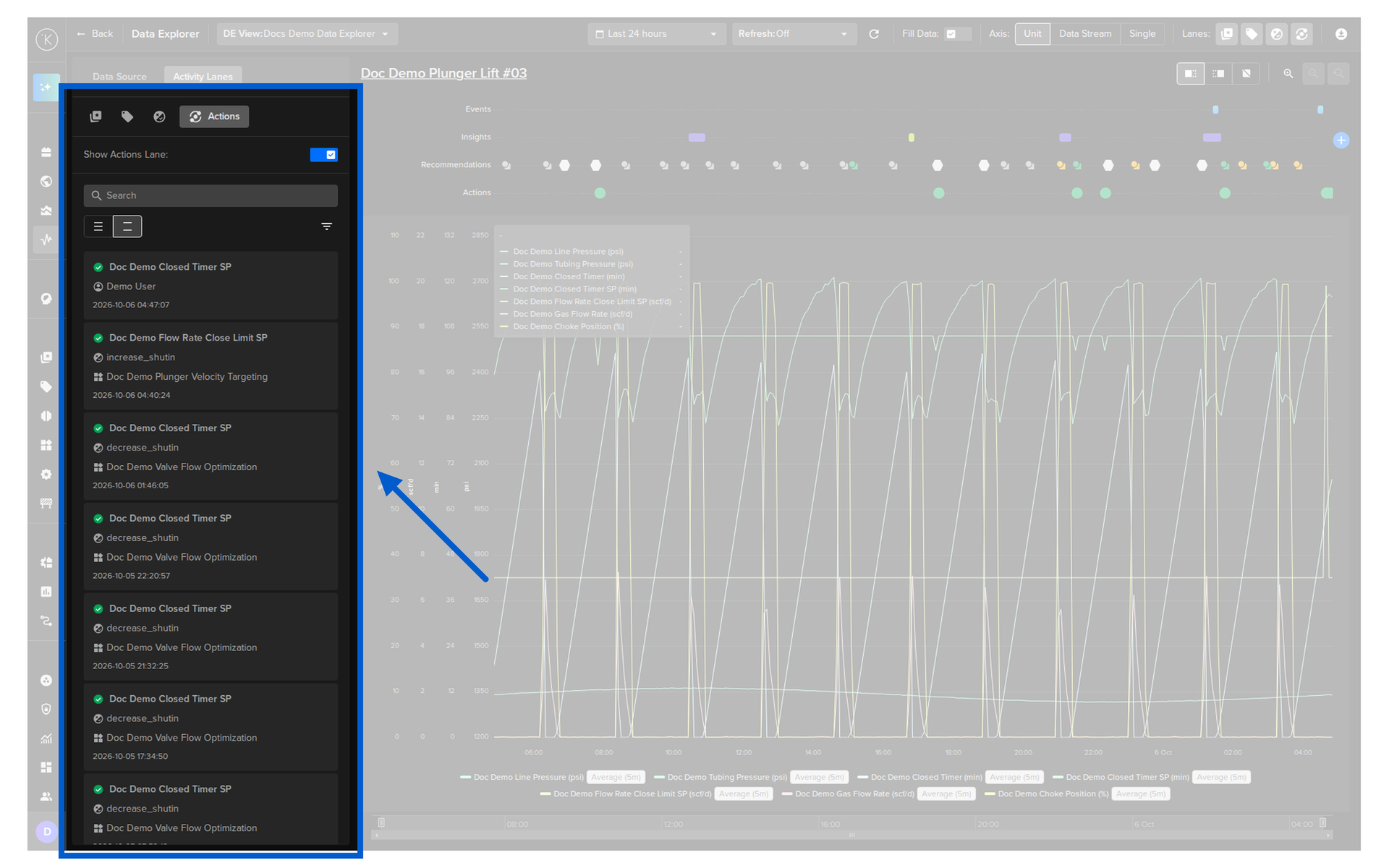
Click on a card in the Activity Lanes tab to see its details.
The details open in a new column to the right of the left panel. The chart automatically shrinks to fit the space that is left.
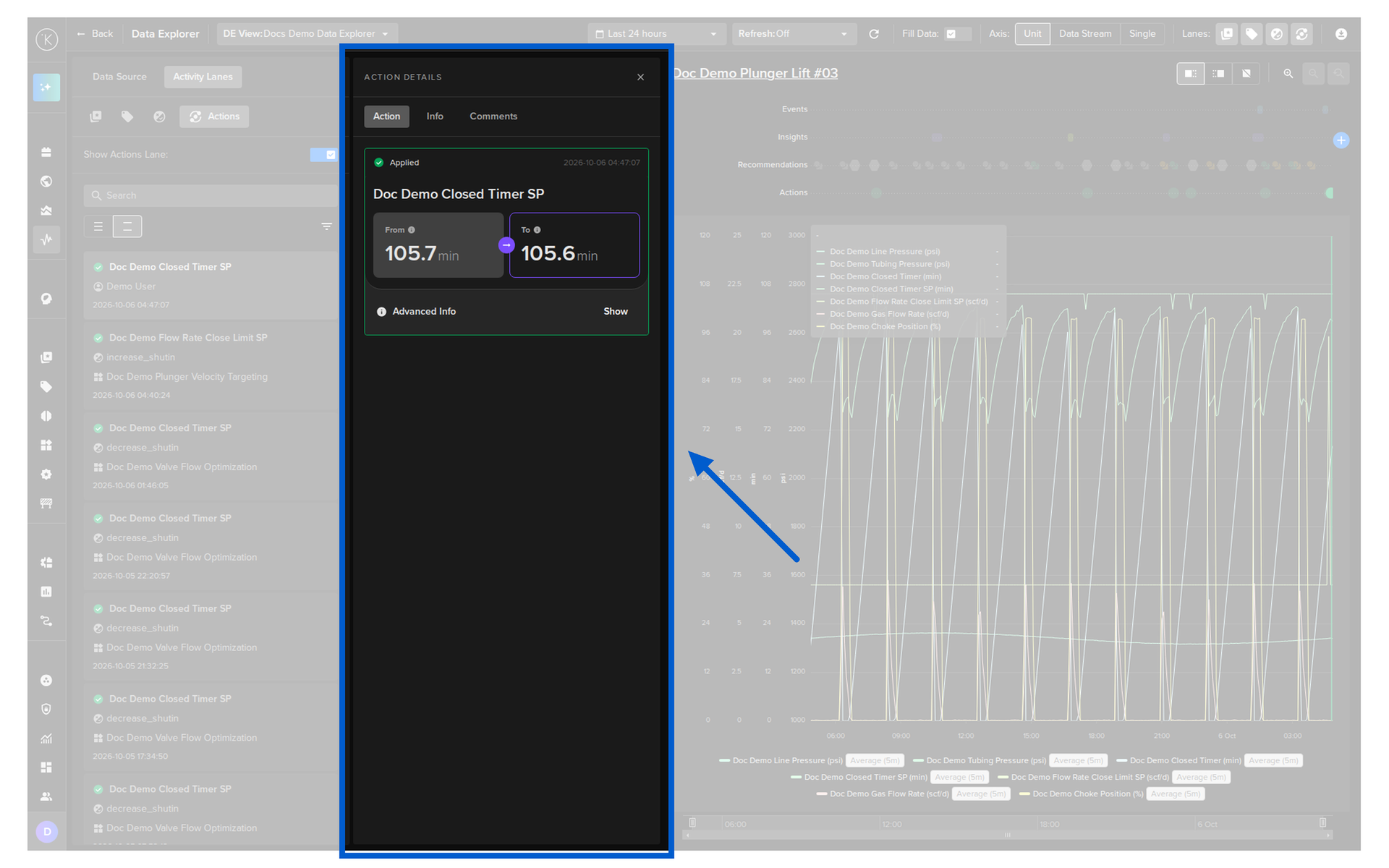
You can read more about each type of activity in;
Download Data
Click on the download icon in the top right corner to export the data of the selected Asset over the time range you are viewing.
The export options are;
- Export Data
- Export Events
- Export Insights
- Export Recommendations
- Export Actions
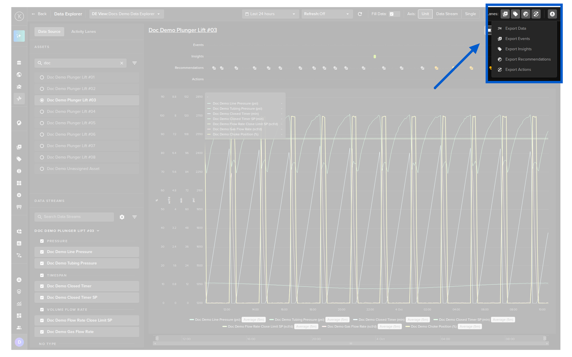
Read more in Download Data.
Timeseries Features
Fine tune how the data is shown in the chart.
You can watch this short demo video on the Axis, Fill Data, legend and zoom controls, or read the details below.
You can use the Data Explorer for both real time monitoring or historical data analysis.
In real time monitoring mode, you can set the refresh rate of the graphs from 5 seconds to 1 hour.
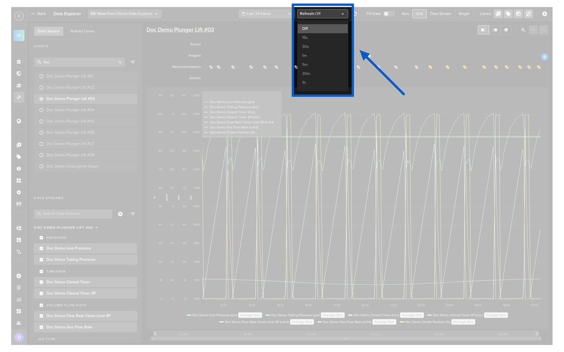
To revert to historical data analysis you can turn off real time monitoring by selecting Off.
When dealing with different metrics, in many cases you will find the units of each metric will be very different.
For example you may have metrics for a AC Motor, where you record temperature (normally 60 - 200 degrees Fahrenheit), rpm (normally 1,000's) and flow rate (say 0 - 10).
With Data Explorer, you can have separate y-axis to have good visibility on each, rather than having one y-axis and the small numbers like flow rate a very small line at the bottom only.
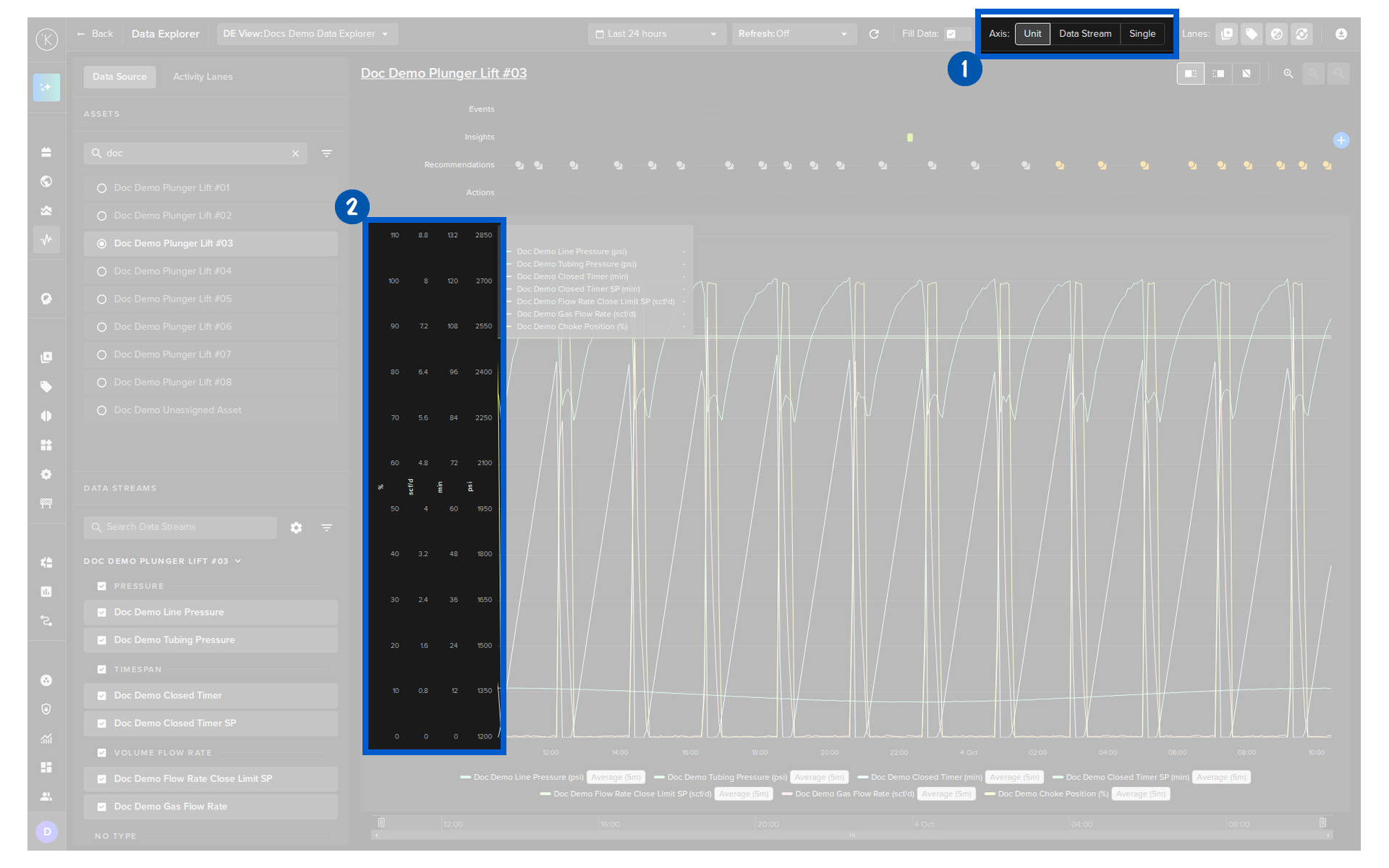
The Axis control at the top of Data Explorer sets how the y-axis is shown.
| Option | Description |
|---|---|
| Unit | All Data Streams with the same unit share one y-axis scale. Each different unit gets its own y-axis scale. |
| Data Stream | Each Data Stream gets its own y-axis scale. |
| Single | All Data Streams share one y-axis scale, from the largest to the smallest value of all of them. |
Warning
With Single, Data Streams with very different values are difficult to see together.
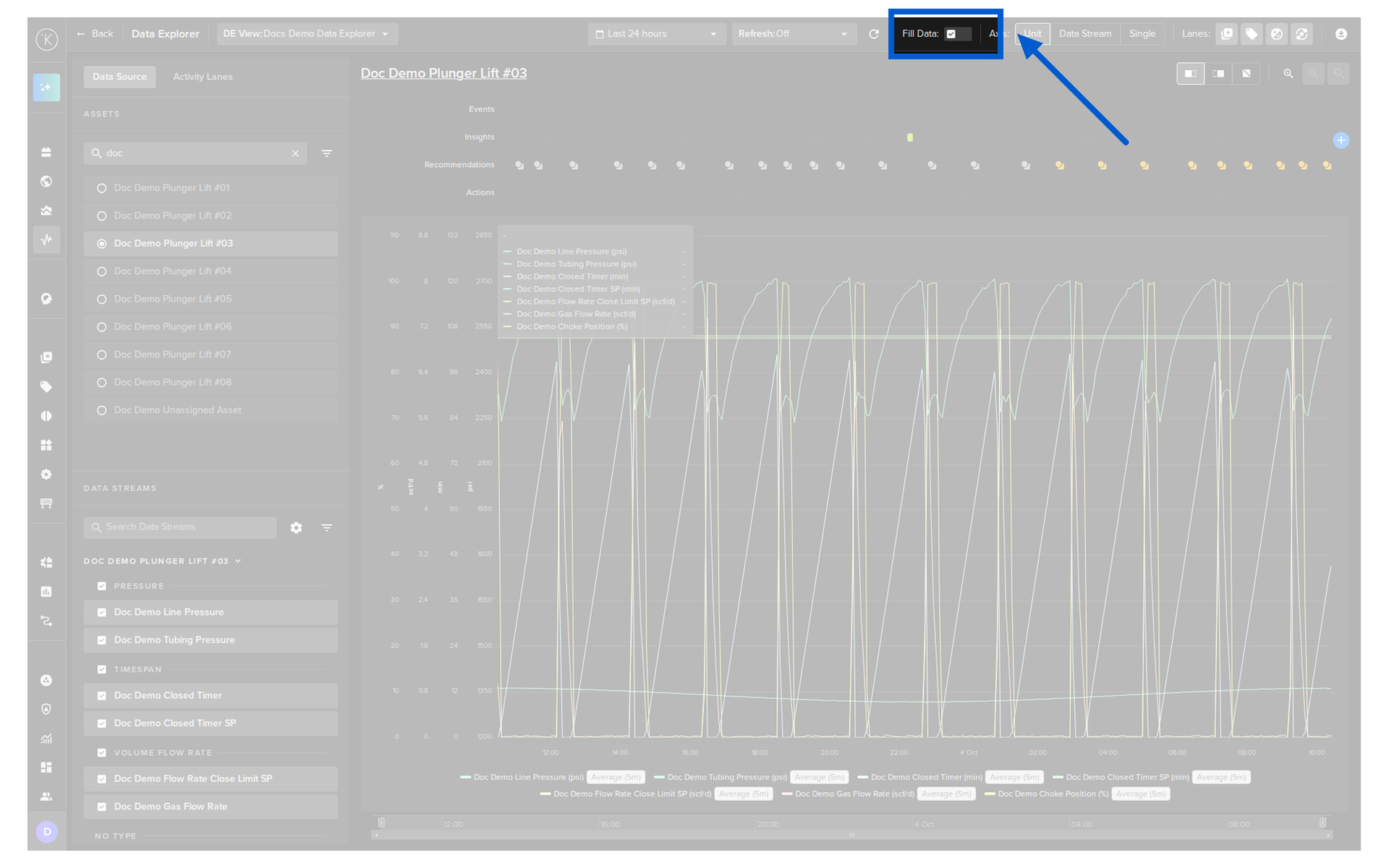
Fill Data is off by default.
To keep Data Explorer fast, the chart plots a subset of all the data in the time period shown.
If you need more resolution, turn on Fill Data and ALL the data is plotted.
Warning
For large time ranges, Fill Data can significantly slow the refresh of Data Explorer.
Warning on Raw Data View
Automatic Data Aggregation
To maintain system performance and Data Explorer readability, the Kelvin UI automatically aggregates data when large datasets or long time ranges are selected.
How Aggregation is Triggered: * Time Range: Aggregation is strictly enforced for any time range exceeding 7 days, overriding manual "raw data" selections. * Screen Density: The UI calculates the maximum data points displayable on your screen and selects an optimal interval based on available pixels.
Default Settings: * The system automatically uses Average as the aggregation method. * The most appropriate predefined interval is selected automatically to ensure the chart remains responsive.
This ensures the chart never tries to render too many points, which would cause performance issues and make the chart unreadable.
When you select your Data Streams, click on the cog icon in the Data Streams section to open the Data Streams Configurations popup.
Select None in the Aggregation dropdown of the Data Stream. This will show you the raw data.