240: Exploring the Kelvin UI for Operations Engineers
This course is for Operations Engineers who are new to the Kelvin UI and want a clear picture of what tools are available to them.
By the end, you will know every section of the Operations area, understand what you can do in each one, and be ready to explore the full documentation for any area you need to go deeper on.
Video Tutorial
You can choose to watch the video walkthrough of this tutorial, or continue below to follow the step-by-step written guide.
Where this course fits
This is the introductory course for the Operations Engineer path. It sits before the hands-on workflow courses.
- This course: What the Operations area contains and what each section does
- 241: Adding Assets to Applications: Getting assets into SmartApps and ready to run
- 242: Asset Table View: Customising your asset table and saved views
- 243: Review and Approve Changes: Understanding and acting on recommendations
Note
This course does not walk through every step of every feature. The goal is awareness. Once you know what exists, the detailed how-to guides in the documentation will make much more sense.
The Kelvin UI at a Glance
You can log into the Kelvin UI through any modern browser using a username and password, or single sign-on (SSO) if your company has it configured.
Browser Support
The Kelvin UI is fully tested on the latest version of Google Chrome. For the best experience, always use the latest Chrome version.
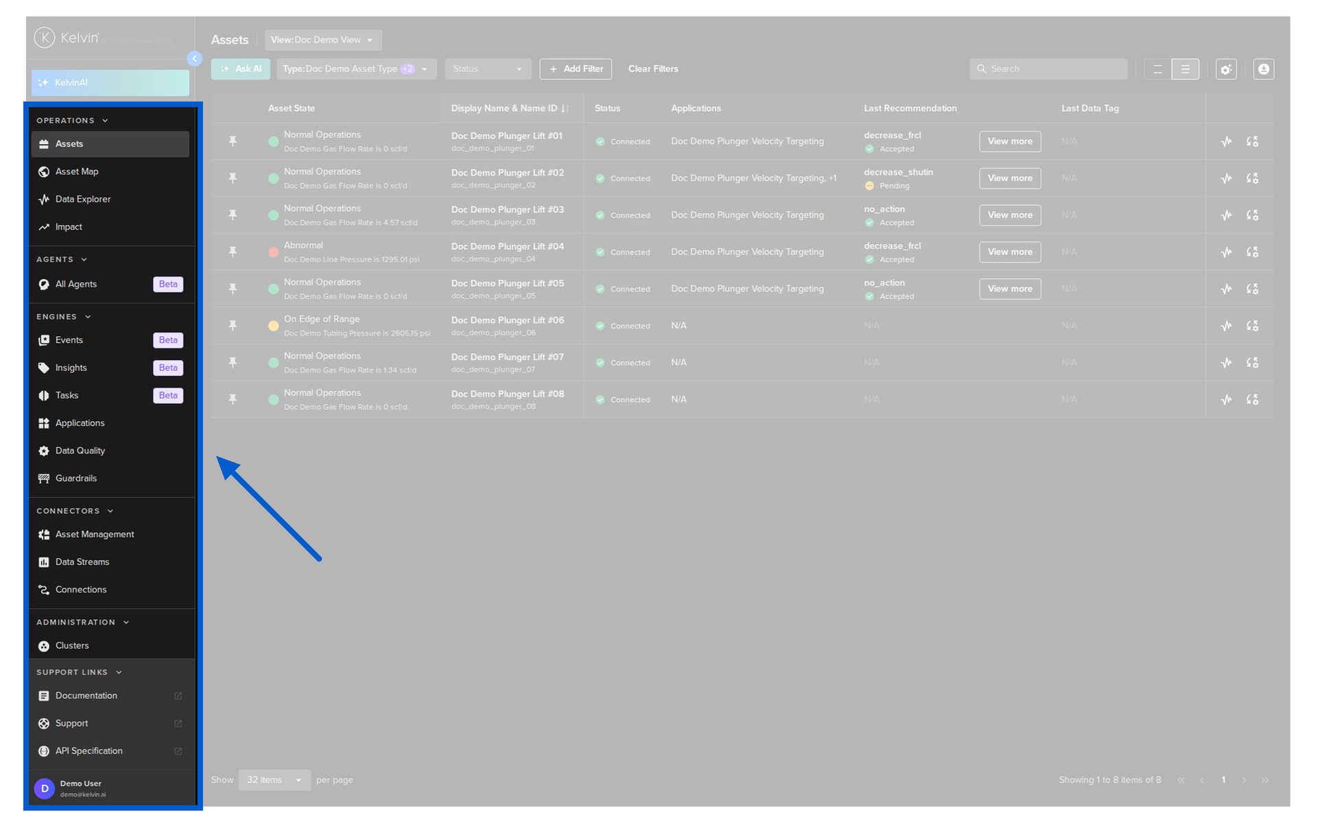
Once you log in, you land directly on the Assets page. This is your home base.
The left sidebar is your navigation. As an Operations Engineer, you will spend most of your time in the top section:
- Assets — the table view of all your assets
- Asset Map — your assets plotted on a geographic map
- Applications — manage Kelvin SmartApps™ and see what they are doing
- Data Explorer — dig into historical data with interactive charts
The Operations area gives you four distinct tools for monitoring, analysing, and acting on your assets.
Pro Tip
Almost everything you can do in the Kelvin UI can also be done through the Kelvin API or the Kelvin API Client (Python). If you want to automate workflows or integrate Kelvin into existing tools, the API is the right tool. The UI is best for day-to-day operations work.
Section 1: Assets Page
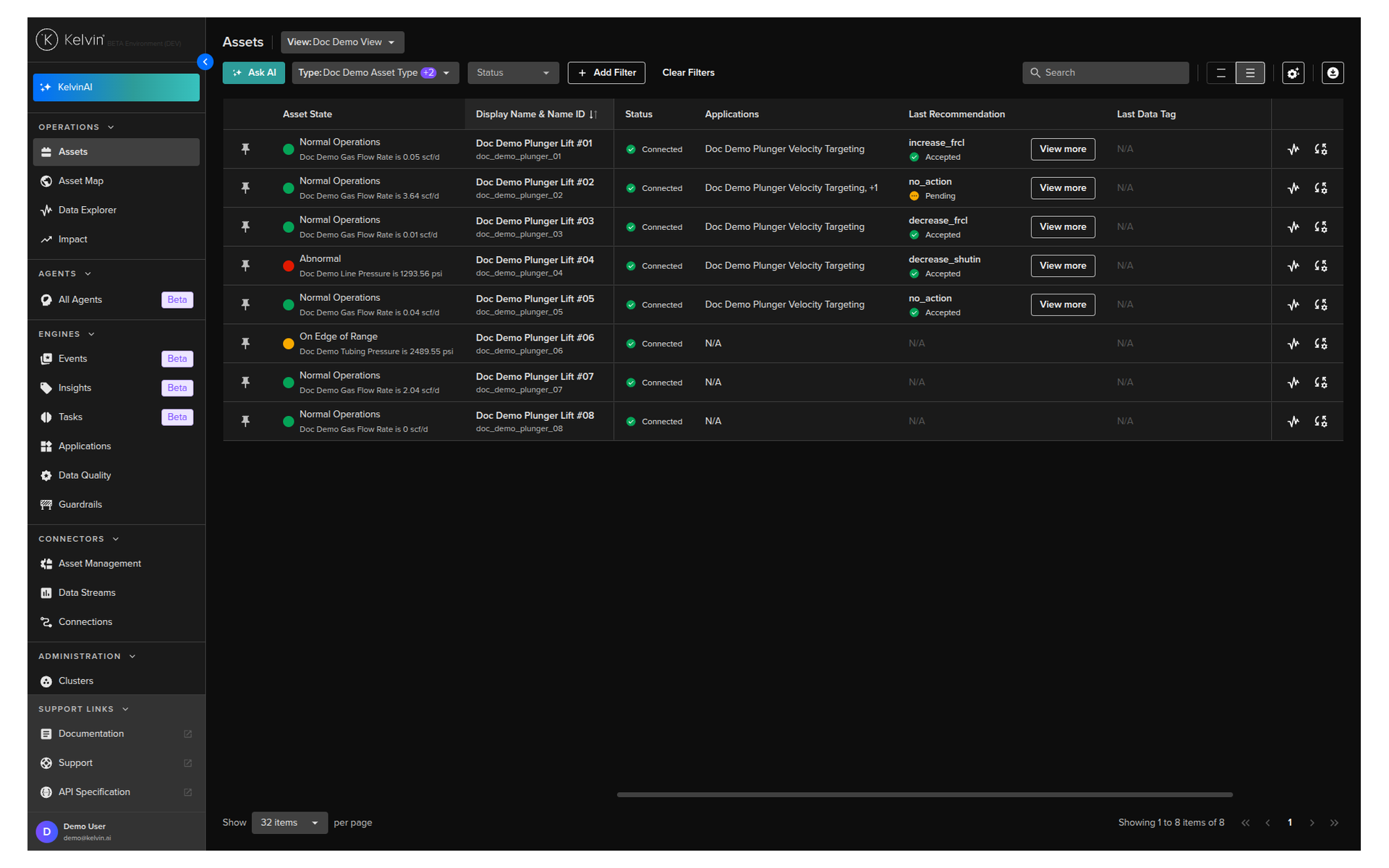
The Assets page is where you land when you log in, and it is where you will spend most of your time. It lists every asset registered in Kelvin and gives you a set of tools to monitor, filter, and act on them without leaving the table.
The Table View
By default, the table shows asset name, status, applications, asset type, and a link to the Data Explorer. These are just the starting columns. Every column, filter, and layout you configure is saved automatically and remembered between sessions.
Basic features available directly in the table:
| Feature | What it does |
|---|---|
| Search | Filters the table as you type. Not case-sensitive. |
| Sort | Click any column header to sort ascending. Click again for descending. Click a third time to clear. |
| Pin | Pin important assets to the top of the list. Pinned assets stay visible across all pages. |
| Row Height | Adjust row height to fit more rows on screen or space them out for readability. |
| Page Size | Set how many assets appear per page. |
| Filter | Advanced filtering by asset properties, app parameters, or data stream aggregations. Filters persist across sessions. |
Smart Navigation
Once you filter the table, that filtered list carries through to the Asset Details page. When you open an individual asset and navigate to the next or previous one, Kelvin only cycles through the assets in your filtered list. This keeps you focused on what matters right now.
Custom Views
You can save your current column layout as a View. Views let you switch between different layouts instantly.
For example, you might have one view for a morning check (recommendations and status) and a different view for a detailed review (data streams and app parameters).
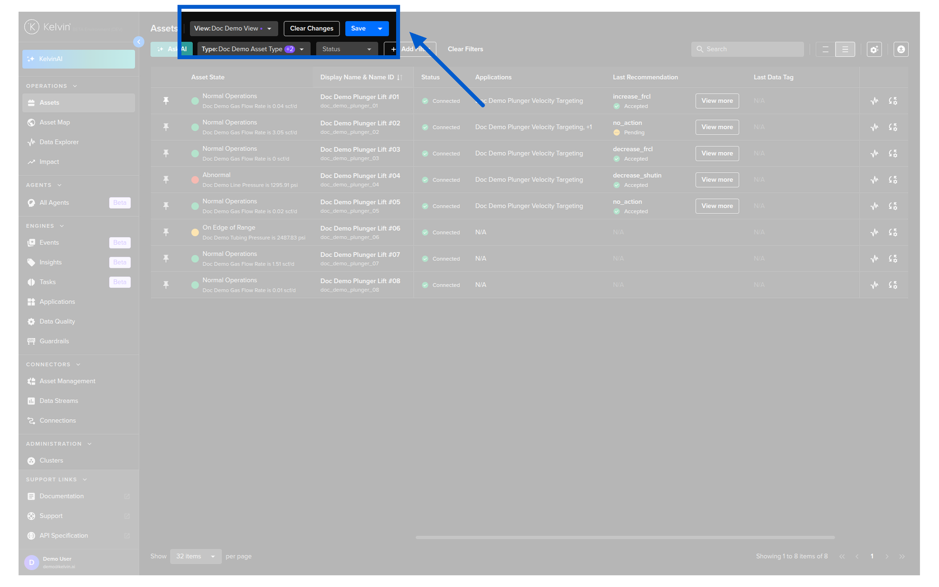
If you customize columns but do not save the layout as a View, your changes will be lost when you leave the page.
Customizing Columns
The default table shows basic information, but the real power is in adding columns that show live data, recommendations, parameters, and more. Click the column settings button in the table header to open the column panel.
The available column types are:
| Column Type | What It Shows |
|---|---|
| Data Stream | Live sensor readings from any data stream on the asset |
| Recommendation | Latest recommendation with a quick action button |
| Last Action | Latest action status (control changes and custom actions) |
| Asset Property | Static properties like location, well type, or model |
| App Parameter | Current SmartApp configuration values |
| Schedule | Upcoming scheduled parameter changes |
| Insight | Latest insight |
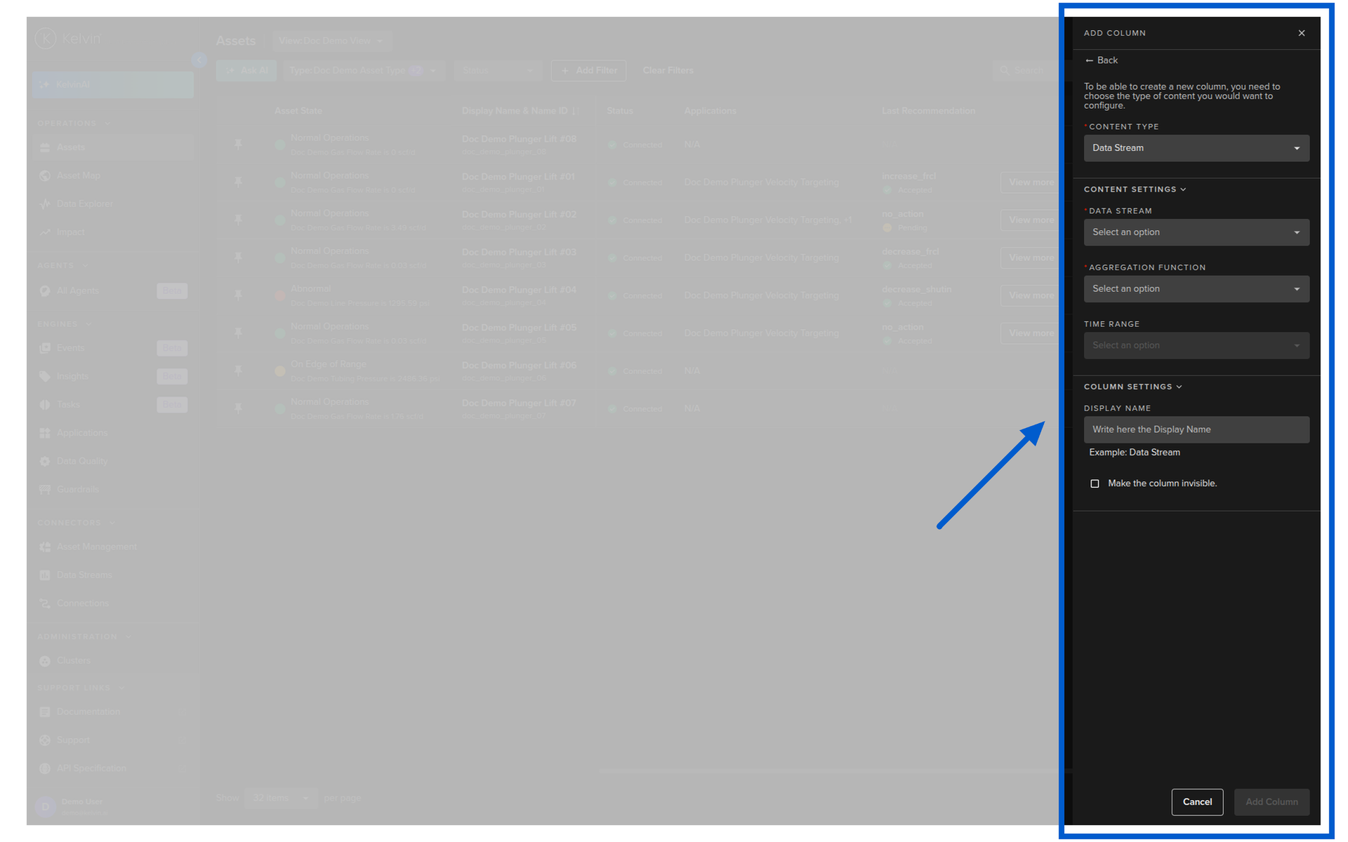
Column settings also let you:
- Freeze columns left or right so they stay visible when you scroll horizontally
- Hide columns you do not need at the moment
- Reorder columns by dragging them
Asset State Column
The Asset State column shows a color-coded indicator based on live data stream values, as configured by your Platform Administrator. This column cannot be deleted or moved, but you can show or hide it.
For a full walkthrough of column customization and saved views, see Course 242.
Asset Details
When you click on any asset in the table, you open the Asset Details page. This is where you work with an individual asset.
At the top you can see the asset status, navigate to the next or previous asset in your filtered list, and jump directly to the Data Explorer for that asset.

The details page has three tabs. You can reorder the tabs to suit your workflow.
Control Panel
The Control Panel is your customizable dashboard for this asset. You drag widgets onto the screen and arrange them to show the information that matters most for your decision-making.
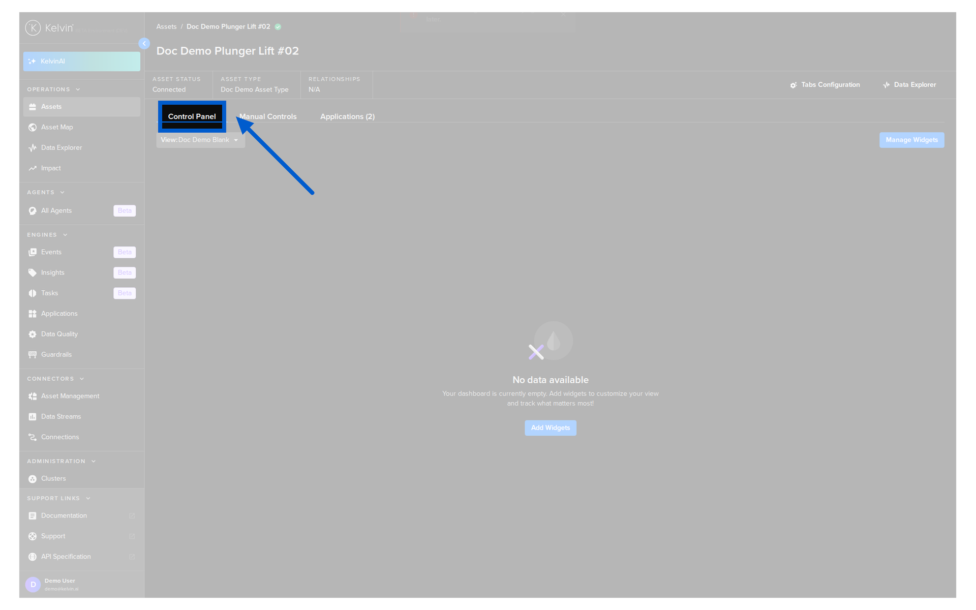
There are six widget types available:
| Widget | What it shows |
|---|---|
| App Parameters | Current parameter values for the asset's applications |
| Asset Properties | Static metadata defined for the asset |
| Data Explorer | An embedded Data Explorer view scoped to this asset |
| Kelvin Control Mode | A toggle to switch the application between Open Loop and Closed Loop |
| Recommendations | Current recommendations, with optional filters by application and status |
| Schedules | Upcoming scheduled parameter changes for this asset |
Note
Any Control Panel layout you configure applies to all assets of the same Asset Type. Set it up once and it is consistent across every asset of that type.
You can also save multiple Control Panel layouts as different views and switch between them instantly.
Manual Controls
The Manual Controls tab shows all the data streams for this asset, grouped by type.
- Setpoints are read/write data streams. You can send new values directly to the asset from here.
- Data Streams are read-only. You can see their current values but cannot write to them from here.
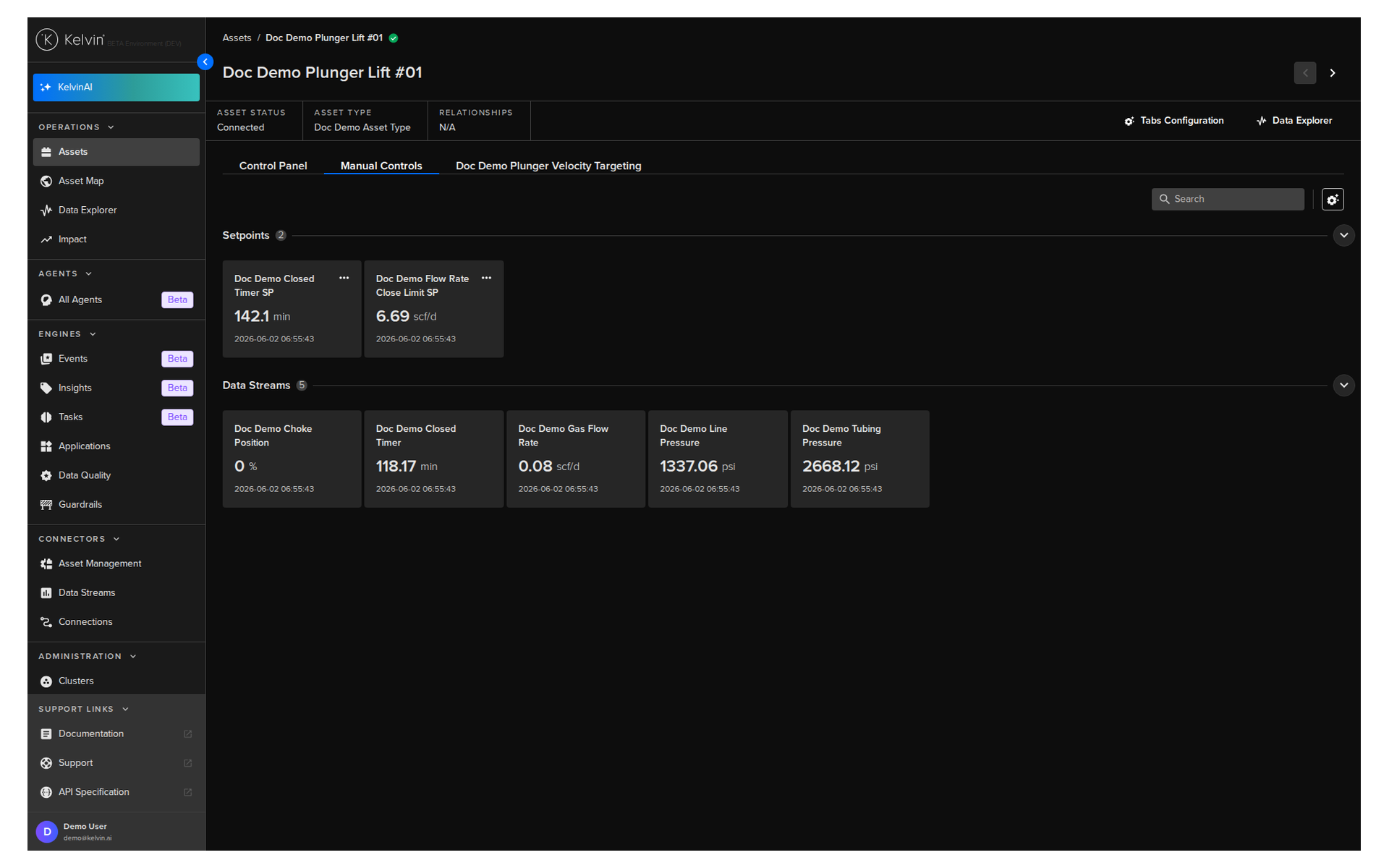
You can create custom groups, move data streams between groups, hide data streams you do not need, and reorder both streams and groups to match your workflow.
Use with care
Writing a value to a Setpoint sends a control change directly to the asset. Guardrail rules will block any write that exceeds defined safety limits, but always review what you are sending before you confirm.
Applications Tab
The Applications tab is where you manage the SmartApp side of this asset. This is where most of your day-to-day decision-making happens.
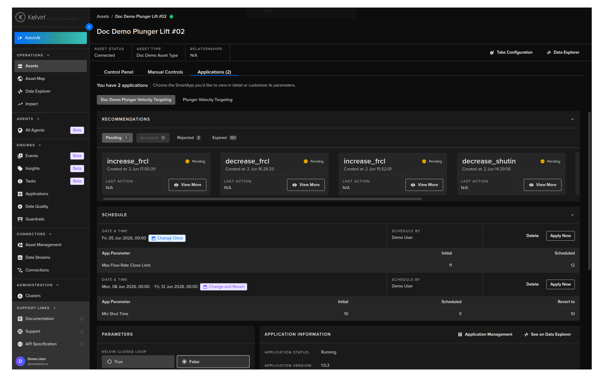
What you can do here:
- Recommendations: See all pending, accepted, rejected, and expired recommendations for this asset. Click View More to review the evidence and take action.
- Schedule: See upcoming scheduled parameter changes. If it is a single-asset schedule, you can apply it immediately from this screen.
- Parameters: View and update the app parameters for this asset. Changes are sent to the edge immediately. If the edge is offline, they are queued and sent when it reconnects.
- Application Information: View the application mode and navigate directly to the full application page or the Data Explorer.
Open Loop vs Closed Loop
If the application is in Open Loop mode, you must review and approve each recommendation before any control change is made. In Closed Loop mode, recommendations are automatically accepted and executed without your input.
For a deep dive on recommendations, see Course 243.
For full documentation, visit:
- Managing Assets
- Customize Columns
- Asset Details Overview
- Control Panel Tab
- Manual Controls Tab
- Applications Tab
Section 2: Asset Map
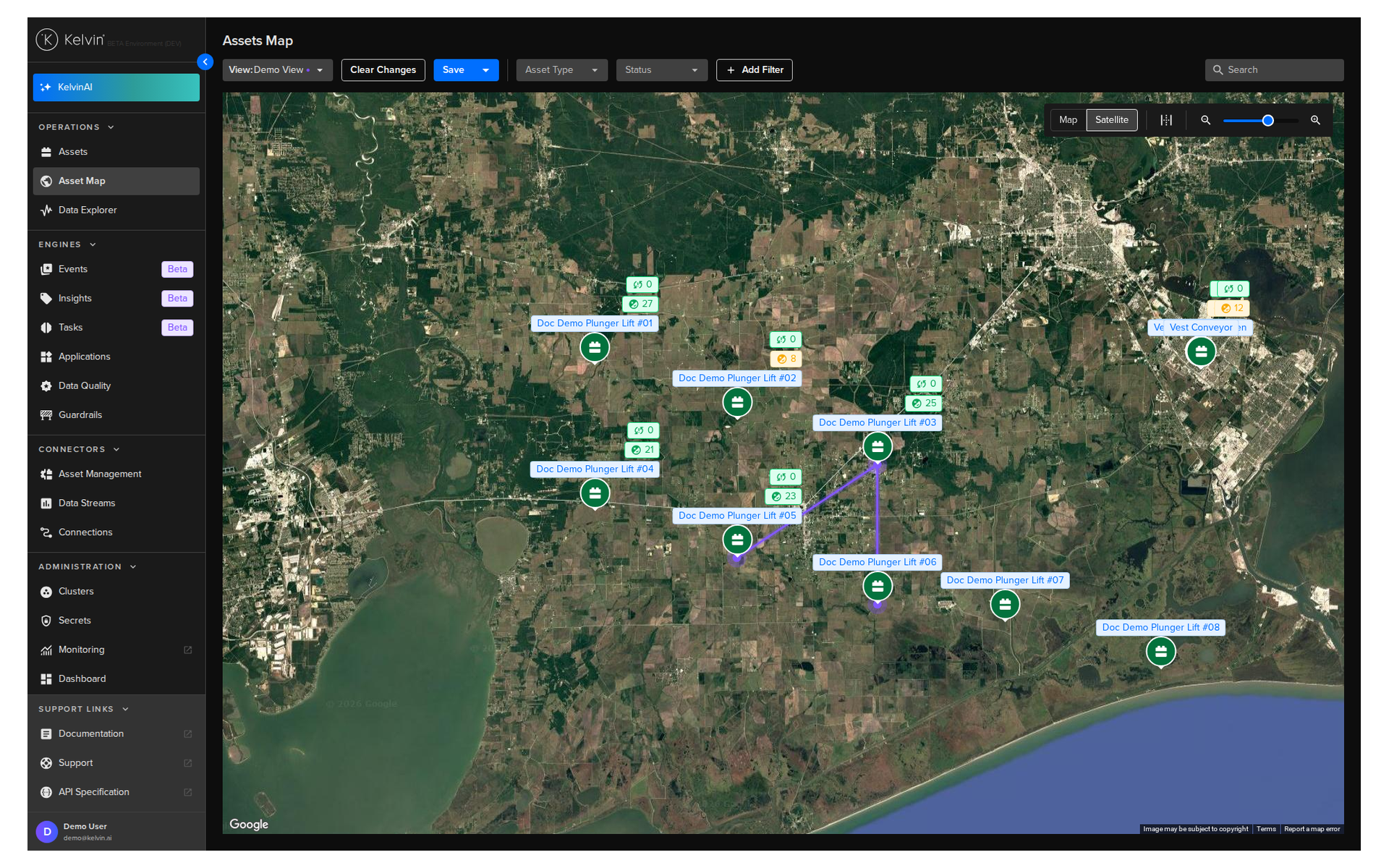
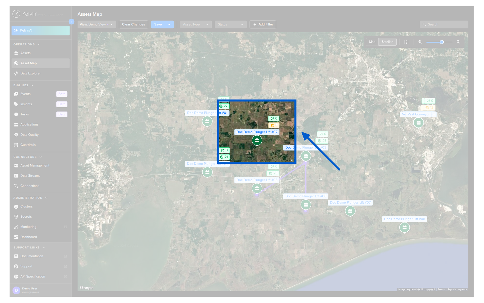
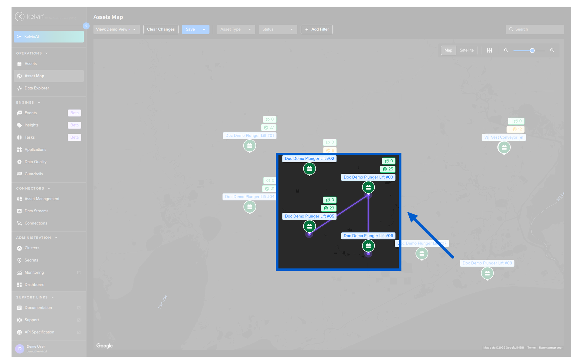
The Asset Map shows your assets on an interactive geographic map. If your assets have latitude and longitude coordinates configured by your Platform Administrator, they appear as pins on the map.
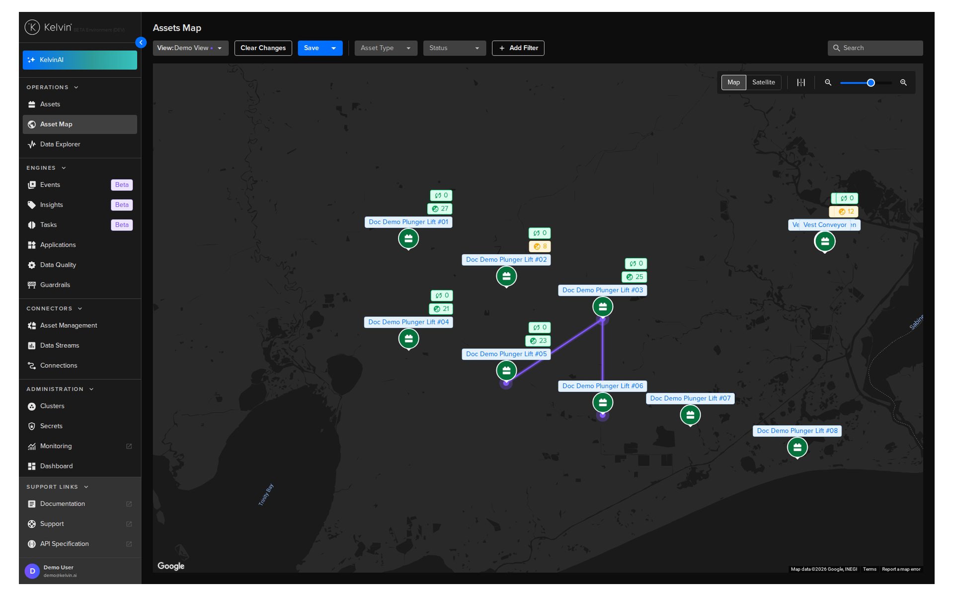
The map uses Google Maps, so familiar features like satellite view, mouse zoom, and panning all work as you would expect.
What You See on the Map
Each asset pin shows three quick-status tags:
| Tag | What it shows |
|---|---|
| Top tag (red/white) | Number of failed control changes. Red if there are failures, white if clear. |
| Middle tag (orange/green) | Number of pending recommendations. Orange if there are any waiting, green if none. |
| Bottom tag | Current asset status: Online, Offline, or Unknown. |
Clicking on a pin opens a popup with more detail, including current data stream values, recent control changes, and current recommendations with action buttons.
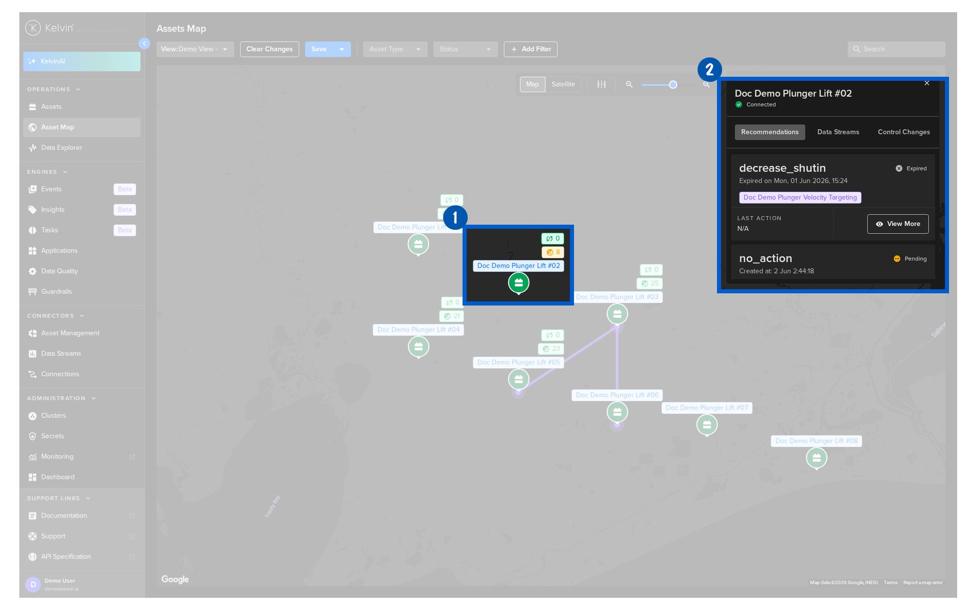
In the recommendation card within the popup, you have two options depending on whether there is a pending recommendation:
| Option | When it appears | What it does |
|---|---|---|
| View More button | There is a pending recommendation | Opens the recommendation popup so you can accept or reject it |
| Details link | There are no pending recommendations | Shows the last recommendation details |
Finding and Filtering Assets
The Asset Map has the same filtering tools as the Assets table:
- Search: Type to filter which assets are visible on the map. Updates dynamically as you type.
- Asset Types: Show only assets of selected types.
- Status: Filter by Online, Offline, or Unknown.
- Advanced Filters: Filter by asset properties, app parameters, or data stream aggregations.
- Custom Views: Save your current map position and zoom level for quick return.
Note
All filters on the Asset Map are persistent. If you leave the page or log out, your filters will still be applied when you return.
Advanced Features
Assets that are related to each other are shown with a connecting line between their pins on the map. This makes it easy to see dependencies and linked equipment at a glance.
For full documentation, visit:
Section 3: Applications
The Applications page is where you see and manage all the Kelvin SmartApps™ deployed on your platform. Each card on the page represents one application.
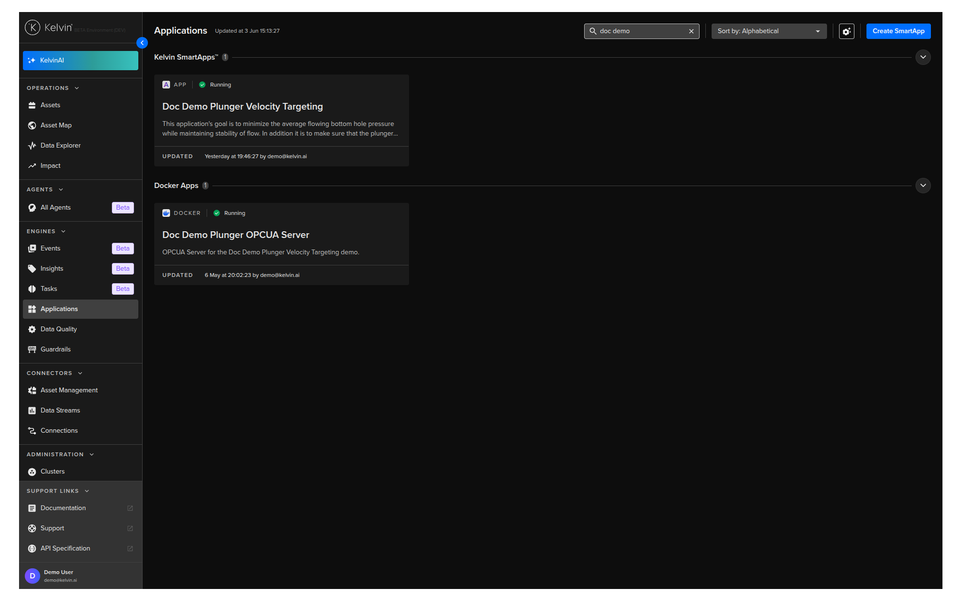
The Applications Dashboard
Applications are grouped by type. The two main types you will see are:
| Type | What it is |
|---|---|
| Kelvin SmartApps™ | Applications built with the Kelvin SDK. Fully integrated with the Kelvin UI with a complete set of features. |
| Docker Apps | Applications built outside the Kelvin platform. Limited UI features compared to SmartApps. |
You can create custom groups to organise applications in a way that makes sense for your team. Drag and drop applications between groups, hide ones you do not use often, and reorder groups to put the most important ones first.
For each application card you can see the deployment status, how many assets are associated with it, and when it was last updated.
Application Details
Clicking on an application card opens its details page. From here you get a platform-wide view of the application across all the assets it is managing.
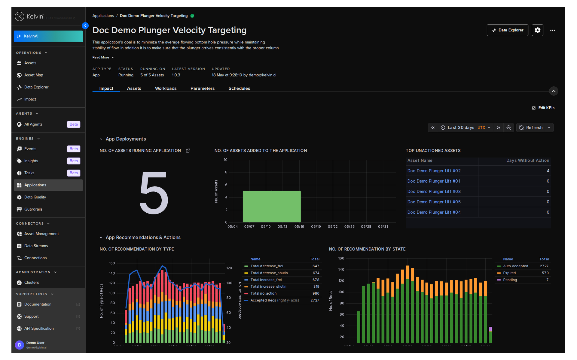
What you can see at the top:
- The latest version available and when it was last updated
- A status summary showing how many assets are running, how many have issues, and how many are offline
What you can do from the Assets tab:
- Open any individual asset directly in the Data Explorer
- Select up to four assets and compare them side-by-side in the Data Explorer
- Enable or disable the application for individual assets
- Update the application version for one or more selected assets
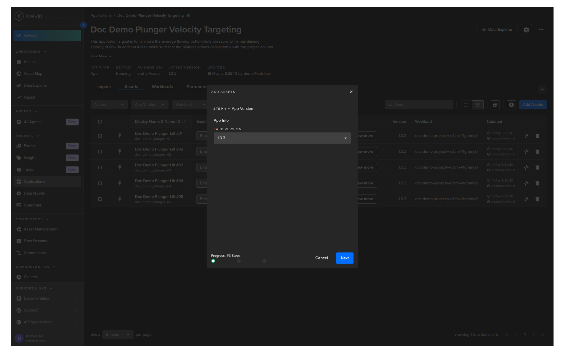
Adding Assets to an Application
Adding an asset to an application is how you get SmartApps processing your data and generating recommendations. Once an asset is added, the application starts reading its data streams and producing outputs.
You do not need to understand the code inside the application, the workload configuration, or any infrastructure details. The platform handles all of that automatically.
Note
This is covered in full detail in Course 241: Adding Assets to Applications.
Version Management
Different assets can run different versions of the same application at the same time. This lets you test a new version on a small group of assets before rolling it out to everyone.
Upgrading an asset from one version to another is a simple selection from the application details page.
Scheduling Parameter Changes
The Applications page is also where you create schedules that change app parameters across multiple assets at once. This is different from scheduling a single asset's parameters from the Asset Details page.
A schedule lets you set a parameter to change at a future time, with an optional automatic revert to the original value after a defined period. This is useful for planned maintenance windows or temporary operational adjustments.
| Schedule Type | What it does |
|---|---|
| Change Once | Changes the parameter at the scheduled time, then marks the schedule complete |
| Change and Revert | Changes the parameter at the scheduled time, then reverts it at a second scheduled time |
For full documentation, visit:
Section 4: Data Explorer
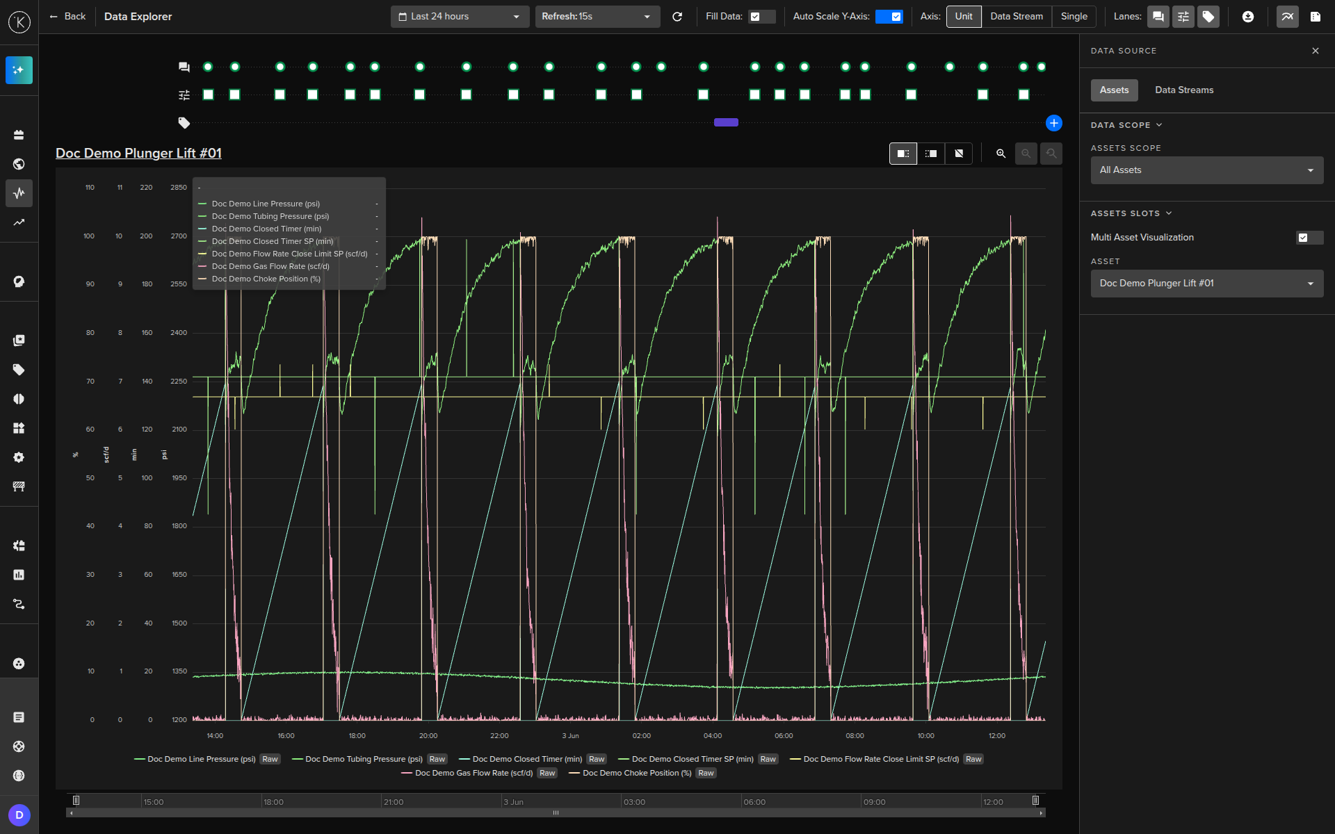
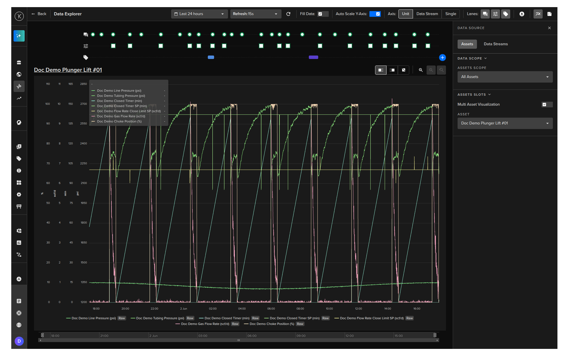
The Data Explorer is the analytical tool for understanding what is happening with your assets over time. It is a time series chart that brings together data streams, control changes, recommendations, and custom tags in a single view.
Opening Data Explorer
You can reach the Data Explorer from several places in the Kelvin UI:
- Click Data Explorer in the left sidebar to open it fresh
- Click the Data Explorer icon on any asset row in the Assets table to open with that asset pre-selected
- Click the Data Explorer button from an Asset Details page to open with that asset pre-filled
- Click an asset name from an Application details page to open with that asset pre-selected
Each entry point pre-fills the asset selection so you do not have to configure it from scratch.
Selecting Assets and Data Streams
In Data Explorer, you build your view by selecting:
- One or more assets (up to four assets for side-by-side comparison)
- The data streams you want to see for each asset
Data streams are linked to their assets, so you never have to search through thousands of metric names. You select the asset first, then choose from only the streams that belong to it.
You can also set the aggregation for each stream: None (raw data), Average, Count, Maximum, Minimum, or Sum over a defined time period.
Automatic Aggregation
When you select a very long time range or a large dataset, the Kelvin UI automatically aggregates data to maintain performance and readability. The aggregation behavior is configured per platform.
Activity Lanes
Activity lanes are horizontal bands below the chart that show events on the same time axis as your data. There are three lane types:
| Lane | What it shows |
|---|---|
| Control Changes | Every control change written to the asset, with icons for success, pending, failed, and multiple simultaneous changes |
| Recommendations | When recommendations were created, accepted, rejected, or expired |
| Tags | Custom markers you or your team have added to the timeline |
You can show or hide each lane individually to save screen space. Hovering over any event in a lane shows a full detail popup. For control changes, this includes the reason for any failures.
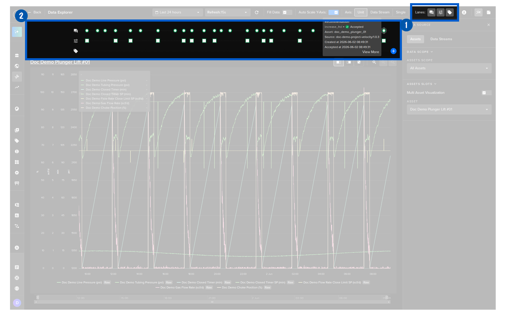
Tags
Tags let you attach notes, data stream references, and application names to a specific time point or time range on the chart. They are useful for marking significant events like maintenance windows, anomalies you noticed, or decisions you made.
Tags persist on the chart and can be listed in a sidebar. Developers and Data Scientists can also retrieve tag data programmatically, making tags a useful bridge between operational notes and analytical workflows.
Y-Axis Options
When displaying multiple data streams, you have three Y-axis options:
| Option | What it does |
|---|---|
| Single axis | All streams share one Y-axis scale |
| One axis per unit | Streams with the same unit share an axis; different units get their own axes |
| One axis per stream | Each stream gets its own independent axis |
You can zoom independently on each Y-axis. This lets you focus in on one stream without losing context on the others.
Downloading Data
You can export what is currently visible in Data Explorer to a CSV file. Four export types are available:
| Export | What it includes |
|---|---|
| Data | All data stream values for the selected asset and time range |
| Recommendations | All recommendation records for the selected asset and time range |
| Control Changes | All control change records for the selected asset and time range |
| Insights | All insight records for the selected asset and time range |
For full documentation, visit:
- Data Explorer Overview
- Monitor Asset Data
- Control Changes in Data Explorer
- Tags in Data Explorer
- Download Data
Quick Reference
| I need to... | Go to |
|---|---|
| See all my assets at once | Operations > Assets |
| Search for a specific asset | Assets page > search bar |
| Add a data stream column to the table | Assets > column settings > Data Stream |
| Save a column layout for later | Assets > Views > Save View |
| See an asset's live data stream values | Asset Details > Manual Controls tab |
| Review a pending recommendation | Asset Details > Applications tab > Recommendations |
| Update an app parameter for one asset | Asset Details > Applications tab > Parameters |
| See my assets on a map | Operations > Asset Map |
| Find assets with pending recommendations on the map | Asset Map > orange tag on asset pin |
| See all applications and their status | Operations > Applications |
| Add an asset to an application | Applications > select app > Assets tab |
| Schedule a parameter change across multiple assets | Applications > select app > Schedules tab |
| Analyse historical data for an asset | Operations > Data Explorer |
| Compare multiple assets side-by-side | Applications > select up to 4 assets > Compare in Data Explorer |
| Download asset data to CSV | Data Explorer > download icon |
Quick Quiz
Quiz 1: What is the first page you see when you log into the Kelvin UI, and why is it important?
Answer: The Assets page (Table View). It is your home base for monitoring all assets, acting on recommendations, and navigating to the rest of the platform. Every column, filter, and view you set up here is saved and remembered between sessions.
Quiz 2: What is the difference between a Setpoint and a Data Stream in the Manual Controls tab?
Answer: A Setpoint is a read/write data stream. You can send new values directly to the asset from the Manual Controls tab. A Data Stream in this context is read-only. You can see its current value but cannot write to it from here.
Quiz 3: What do the three tags on an Asset Map pin represent?
Answer: The top tag shows failed control changes (red if there are failures, white if clear). The middle tag shows pending recommendations (orange if there are any, green if none). The bottom tag shows the asset status: Online, Offline, or Unknown.
Quiz 4: What is the difference between Open Loop and Closed Loop for an application?
Answer: In Open Loop mode, the application sends recommendations but you must manually review and approve each one before any control change is made. In Closed Loop mode, recommendations are automatically accepted and the control changes are executed without your input.
Quiz 5: What are the three activity lane types in Data Explorer, and what does each one show?
Answer: Control Changes shows every write event sent to the asset, with status icons for success, pending, and failed. Recommendations shows when recommendations were created or acted on. Tags shows custom markers that you or your team have added to the timeline.
Quiz 6: How many assets can you compare side-by-side in the Data Explorer at the same time?
Answer: Up to four assets at the same time.
Quiz 7: What happens to your column configuration on the Assets page if you do not save it as a View?
Answer: Your changes are lost when you leave the page. You must save the layout as a View to keep it for future sessions.
Quiz 8: What are the six widget types available in the Control Panel tab?
Answer: App Parameters (current parameter values), Asset Properties (static asset metadata), Data Explorer (an embedded chart scoped to this asset), Kelvin Control Mode (a toggle between Open Loop and Closed Loop), Recommendations (current recommendations with optional filters), and Schedules (upcoming scheduled parameter changes).
Summary
You now have a complete map of the Operations area in the Kelvin UI. Every section has a clear purpose, and they connect to each other.
The key things to remember:
- The Assets page is your home base — customizable, filterable, and persistent between sessions
- Asset Details has three tabs: Control Panel (your personal dashboard), Manual Controls (live values and direct writes), and Applications (recommendations, parameters, and schedules)
- The Asset Map shows your assets geographically with real-time status indicators and direct access to recommendations from the map
- Applications is where you manage SmartApps™ across all your assets: adding assets, updating versions, and scheduling parameter changes
- The Data Explorer combines time series data with control change, recommendation, and tag lanes for full operational context
- You can export data, recommendations, control changes, or tags from Data Explorer to CSV at any time
For full documentation, visit:
- Managing Assets
- Asset Details Overview
- Asset Maps Overview
- Applications Overview
- Data Explorer Overview
Good luck and Happy Learning !