Monitor Asset Data with Data Explorer
On this page you will go through understanding the Data Explorer and its unique features on Kelvin UI.
Data Explorer
In Data Explorer you can see the historical graphical data about one or more Assets and all the Data Streams associated with the asset.
The Data Explorer is tightly integrated with the Kelvin and gives many additional features to the standard graphs including;
- Reference to time when a control change was performed on a Data Stream
- Reference when a Recommendation was activated
- Easily change timezone to see what time events happened according to your location
- Filter which Assets and Data Streams to view - even data that is not related to this Asset.
- Select the Y axis to be either all Data Streams on one axis value range, one axis value range per Data Stream or one axis value range per type (e.g. for temperature, vibrations, etc)
- Independent Y-Axis Zoom controls when displaying multiple y-axis value ranges.
- Multi-chart (up to four) to deeper analysis of multiple Assets together.
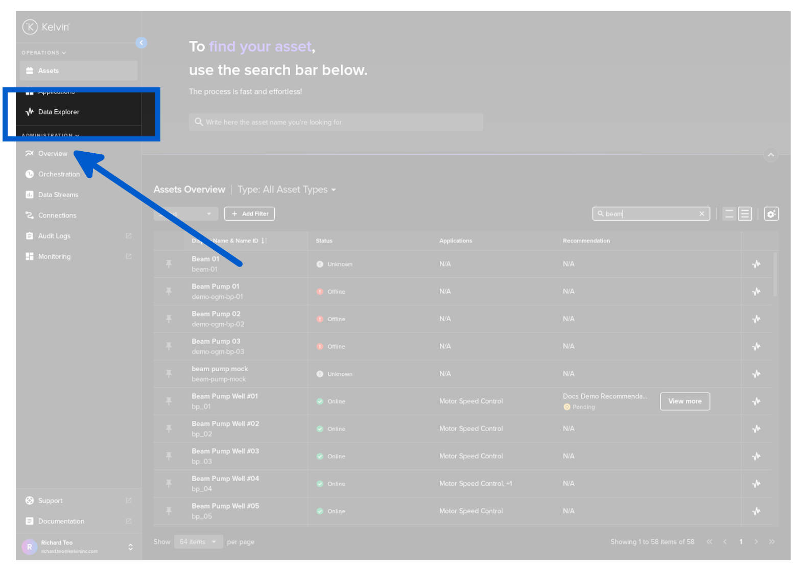
Opening Data Explorer
There are multiple ways to open the Data Explorer.
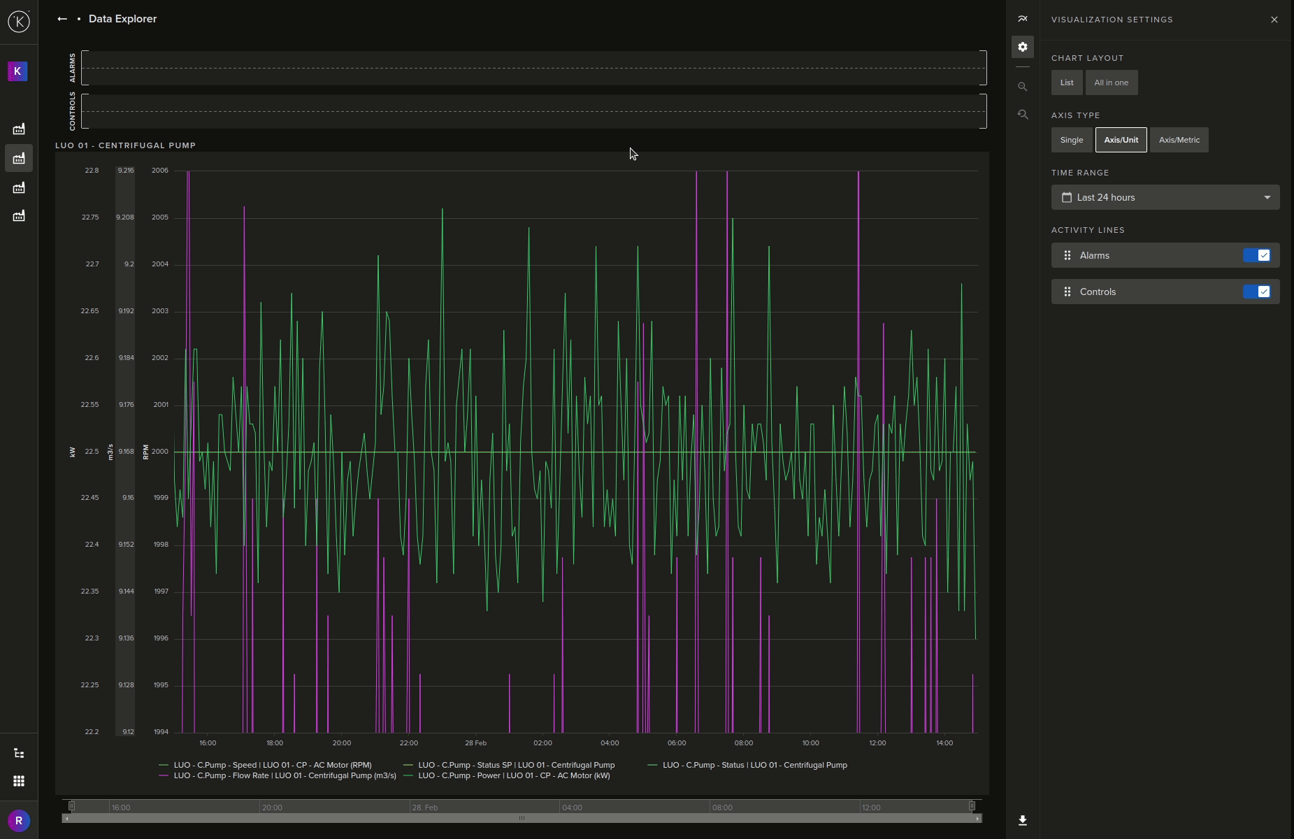
You will then see this page where you can analyze your historical data.
The left and right sidebars will automatically collapse to allow more space for the historical data display.
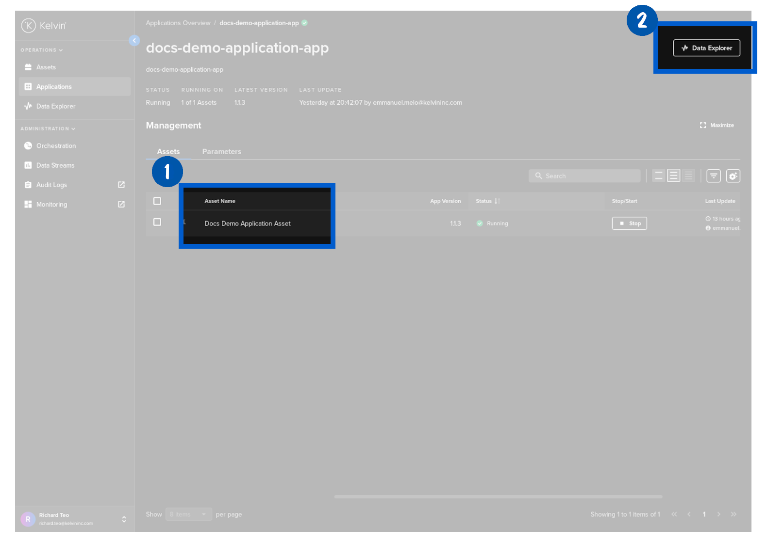
This will automatically select the Asset associated with the row you click on in the Data Explorer page.
You will then see this page where you can analyze your historical data.
The left and right sidebars will automatically collapse to allow more space for the historical data display.
Click on a Asset (1) or clicking on the Data Explorer button (2).
You will then see this page where you can analyze your historical data.
The left and right sidebars will automatically collapse to allow more space for the historical data display.
Data Explorer Layout
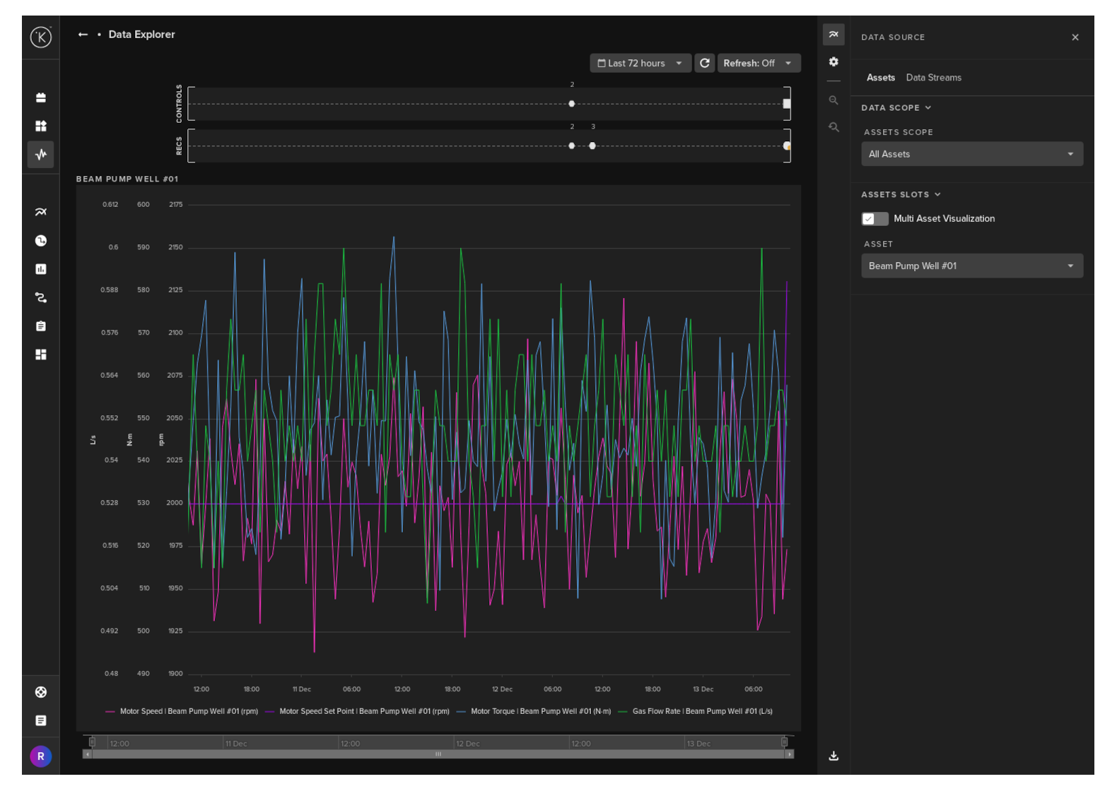
When Data Explorer is first opened, the side bar menus on the left and right will be minimized to allow maximum screen real estate for showing the graphs.
The left sidebar is your standard left sidebar in Kelvin UI and will expand if you move your mouse over the collapsed vertical bar.
The right sidebar has your all your options for managing Data Explorer; view, data, filters and other functionality.
It is also collapsible so that you can maximize the space on your screen for the historical line charts.
When you expand this side menu, you have a number of options available.
Data Source has two tabs for configuring your Data Explorer; the Assets and the Data Streams.
The data source tab allows you to select which Asset and Data Stream to show on the visualization.
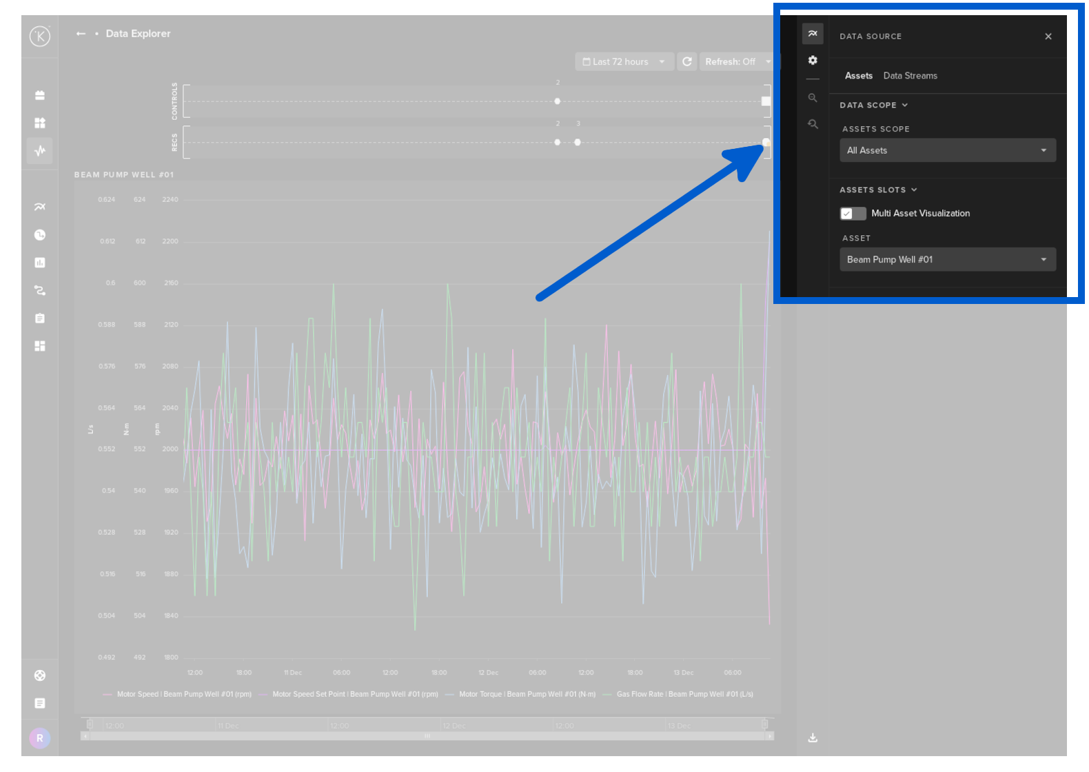
Under the Assets tab which you see in the screenshot above, you have a number of settings available.
Data Scope
| Settings | Options | Description |
|---|---|---|
| Assets Scope | All Assets | The list of Assets available to display will include all Assets on the Kelvin Cloud. |
| Same Asset Type | The list of Assets available to display will include only Assets that have the same Asset Type. | |
| Same Application | The list of Assets available to display will include only Assets that belong to the same Application. |
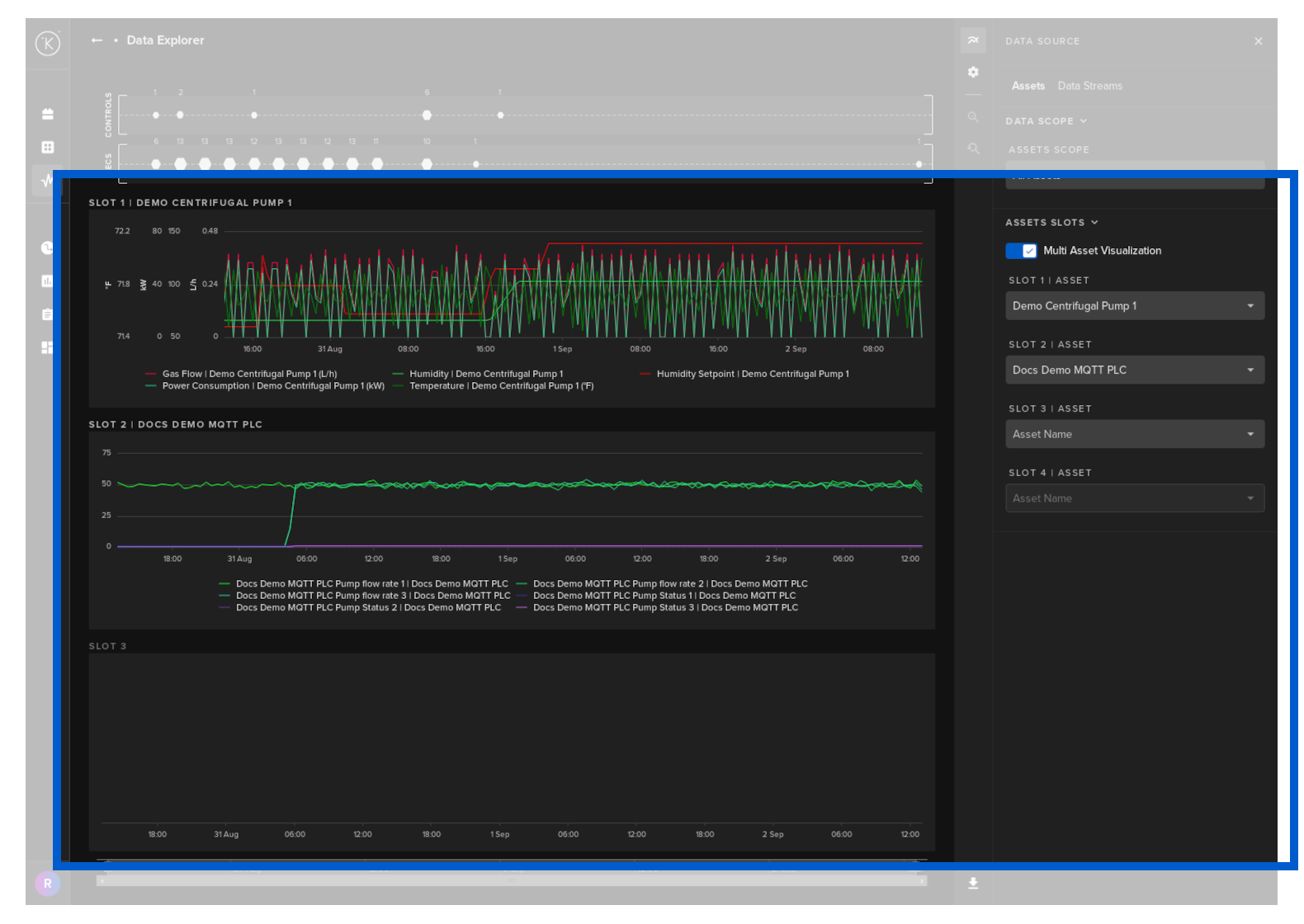
Assets Slots
| Settings | Options | Description |
|---|---|---|
| Multi Asset Visualization | On / Off | If you turn this on you can select up to four different Assets to be displayed in the visualization. |
| Asset (only displays if Multi Asset Visualization is Off) | A list of all Assets available dependent on the Assets Scope setting above. | Select which Asset to collect a list of Data Streams for Visualization. |
| Slot X | Asset (only displays if Multi Asset Visualization is On) | A list of all Assets available dependent on the Assets Scope setting above. |
Select which Assets (Up to four) to collect a list of Data Streams for Visualization. |
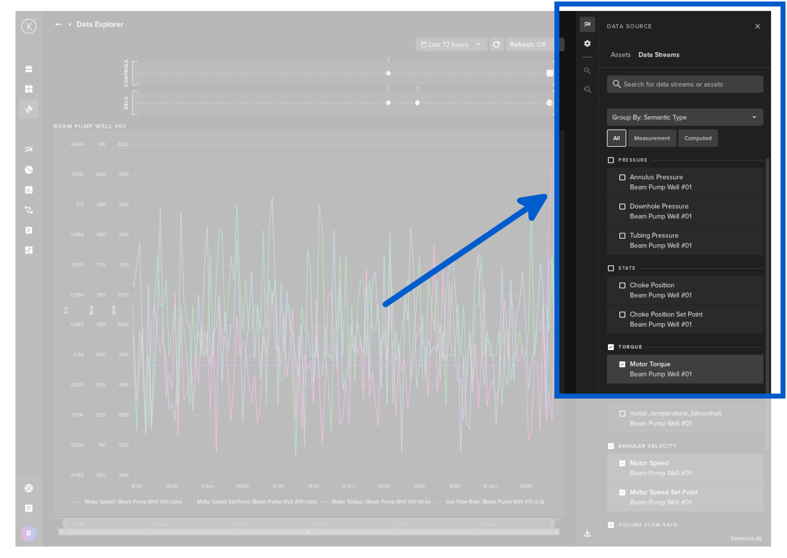
Under the Data Streams tab, you can select which Data Streams associated with the Asset to be displayed.
When looking for specific Data Streams, you can filter on Measurement and/or Computed. These are defined when you first create a Data Stream. These are setup by the Software Engineers or Administrators.
If you have selected to view multiple Assets together, then you have the option to group the Data Stream options by Assets and Semantic Type together.
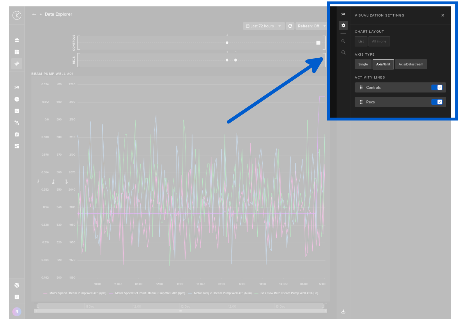
Visualization settings is where you can customize the look and feel of the Visualization screen. This is done from the configurations button in the top right corner.
| Settings | Options | Description |
|---|---|---|
| Chart Layout (Only active if Multi Asset Visualization option in Data Source above in turned On) | List | Each Asset will be displayed in a separate visualization. All visualizations will be stacked horizontally with a common time axis. |
| All in one | All Assets will be displayed in one visualization. | |
| Axis Type | Single | See Y-Axis Options chapter below. |
| Axis/Unit | See Y-Axis Options chapter below. | |
| Axis/Datastream | See Y-Axis Options chapter below. | |
| Time Range | Multiple | See Time Range Options chapter below. |
| Activity Lines | Controls On/Off | Control Changes. See View Options chapter below. |
| Recs On/Off | Recommendations. See View Options chapter below. |
Real Time
You can use the Data Explorer for both real time monitoring or historical data analysis.
In real time monitoring mode, you can set the refresh rate of the graphs from 5 seconds to 1 hour.
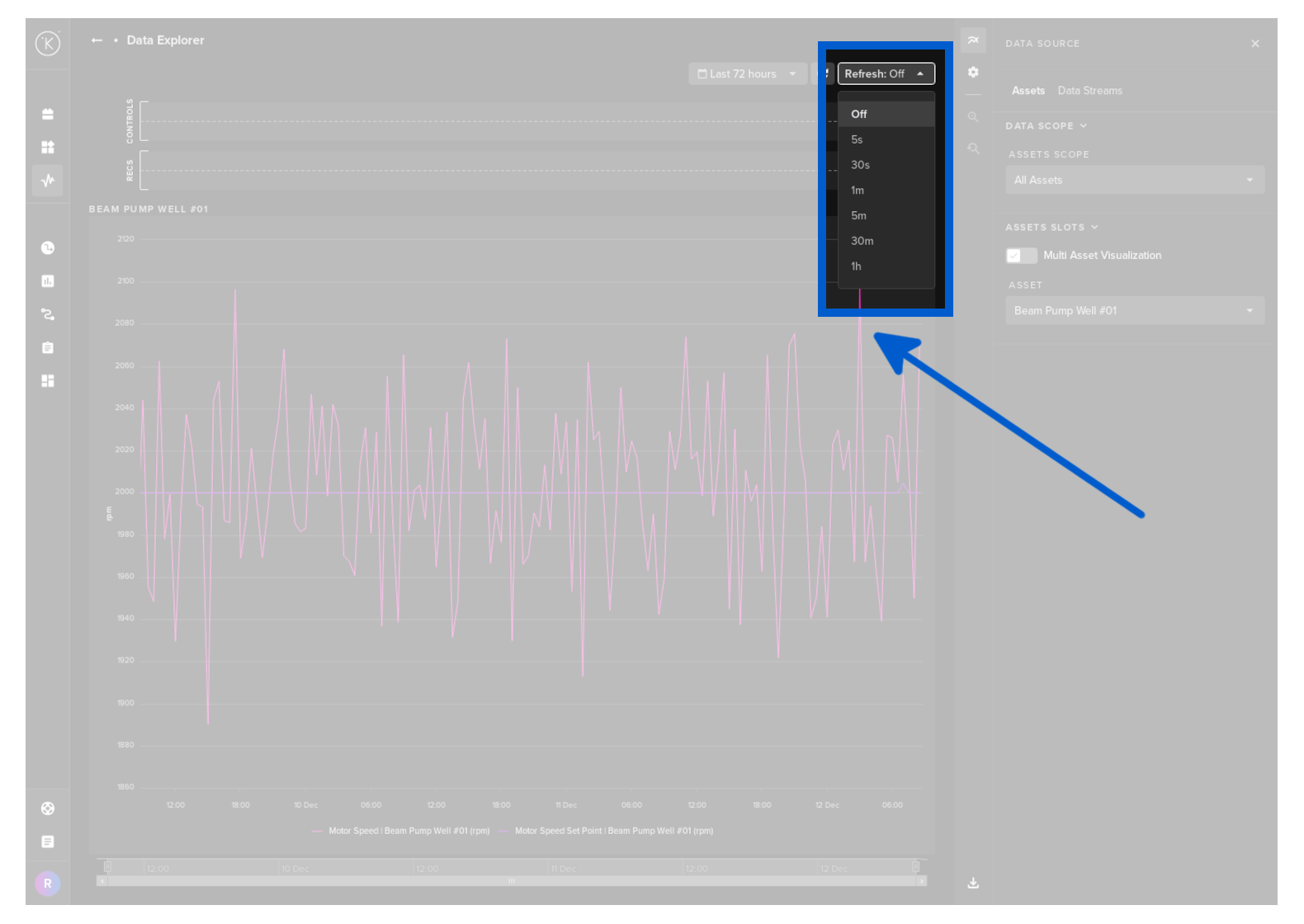
To revert to historical data analysis you can turn off real time monitoring by selecting Off.
View options
There are three main areas on the graph data;
- Control Change Requests
- Recommendations
- Data Stream time series data
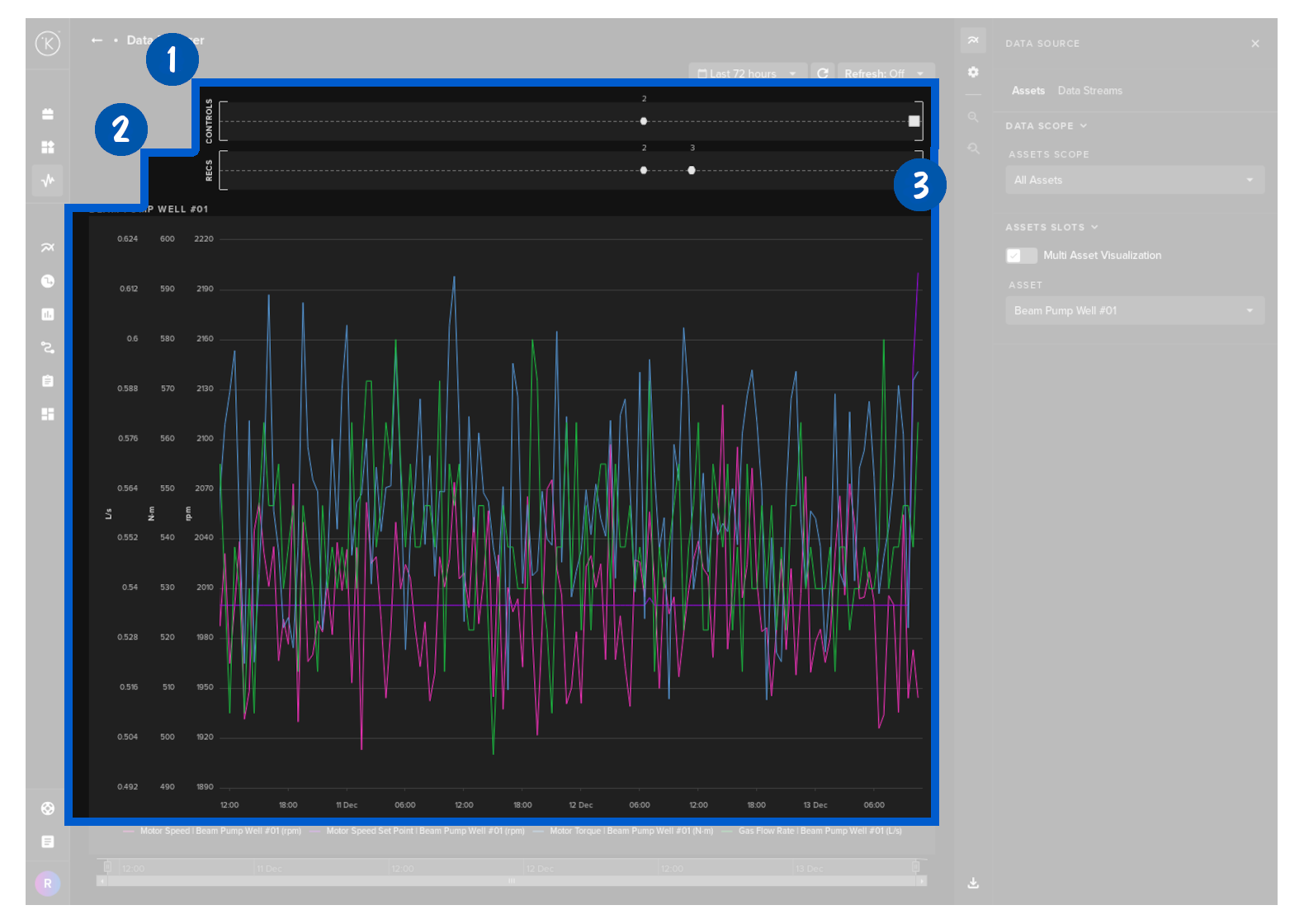
When viewing the Data Stream time series data, you have a number of options to customize your viewing experience.
You can view multiple Assets and their associated Data Streams all together and synced to the same time.
You still have the related control changes and recommendations shown on the top that allows you to get the most information on what is happening to your assets at any time.
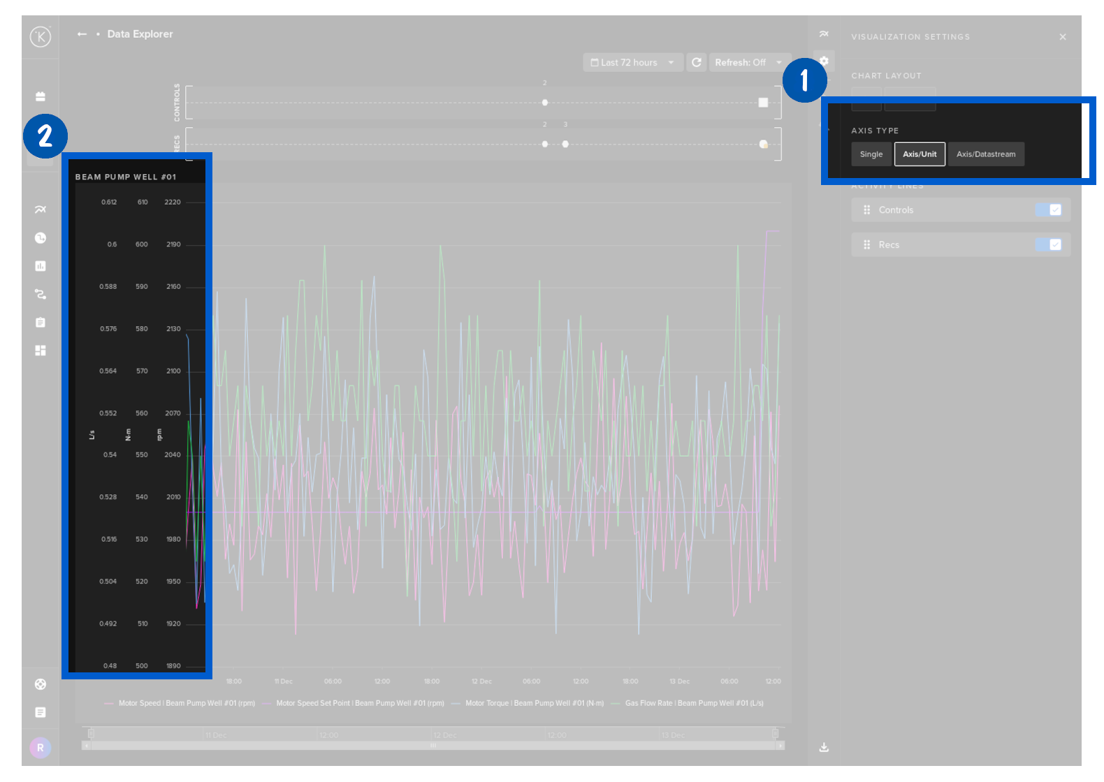
Inside the data series graphs you have three options for displaying the Y axis;
- Single - where all Data Streams are represented by one Y Axis range.
- Axis/Unit - where different units will have its own Y Axis range. For example; If two Data Streams have units m2 and a third Data Stream has units g/kg, then there will be two Y Axis represented - one for m2 and one for g/kg.
- Axis/Line - where each Data Stream will have its own Y axis range but the Y axis is not shown on the graph.
You can select which Y Axis option to display at the top.
Y Axis
On the Y Axis you have the ability to individually zoom into each variable separately. This is very useful if you want to see a section of data in high detail.
To zoom all axis at the same time, simply click on the Single Axis option button at the top.
X-Axis
On the X Axis you can zoom the time span. When zoomed in, the Zoom Out / Zoom Reset controls in the right hand sidebar also become active.
When you click on the calendar symbol a dropdown box will appear with a number of time range filtering options for the graphs shown on the dashboard.
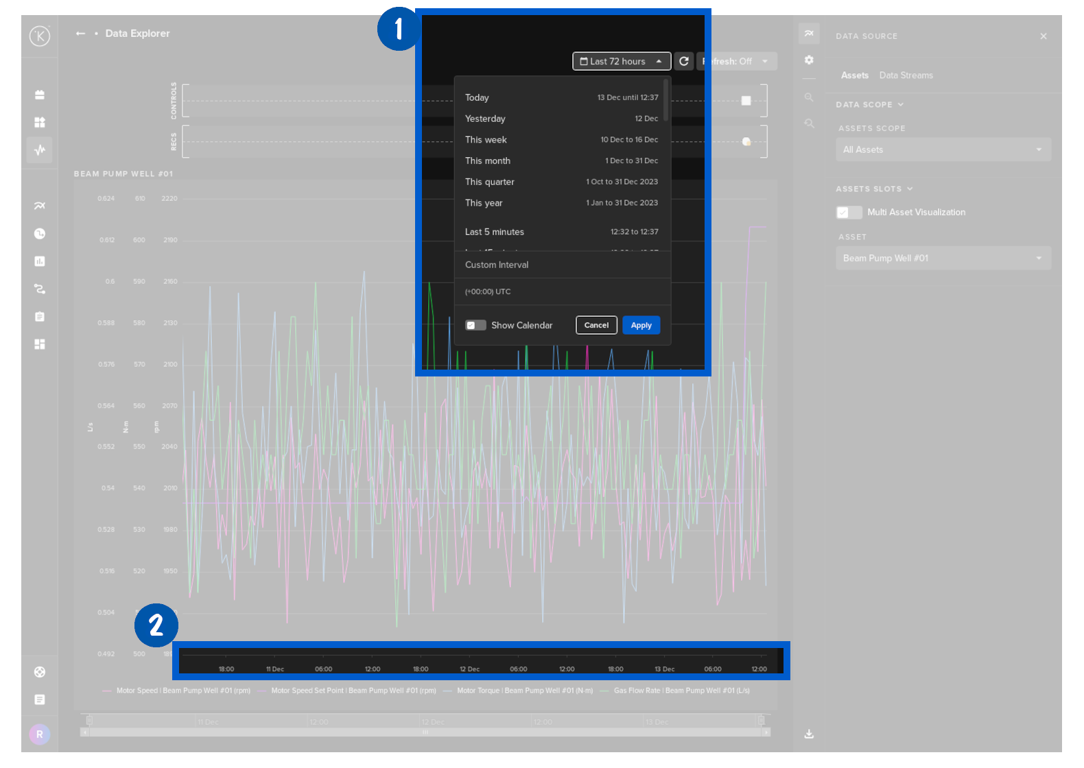
There are some useful features in the time range selection which are explained here.
| Feature | Options | Description |
|---|---|---|
| Quick Time Range | Today |
You can choose a quick select the start and finish times of the graphs displayed. |
| Customize Interval | You can quickly select a custom time range based on your current time. |
|
| Time Zone | Instead of having to calculate local time of asset compared to your timezone, you can just change the timezone of the graph to match asset location. |
|
| Show Calendar | Show both the Quick Time Range, Custom Interval and Time Zone together. |
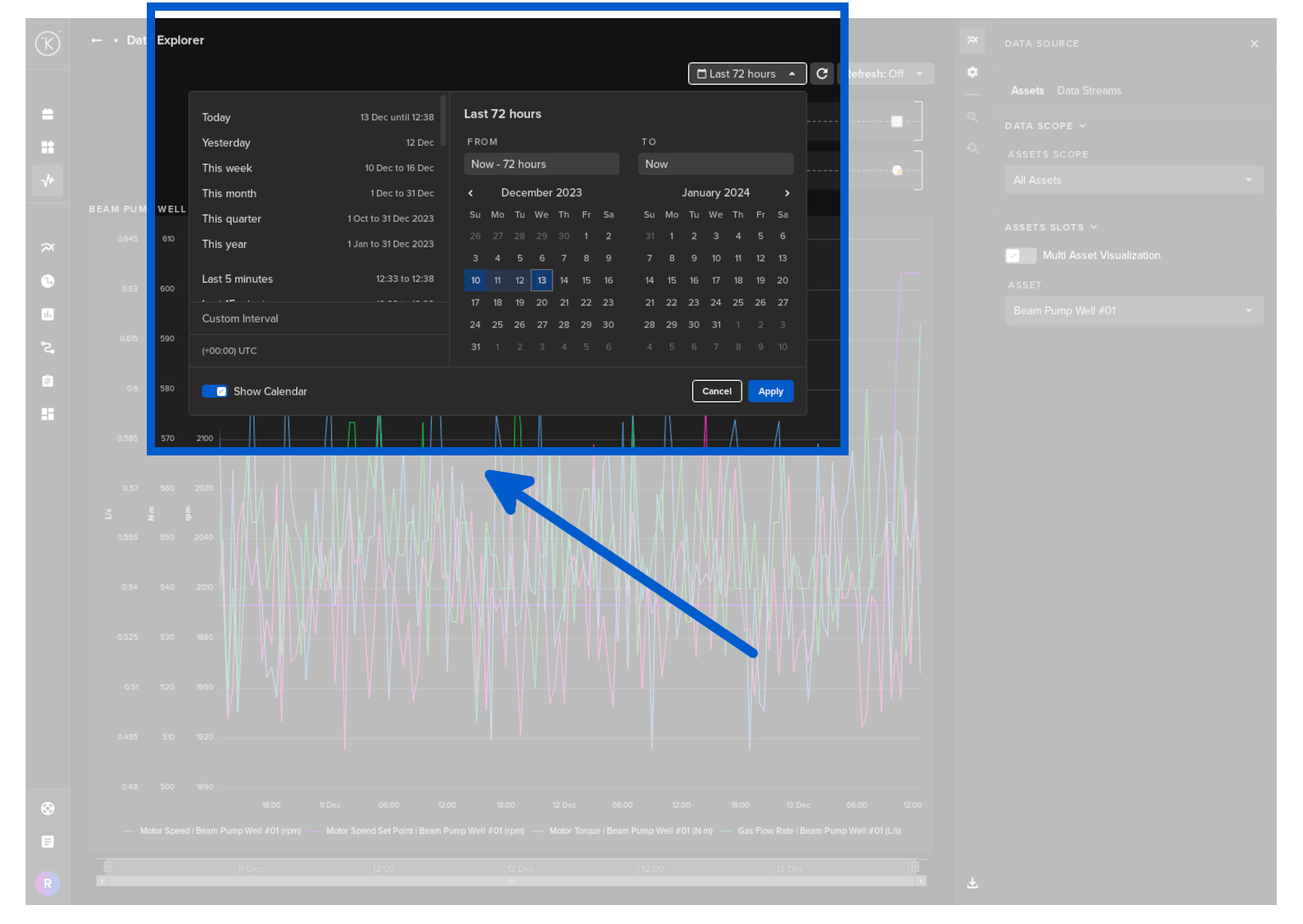
Custom Interval
If you click on the Show Calendar, then all you will also have an option to select the time range from a calendar.
You can also set you local timezone here.
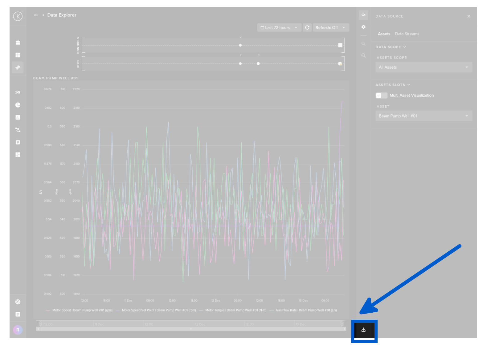
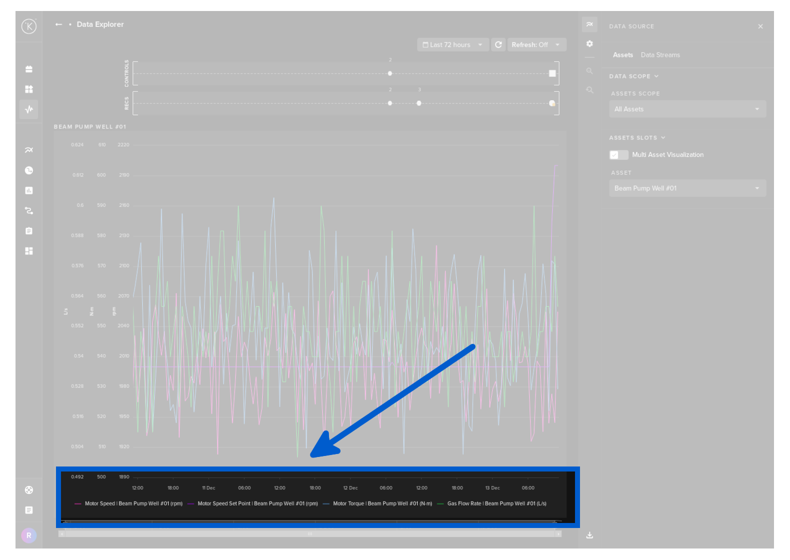
At the bottom is a legend with the Data Streams and their corresponding color on the line chart.
There is an option to download the data that is in the visualization to a csv file which can be opened by Google Sheets or Microsoft Excel.